Terra Regenerative Capital
Taking regenerative farming mainstream.
Brief
Terra Regenerative is the only investment group in the regenerative agriculture space specifically focusing on building out the missing middle of the supply chain. Without a robust supply chain connecting producers to the marketplace, regenerative agriculture will not be able to scale effectively. The team at Terra asked us to create a brand identity that would help them compete with ag-tech and general climate funds, which are positioned as cutting edge and promise outsized financial returns.
Audience
Investors, founders, and regenerative producers who understand that the current system, agriculturally and financially, is extractive and destructive. Bold, out-of-the-box thinkers and leaders who are comfortable being patient with their capital and thrilled with measuring success by both impact returns and financial returns.
Opportunity
Ag-tech and general climate funds tout manmade technology for manually sequestering carbon, genetically engineered seeds, and cellular lab-based meats, which is perpetuating an extractive model that requires more energy, more natural resources to build, and may have unintended consequences for food, soil, and planetary health. Terra had an opportunity to combat this “sexy-sounding tech” by reframing regenerative agriculture in a way that speaks to tech-minded investors.
Concept
Our planet is a perfectly designed machine. Its precision systems produce nutrient-rich foods, filter and restore our waters, and is a natural at drawing down carbon – all meticulously engineered by Mother Earth. Regenerative farmers are working with this amazing “native technology” and having great success in revitalizing farm ecosystems. But, they need our help taking regenerative to the mainstream. We invest in regional aggregators and processors in our supply chain to support the growth of regenerative agriculture, the health of humankind, and the pinnacle innovator for our future: Mother Earth.
Design
Our design system presents a modular framework where precise blueprint lines interweave with organic, leaf-like shapes and carefully integrated natural and agricultural photography. This dynamic visual language speaks to engineering expertise while celebrating the ever-changing natural world, creating layouts that can flex and grow with each application. The system embodies the beautiful tension between technical structure and organic fluidity, suggesting a world simultaneously governed by mathematical precision and natural wonder.
Voice
The tone of voice we developed for the Terra Regenerative brand is modern, strong, and optimistic yet grounded. The brand talks about nature as innovative, and elevates the idea of manmade systems working alongside nature’s systems for a powerful solution that benefits planet and people alike.

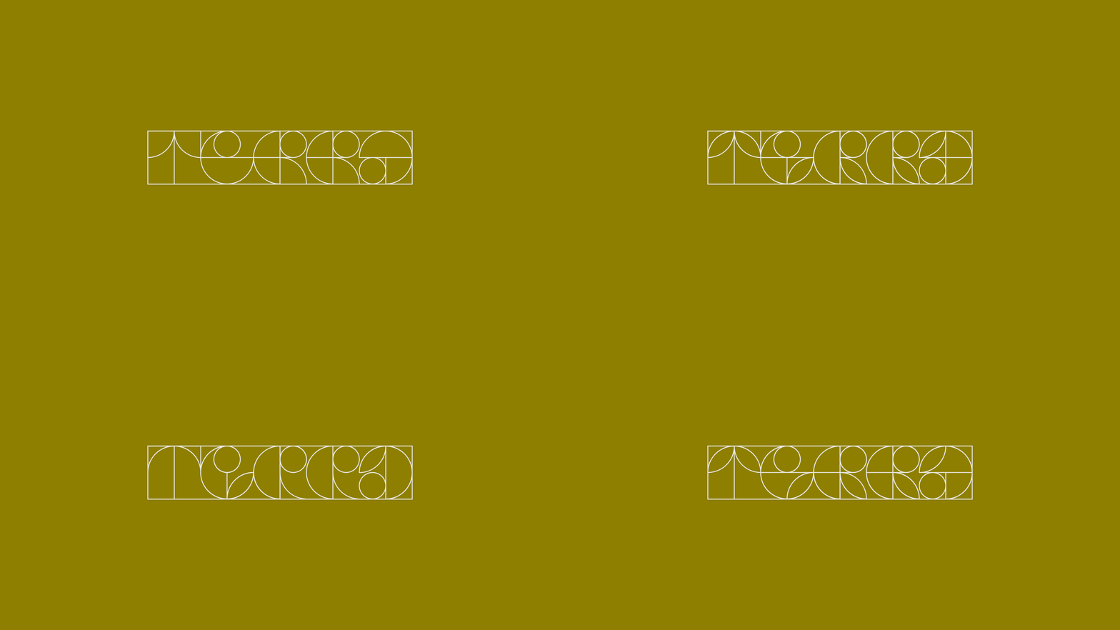
The logo exists at the intersection of precision and fluidity—a dynamic framework that breathes and transforms while maintaining its essential DNA. Its architectural wireframe reveals a calculated elegance, with geometric planes that subtly echo botanical forms without literal representation.
This visual foundation serves as both identity and algorithm—the generative heart of a design system that adapts to context while preserving cohesion. It's a living blueprint rather than a static symbol, continuously reconstructing itself like the natural systems it represents.

Our typemark provides essential balance to the evolving graphic system with its sturdy, deliberate forms. The strong lines and technical precision create stability, while subtle quirks add distinctive character that ensures immediate recognition even amid complex visual environments.
Our palette draws inspiration from nature's rich spectrum, capturing the vibrant authenticity of agricultural ecosystems. These colors convey genuine optimism while maintaining the serious purpose behind regenerative practices—warm and inviting yet rooted in earthy authenticity. Each hue balances vibrancy with restraint, reflecting both the promise and commitment inherent in ecological restoration work.


Our typography employs straightforward, technically-oriented typefaces that deliver exceptional readability. These precise, unembellished forms echo the blueprint aesthetic of our design system while providing essential grounding to layouts. Their technical character signals expertise while ensuring information remains accessible—creating reliable structure that helps translate complex natural systems into comprehensible communications.


Our logo anchors a blueprint-inspired design system that translates nature's complex systems into accessible visuals. Its technical framework lets us transform scientific intricacy into clean, ownable infographics—revealing the elegance in ecological relationships through a visual language that's both technically precise and intuitively clear.


We collaborated with the client to completely transform their presentation deck, restructuring the communication flow and creating clear visualizations of environmental challenges and Terra's solutions. The redesigned deck now effectively translates complex regenerative principles into accessible graphics while maintaining technical credibility and serving as a powerful stakeholder engagement tool.


KIND WORDS
"Pact crafted a beautiful brand that articulates what we do with clarity and sophistication. I also truly appreciate how effortless they've made this process for us."
Tara Smith Swibel, Co-Founder / Managing Partner
SHOUT-OUTS
Natalia Kowaleczko / Tony Mingo / Michelle Weed / Michelle Busy