SF Design Week: Reform
Reshaping outcomes with conscious design.
Brief
In our 3rd year as Design Bay Area’s creative partner, we were once again asked to create a theme and identity for San Francisco Design Week that would inspire thoughtful conversations across all disciplines of design.
Audience
The Bay Area design community in all it’s range: industrial, architectural, experiential, brand, product, materials, and more. The theme had to hold together across 100+ events and give hosts something to build on.
Opportunity
Too many design events in the Bay Area have become extensions of big tech: sponsored stages that double as product ads and hype machines for investor love. SFDW is decidedly not that. Rather, it spans all design disciplines and is a place to cultivate independent, critical thinking — a tradition that the Bay Area has a long history of. So we took the opportunity to investigate our relationship to past and present. Design has the power to create and reform processes, structures, materials, beliefs, behaviors, and systems that impact society and culture. How do we know when to start from scratch and when to build on the foundations others have already built?
Concept
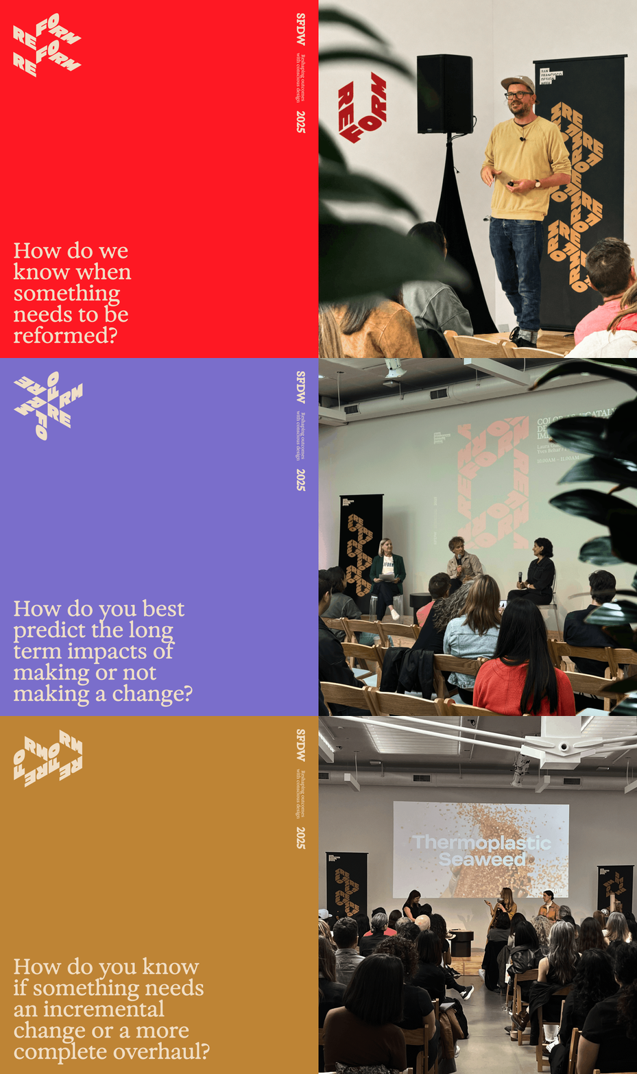
Reform is an invitation to examine ideas of change. Designers shape tomorrow's reality with the decisions we make today, and that power carries both extraordinary opportunity and extraordinary responsibility. How do we know when something needs to be reformed? Does it need an incremental update or a complete overhaul? Do we understand the problem well enough to create a meaningful solution? Reform needs to be informed, which means asking lots of questions and thinking long term.
Design
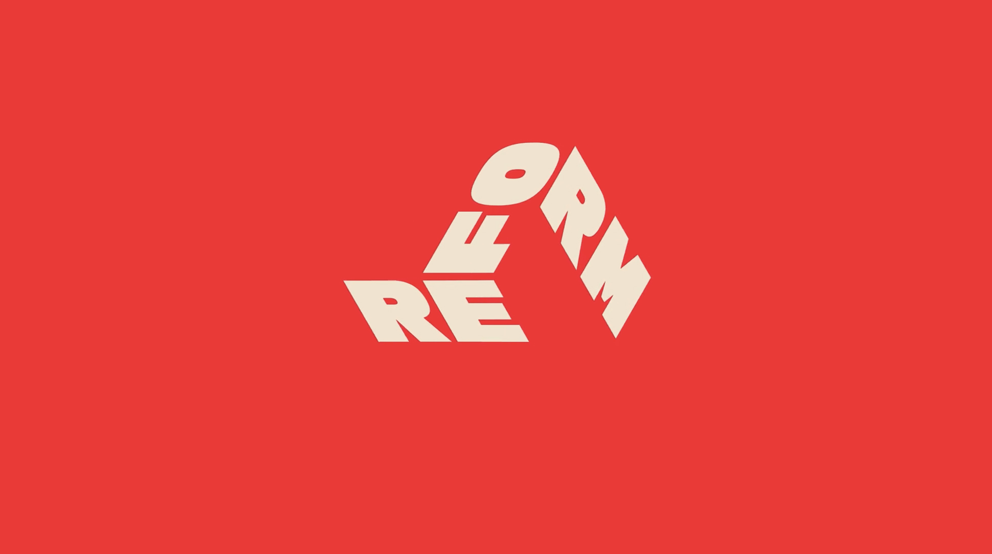
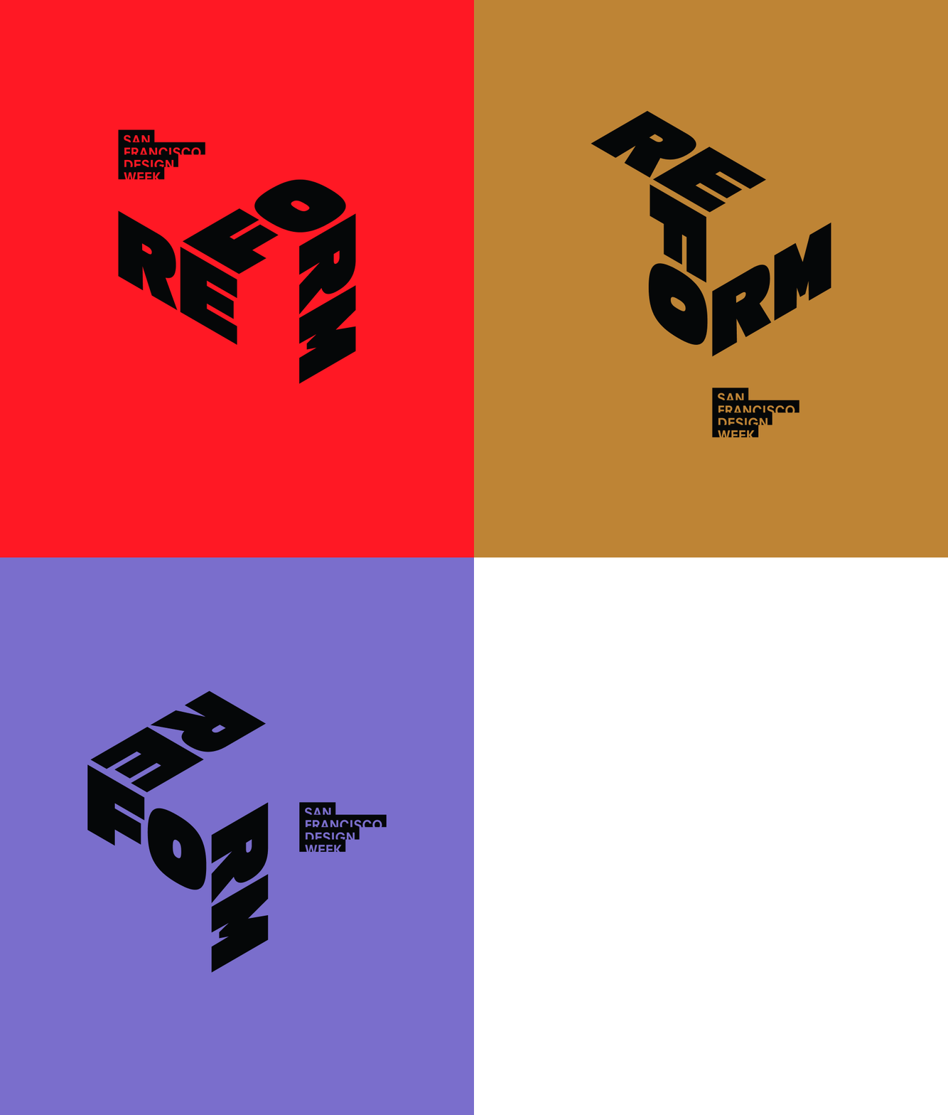
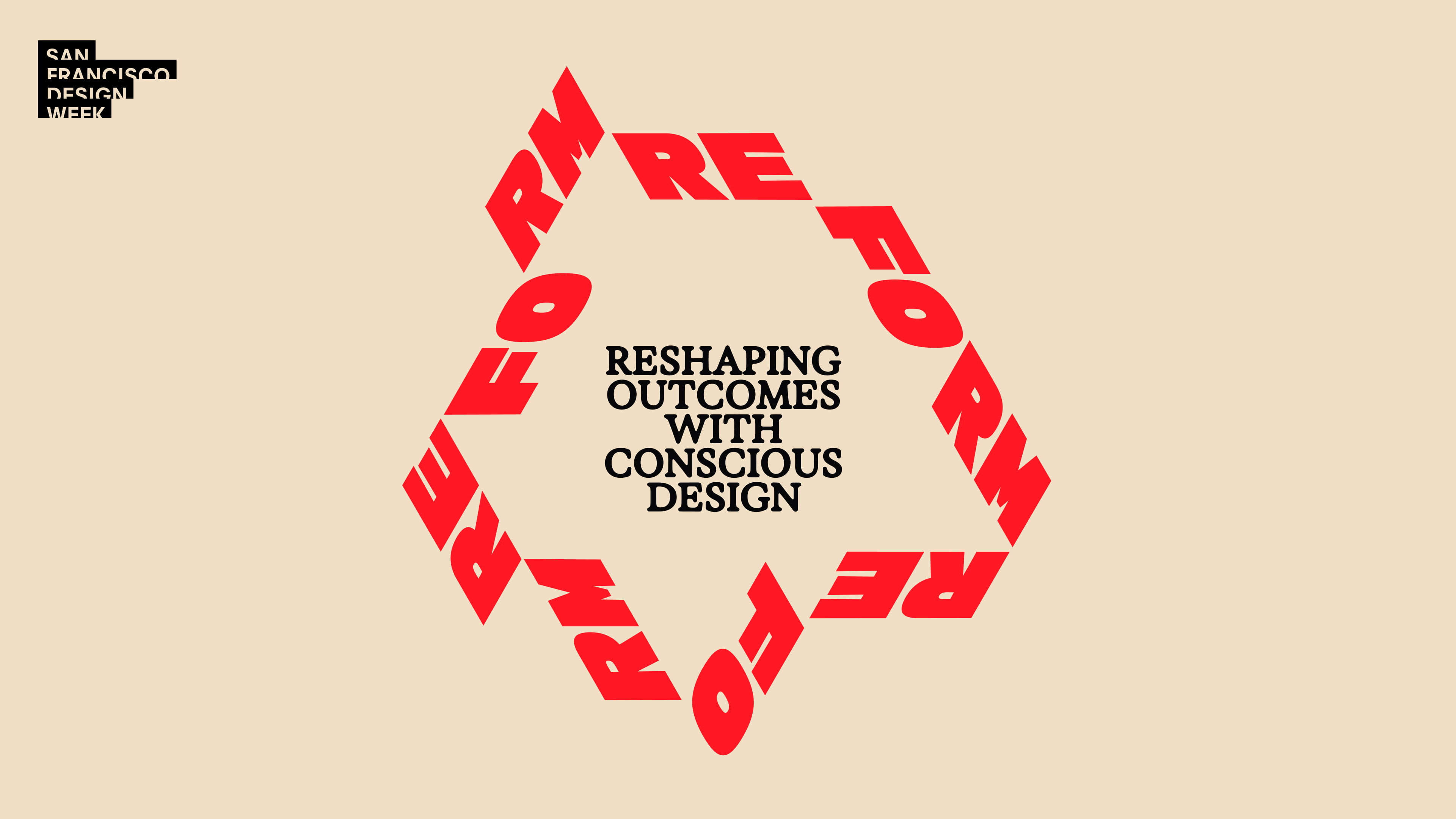
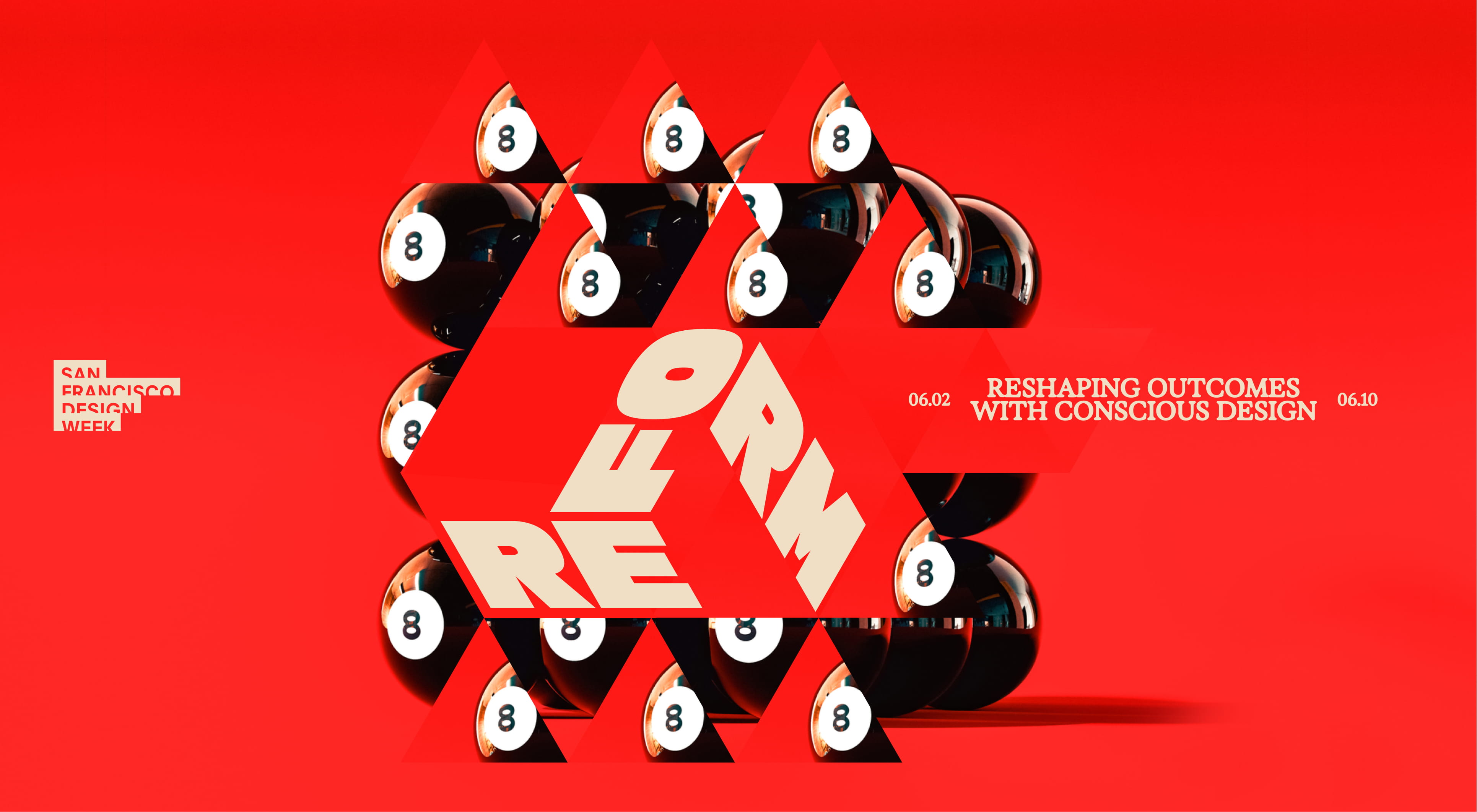
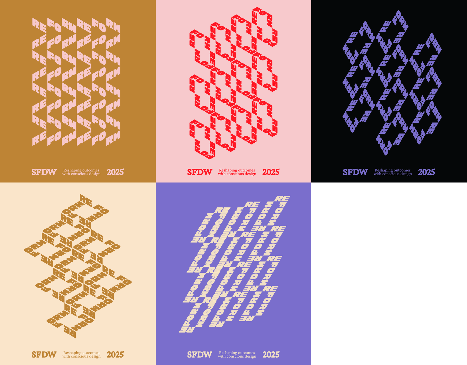
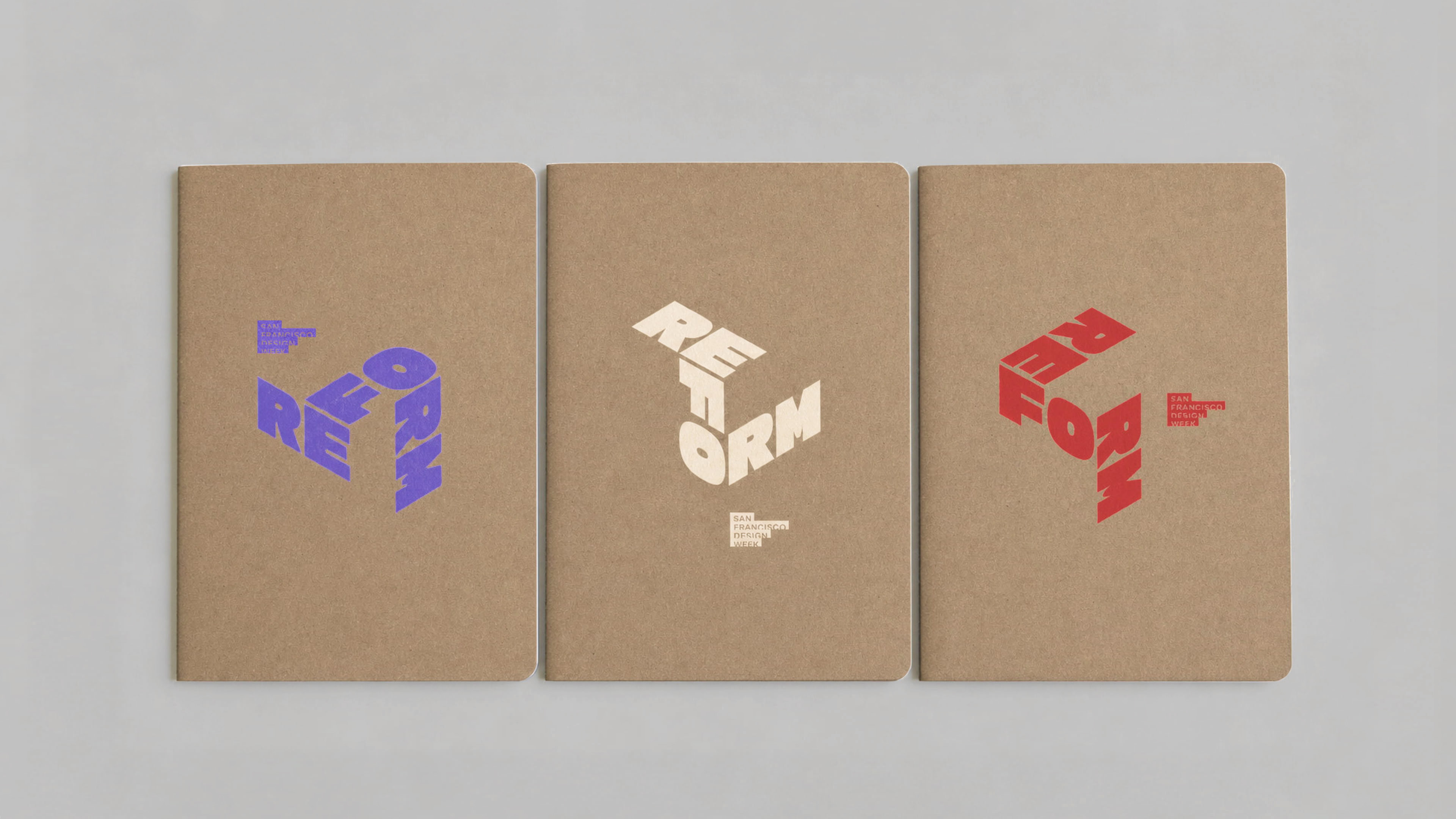
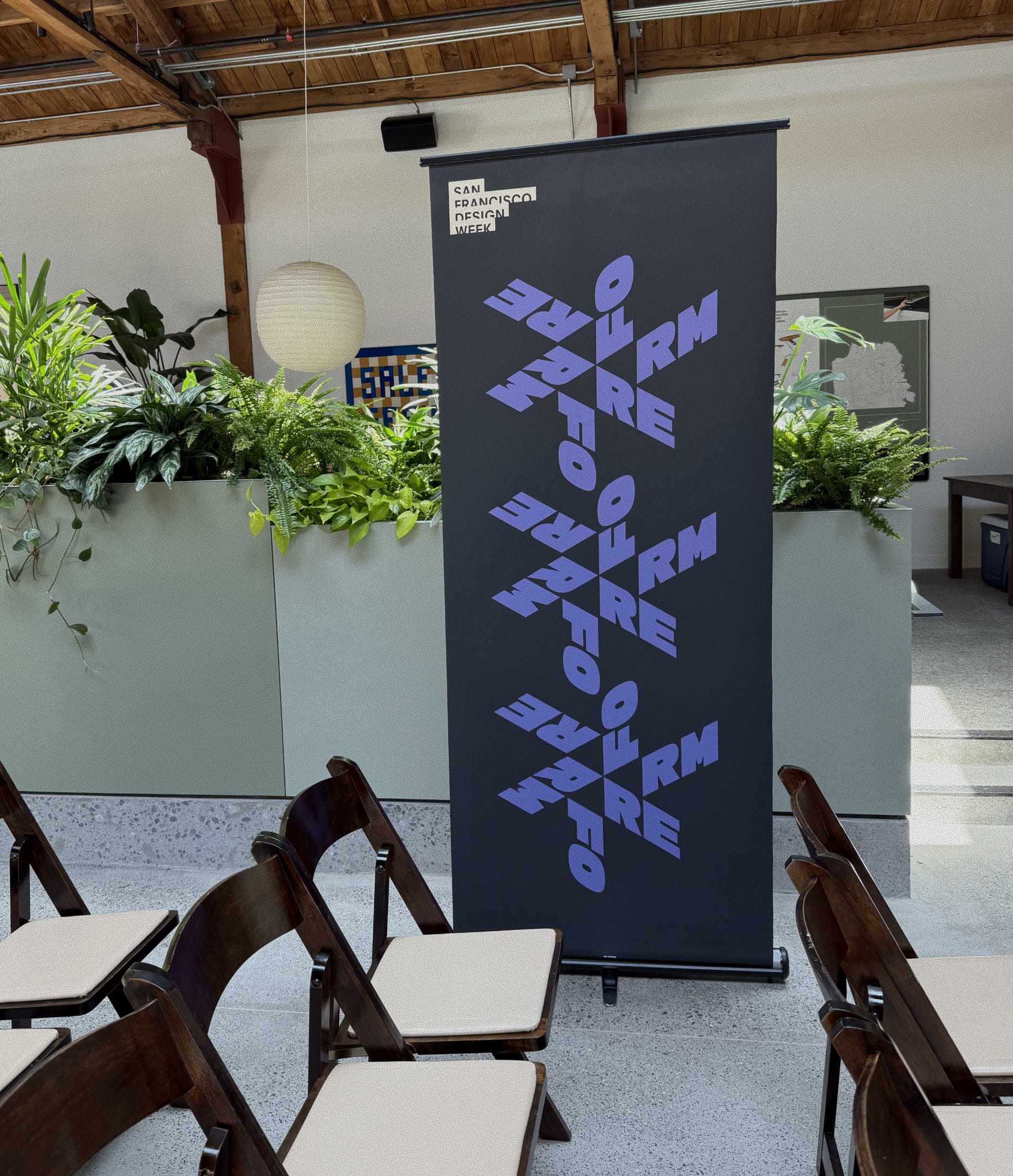
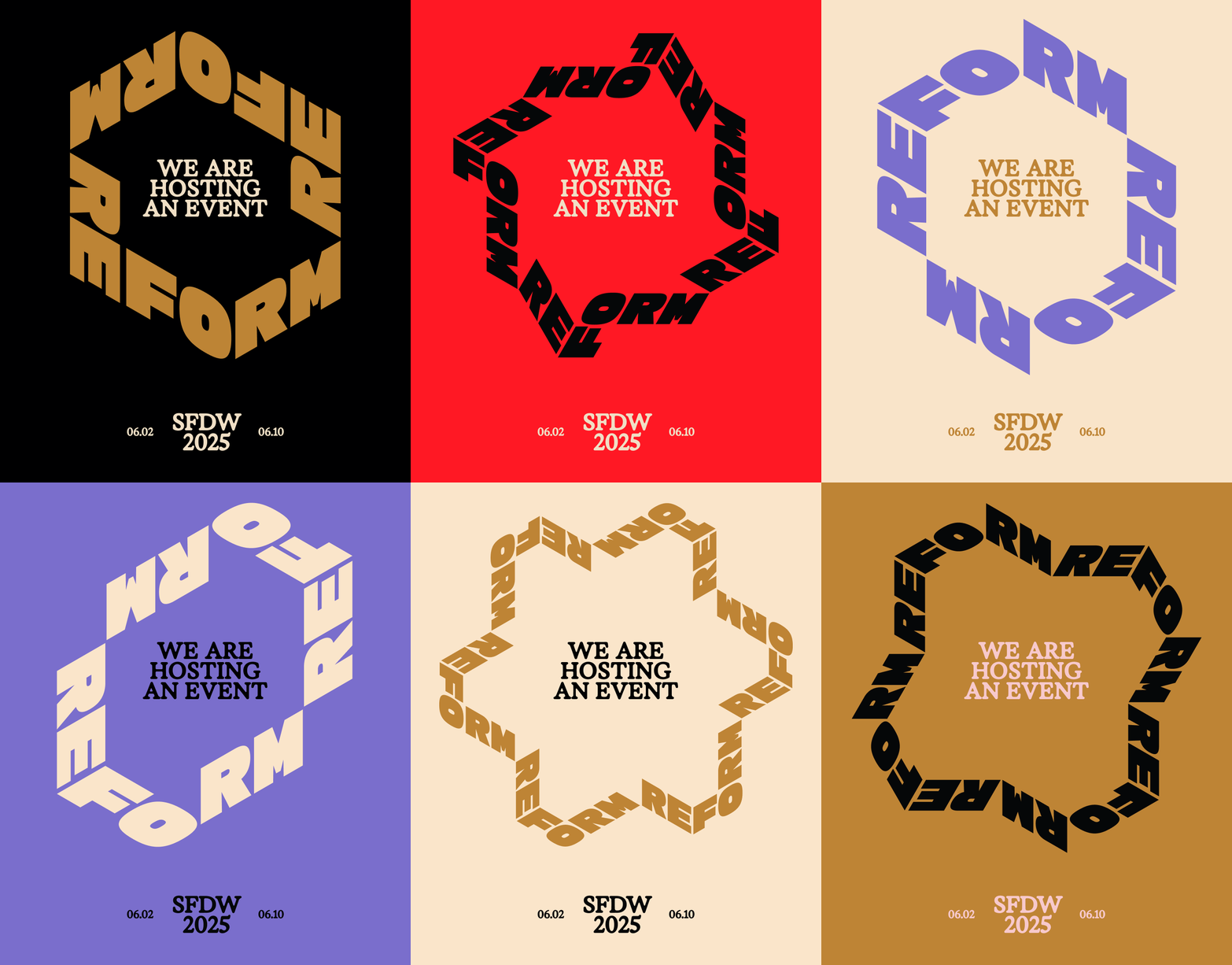
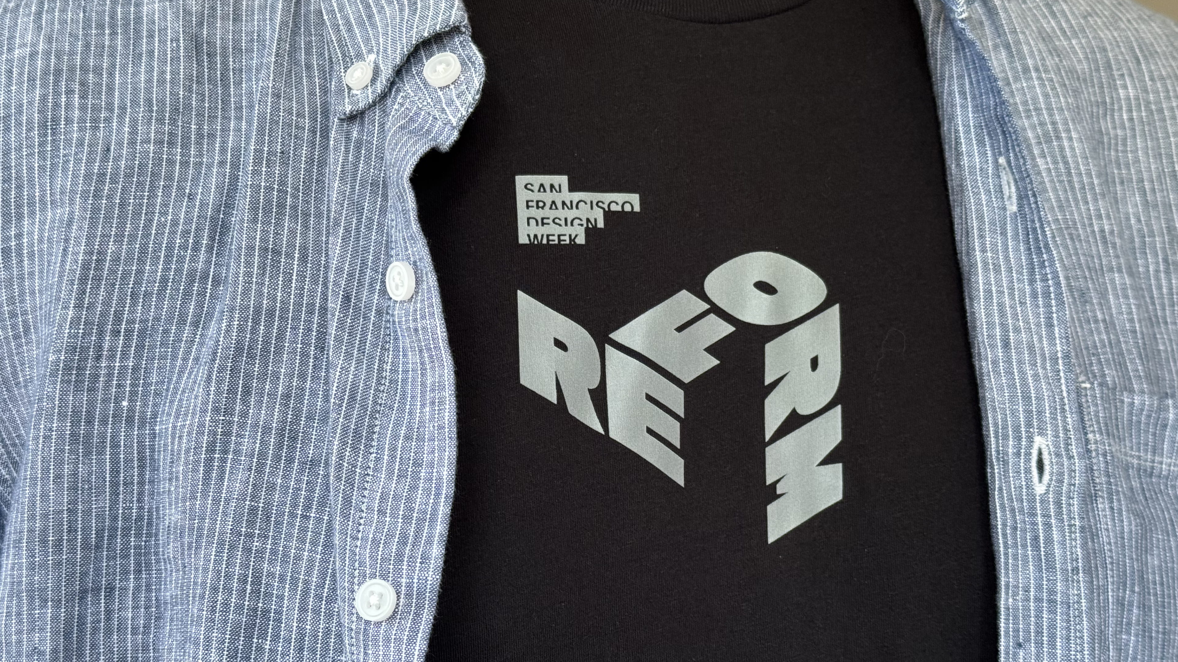
The Reform identity is all about shaping and reshaping. The word splits into three pairs, RE, FO and RM, each set in two isometric views. It folds and unfolds, blends and builds into an ever-changing system, the logo itself able to turn in three dimensions. Kaleidoscopes and folding dielines carry the idea into imagery, reshaping everyday objects the way the theme asks designers to reshape systems. The palette of red, ochre, lavender, pink and cream sits against black, with an editorial serif carrying the theme's questions.
Voice
The verbal identity asks rather than tells. "Reshaping outcomes with conscious design" is the anchor line, and a set of open questions runs through the campaign alongside it: How do we know when something needs to be reformed? Is there a better way to meet the need? If every choice echoes into infinity, what are we setting in motion? The tone is provocative without preaching. It gives hosts and speakers a starting point for conversation instead of a slogan to repeat.
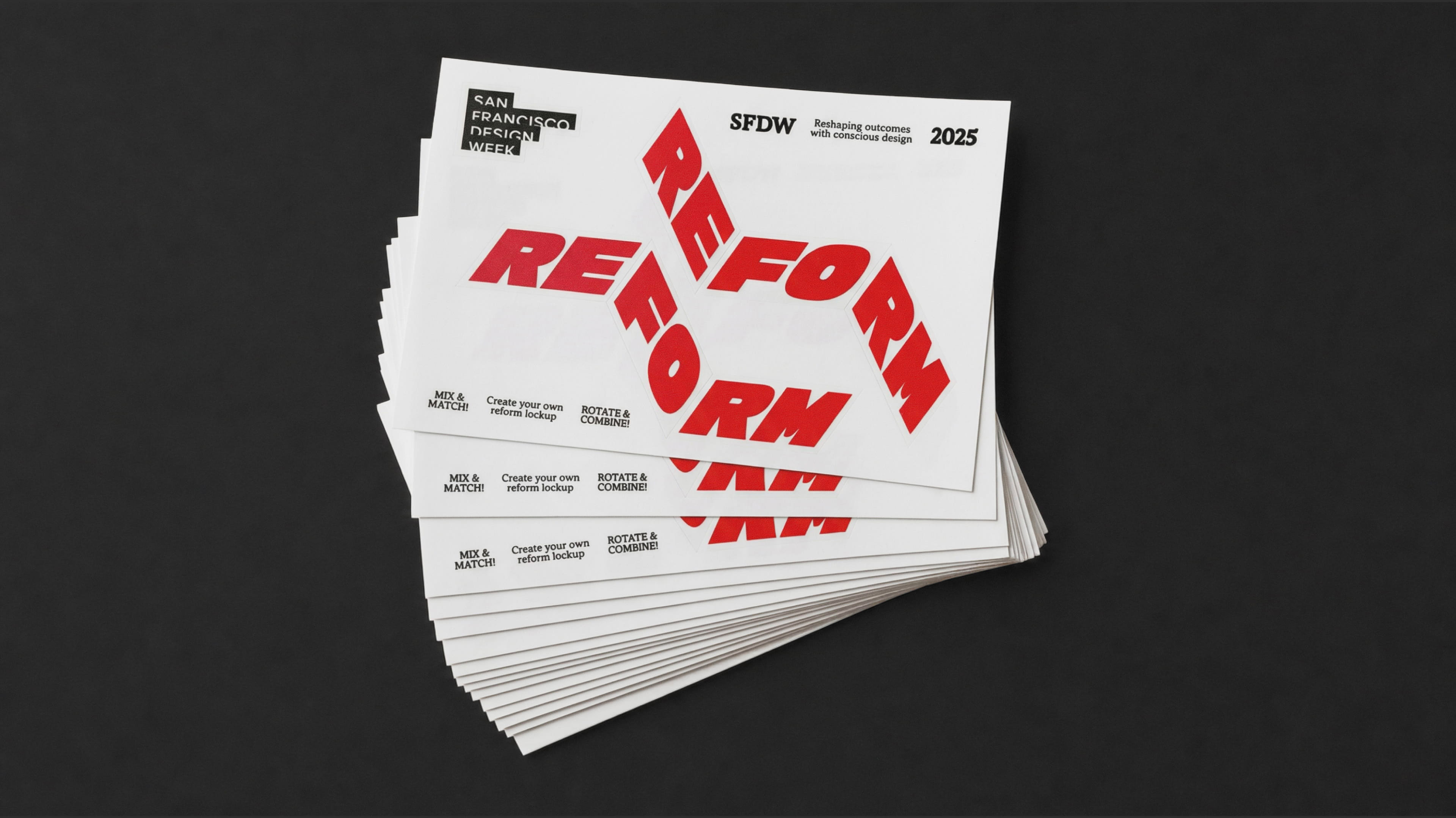
At the core of our system are 6 pieces of type skewed isometrically, which can be combined and reformed to create an endless amount of shapes and patterns.
The isometric treatment allowed us to create diversity and suprirse. In every aspect of the identiy, things were constantly being reshaped and reformed.
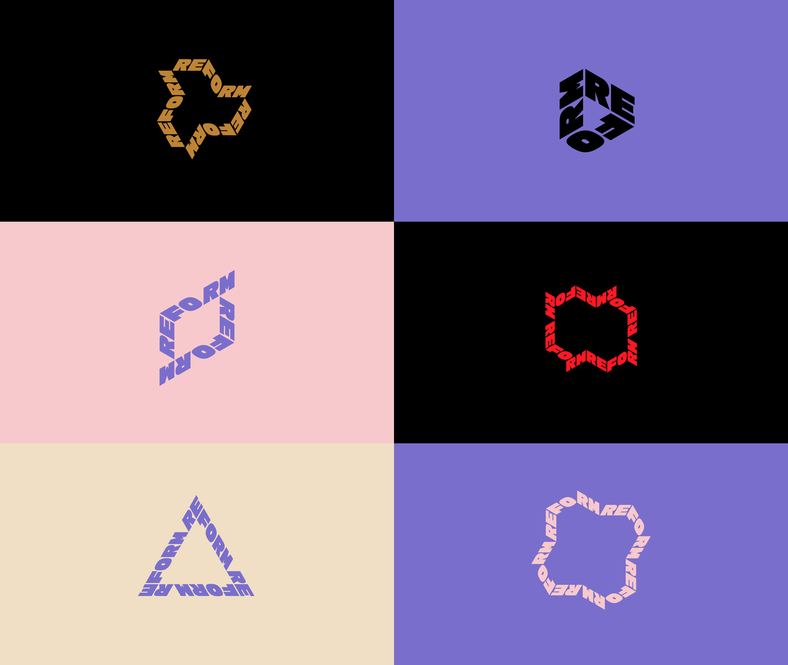
We created an animation system that blended a 3D cube and 2D kaleidoscopic elements that allude to folded and unfolded dielines and create a feeling of constant change and reforming.
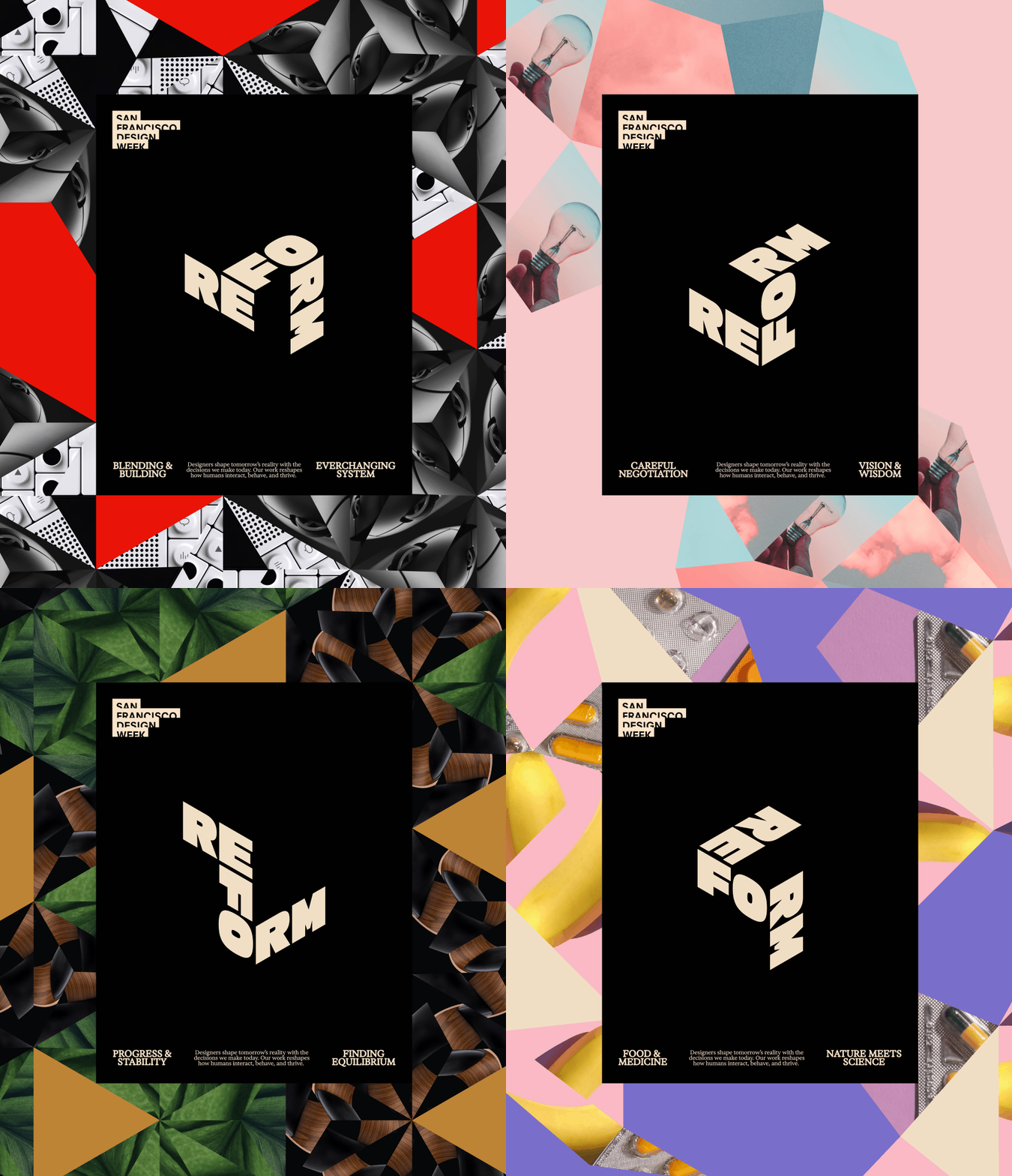
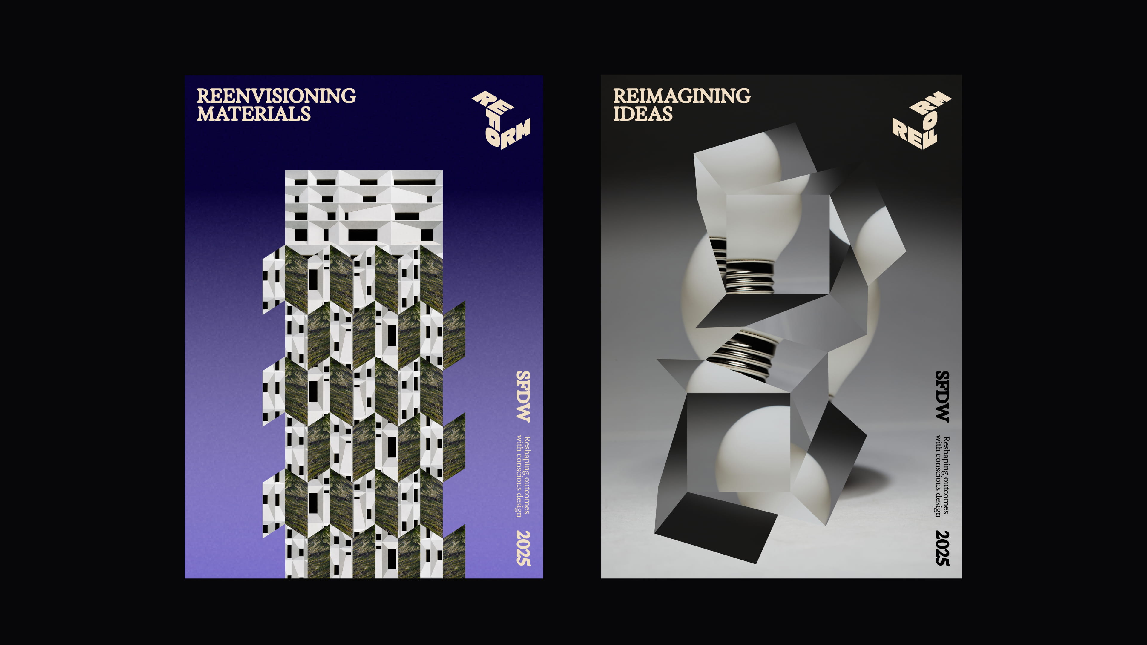
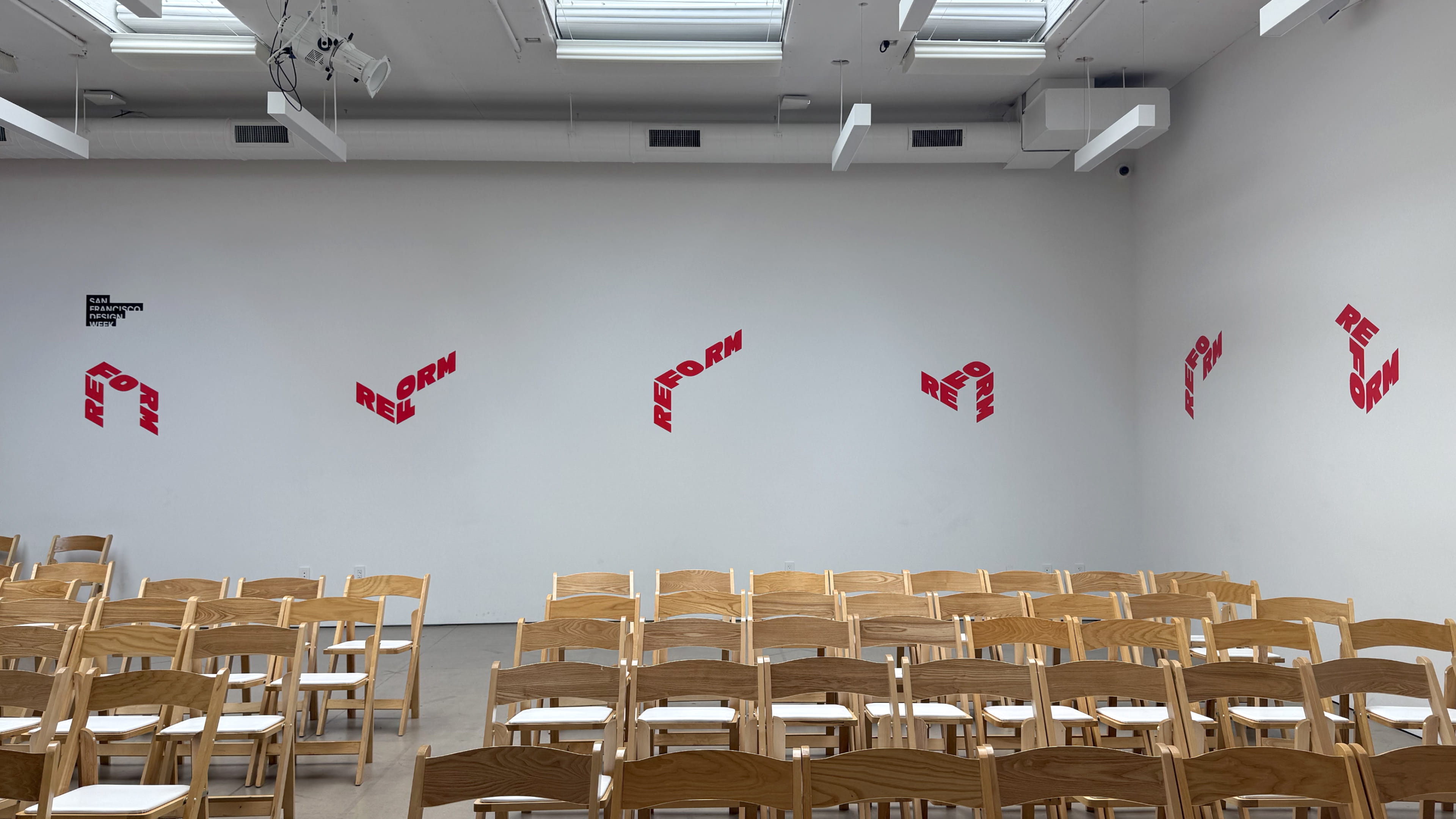
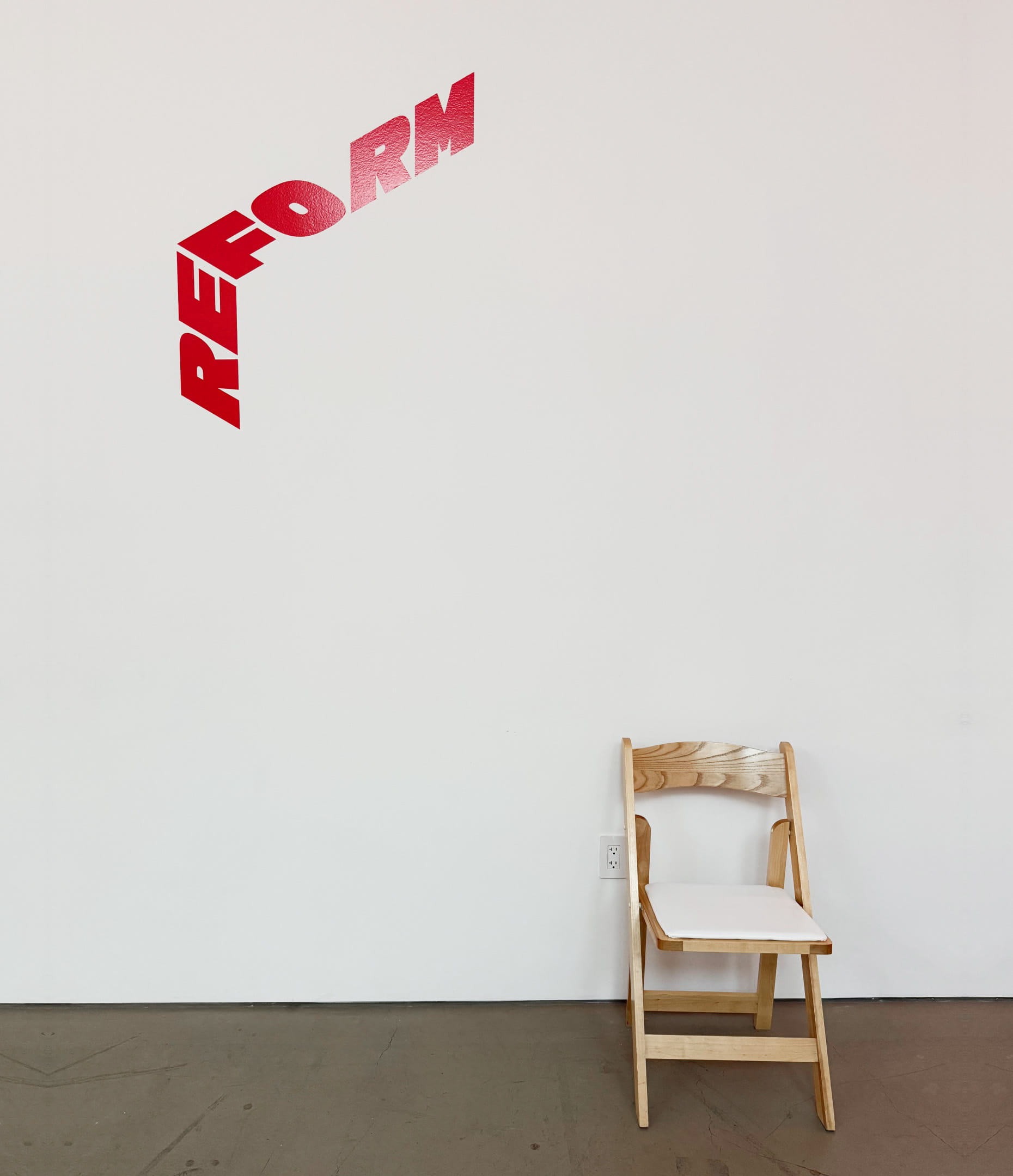
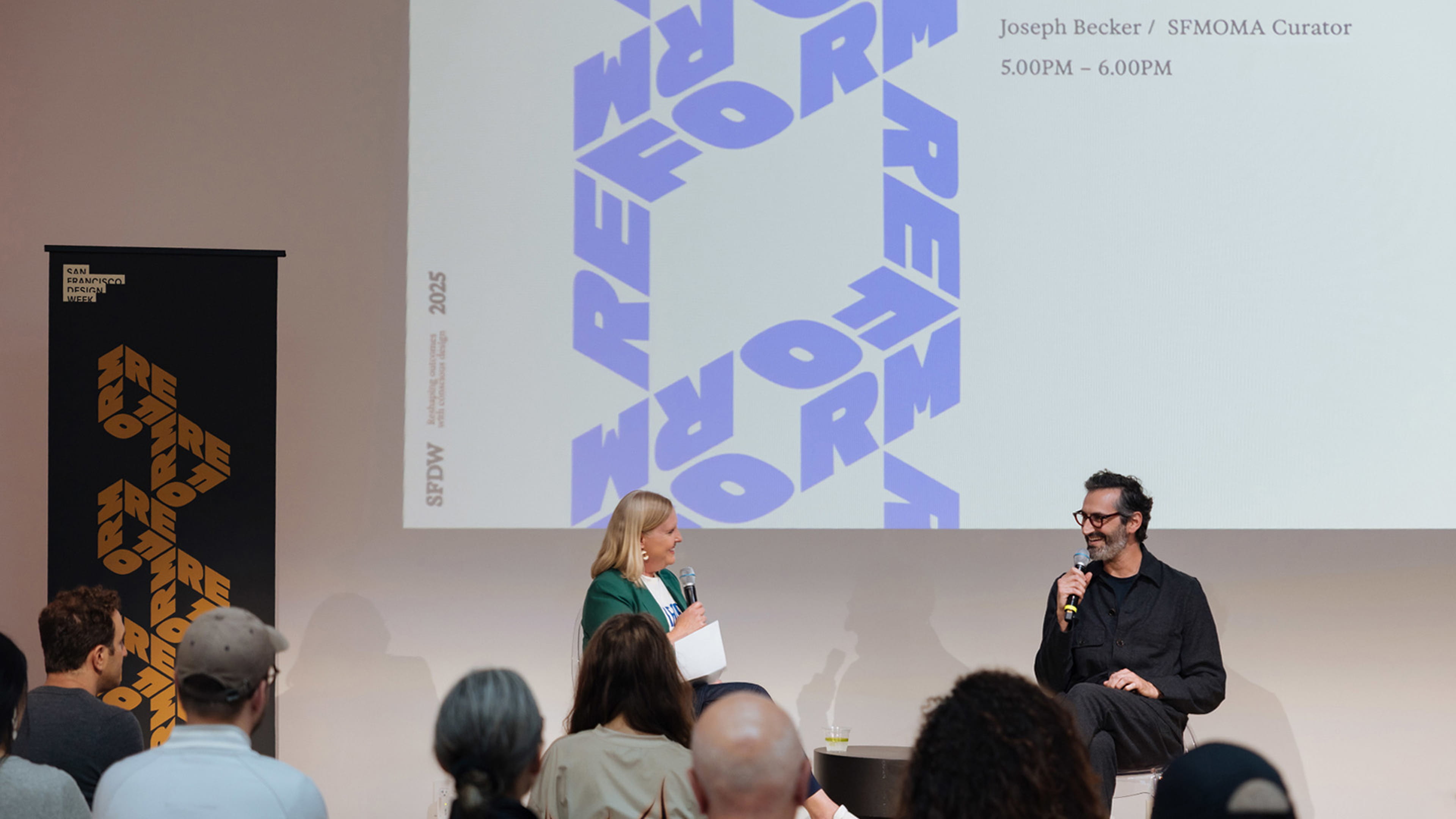
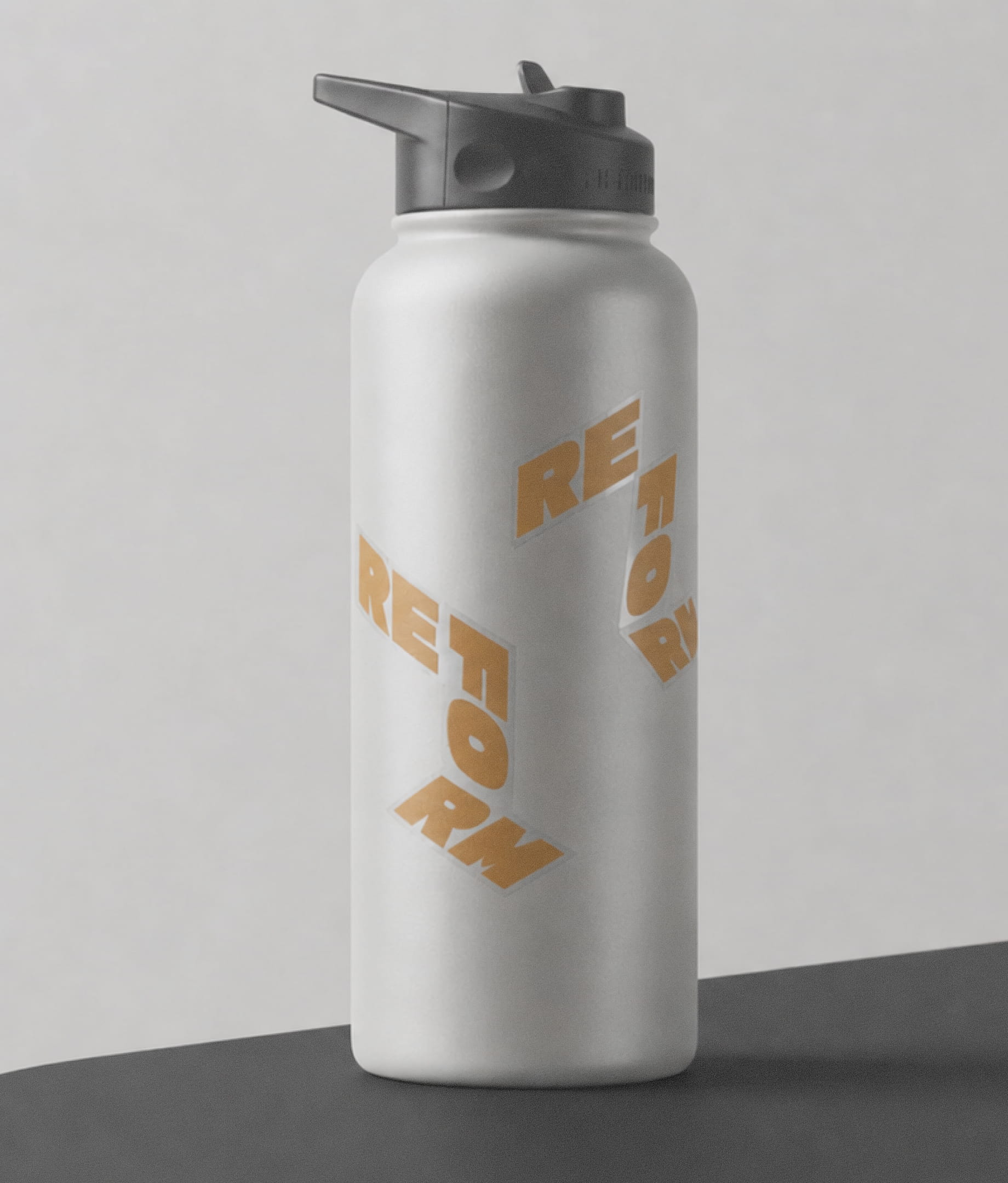
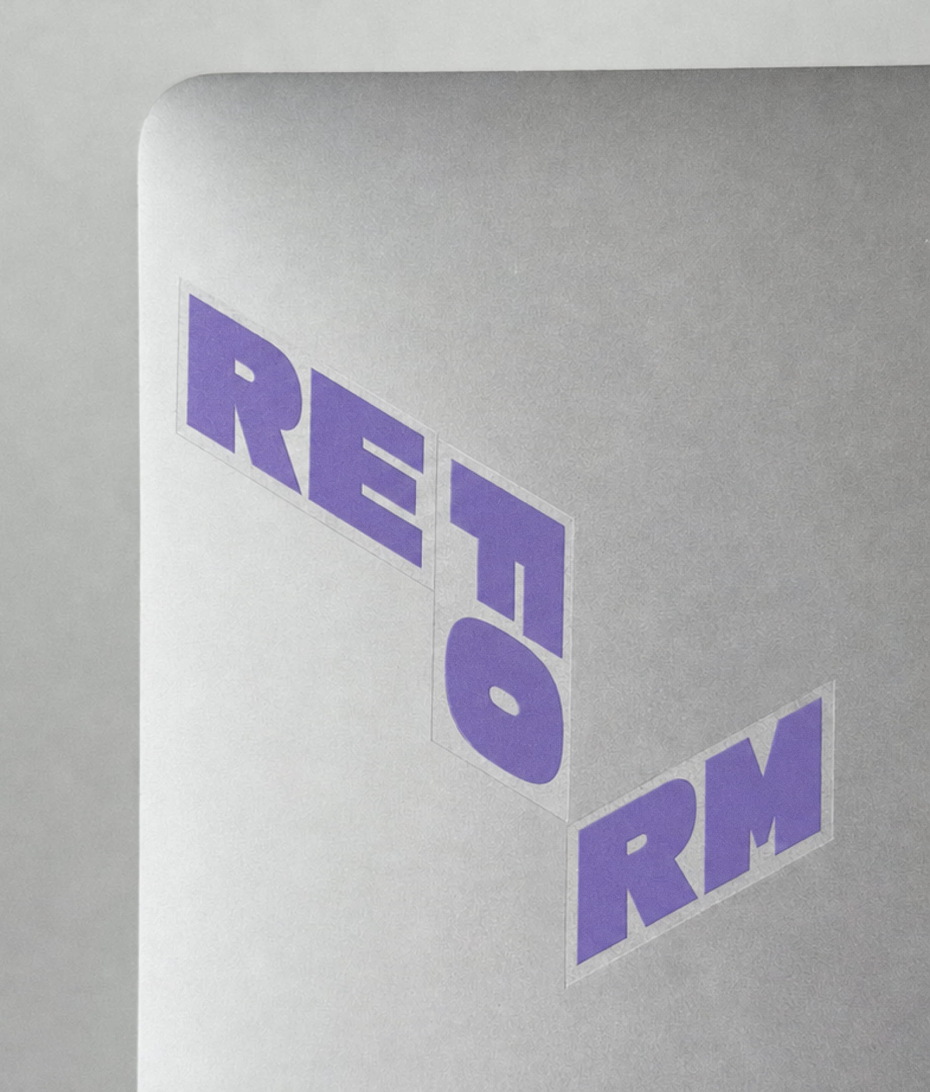
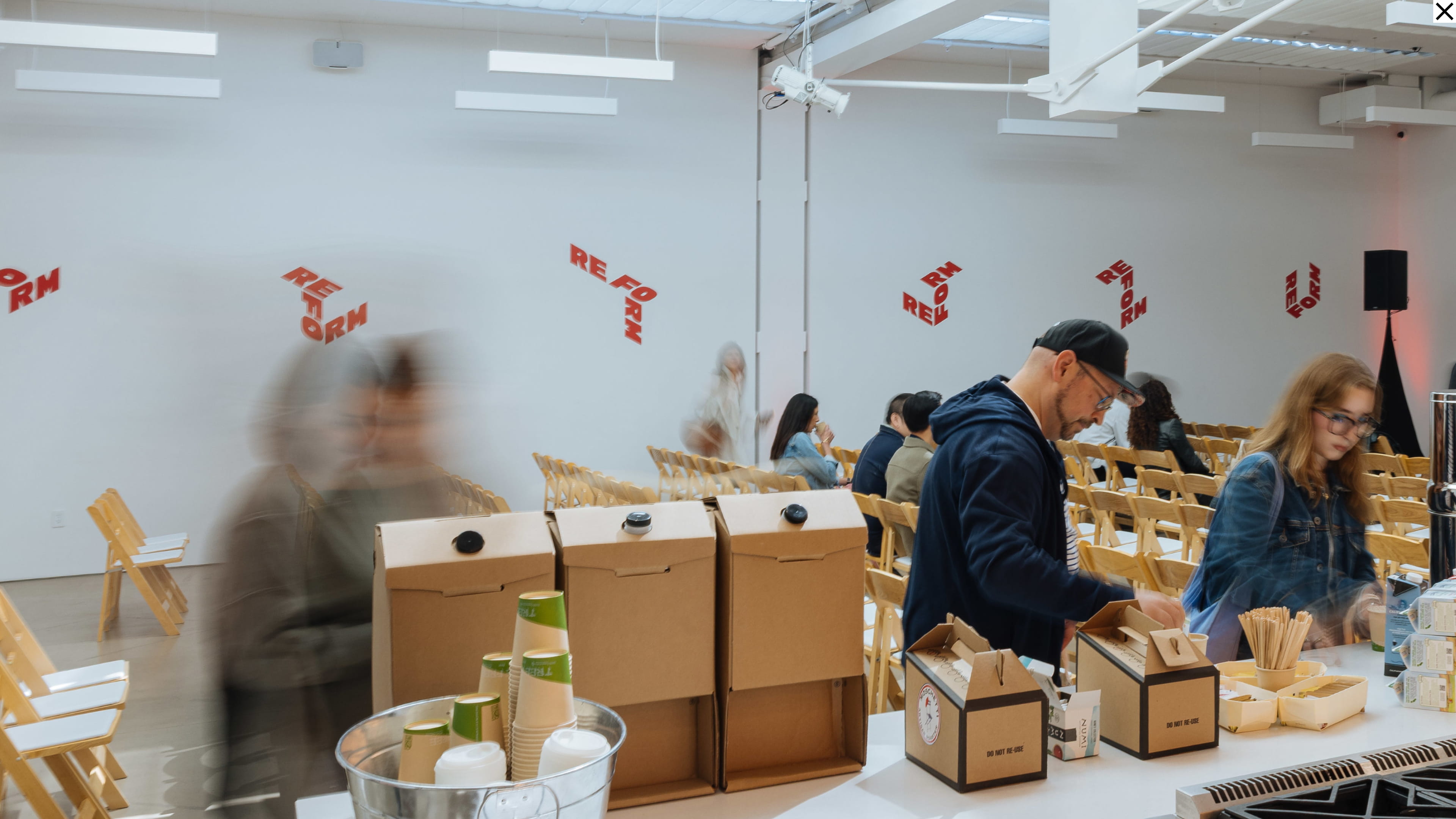
The system went off the screen and into the room: wall decals, banners, stage screens, notebooks, totes, bottles and tees. A mix-and-match sticker sheet invited attendees to rotate and combine the pieces into their own Reform lockup.




.jpg)