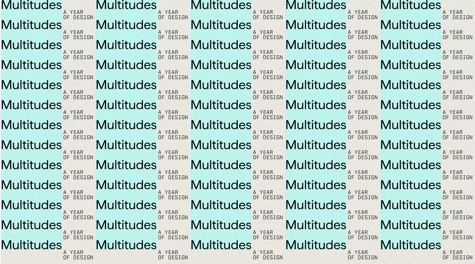
SF Design Week: Multitudes
Celebrating the power of plurality.
Brief
For the 20th anniversary of San Francisco Design Week, and our 4th consecutive year as its creative partner, we were asked to create a theme and identity that would extend beyond the 10-day festival into a year-long celebration of the many talents and contributions across the wider the Bay Area, from the South Bay to Healdsburg.
Audience
The Bay Area design community in all its range: every discipline, identity, and perspective, from San Francisco to Oakland, Berkeley, Marin, Sausalito, Silicon Valley, Palo Alto and the North Bay wine country.
Opportunity
Design Week has never been the work of one voice or one idea. It's a collective force, built from countless contributors. The Bay Area design scene is often reduced to tech and Silicon Valley, but it's far broader: human, community-driven and spread across every discipline and town in the region. Twenty years in, as the festival spread beyond a single week, there was an opportunity to honor that shared history and show the full range of who makes design here.
Concept
Multitudes. A celebration of the many disciplines, identities and perspectives that shape design in the Bay Area, and of the groundswell of ideas that form when many communities gather, collaborate, explore and create. It's a theme that celebrates diversity, and where the impact of design is bigger than any individual place, practice or person. And as its footprint grows, the goal is to minimize waste, which is why the physical event components are all modular, reusable, or compostable.
Design
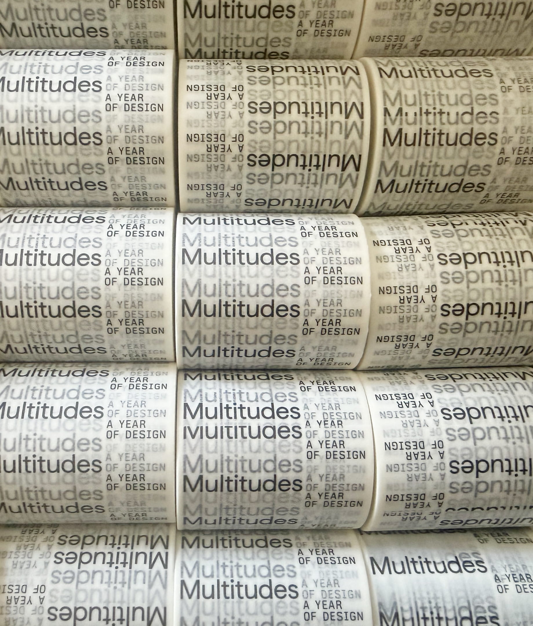
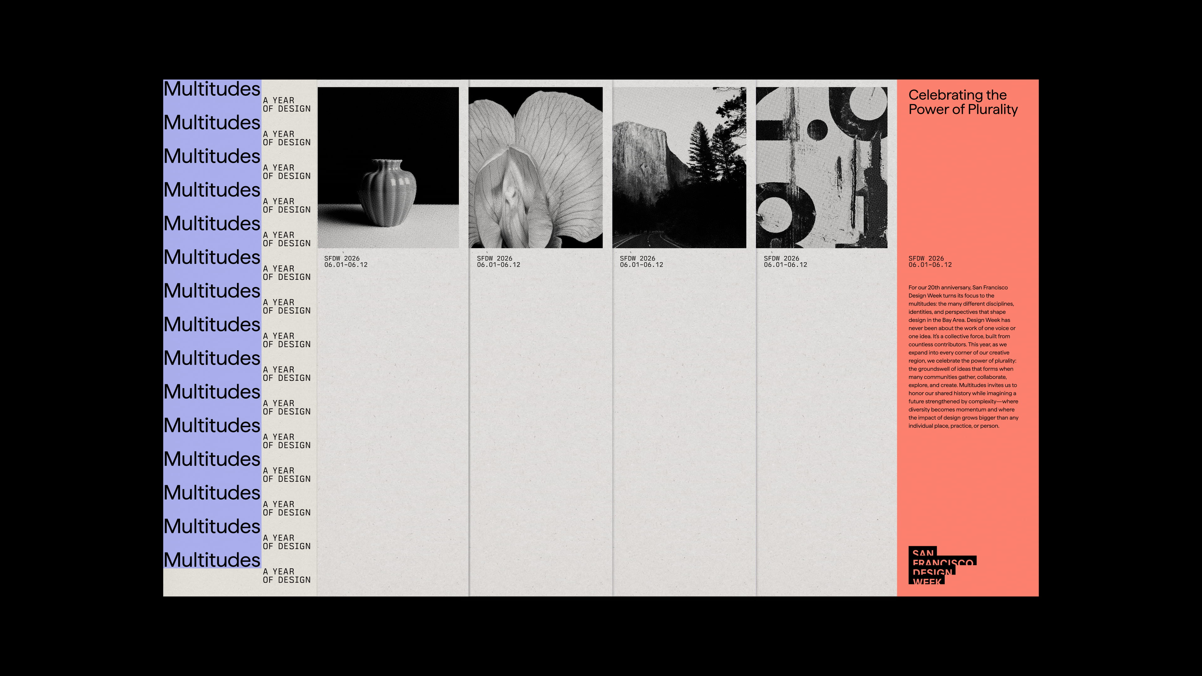
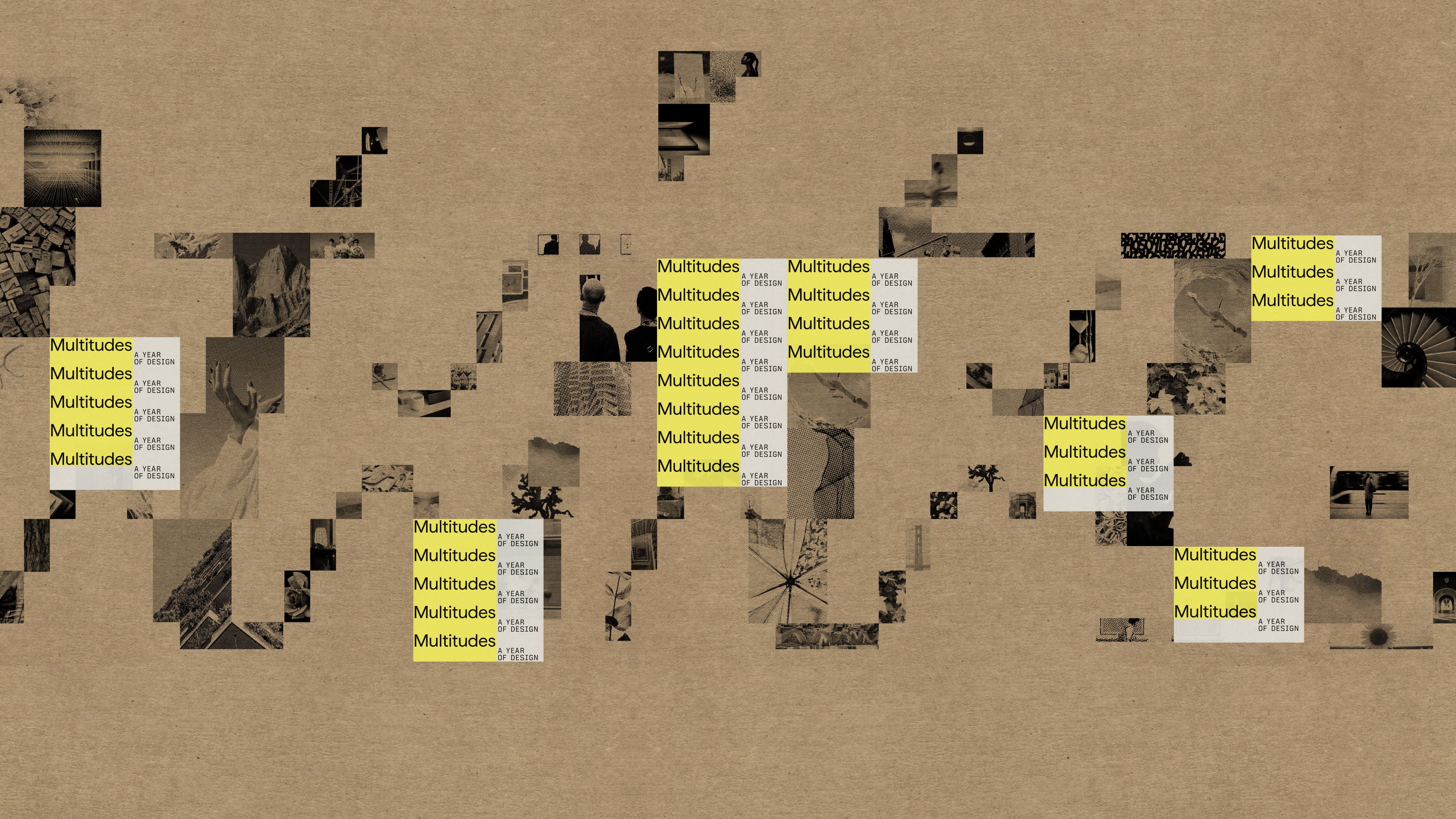
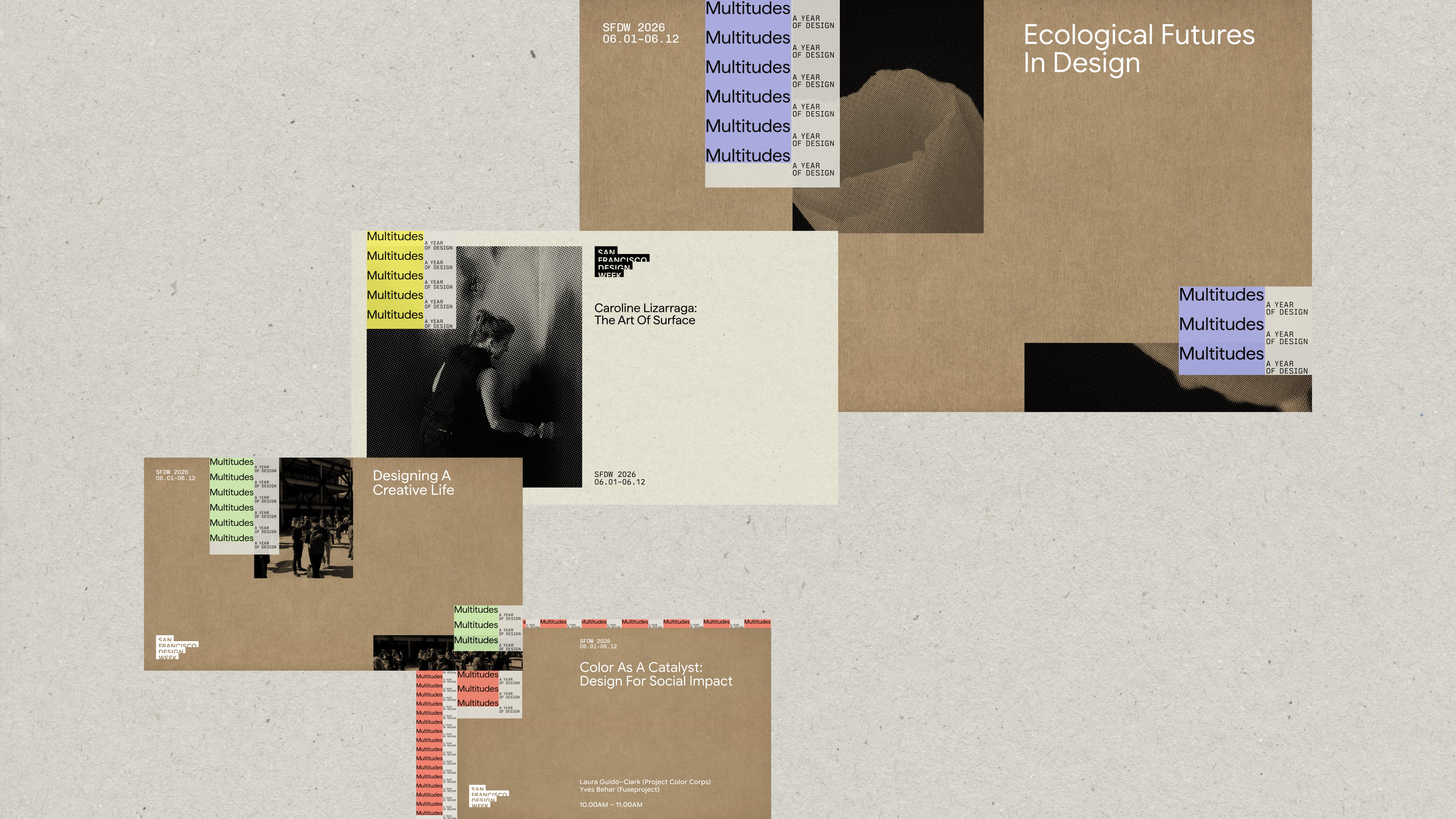
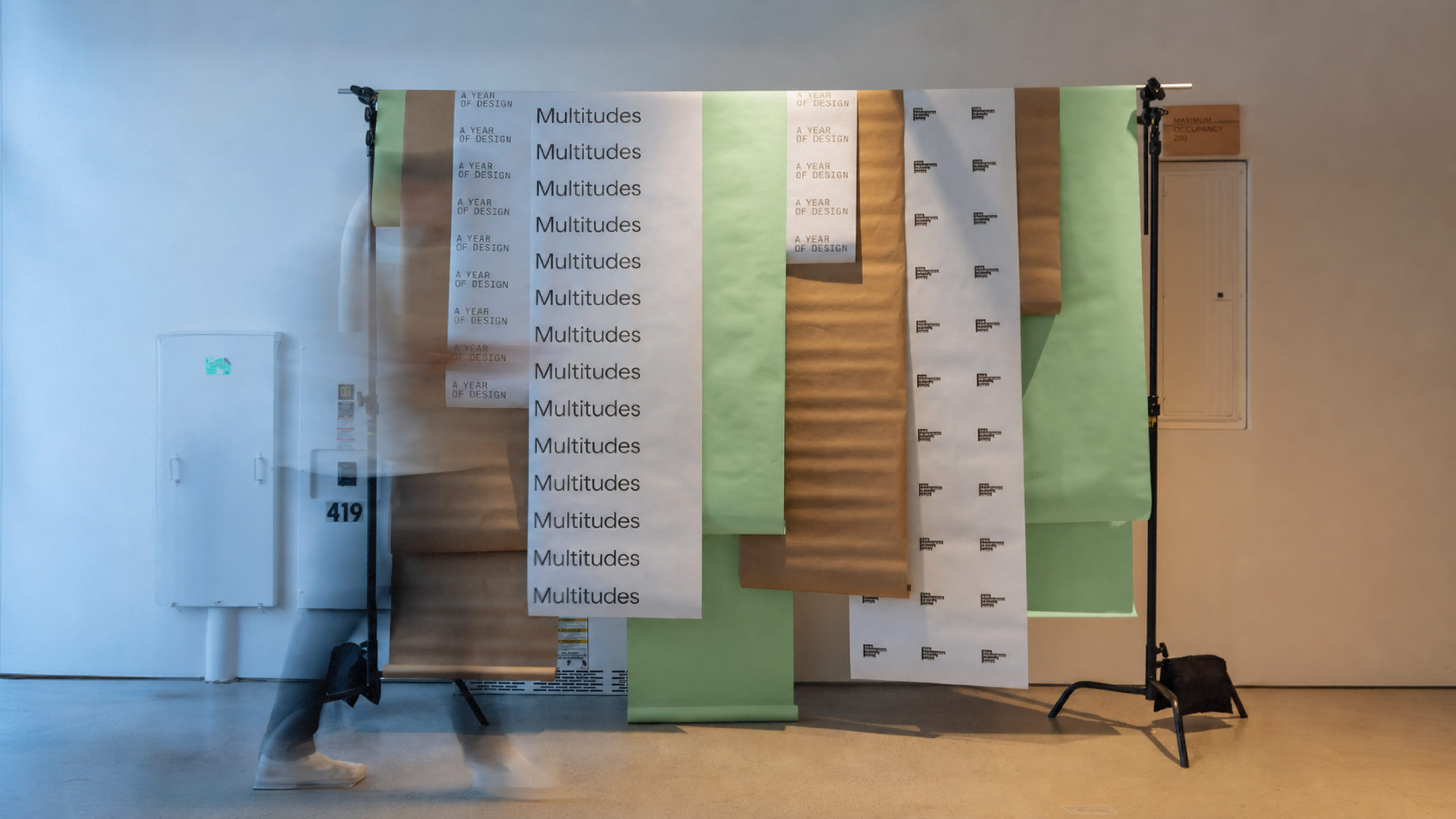
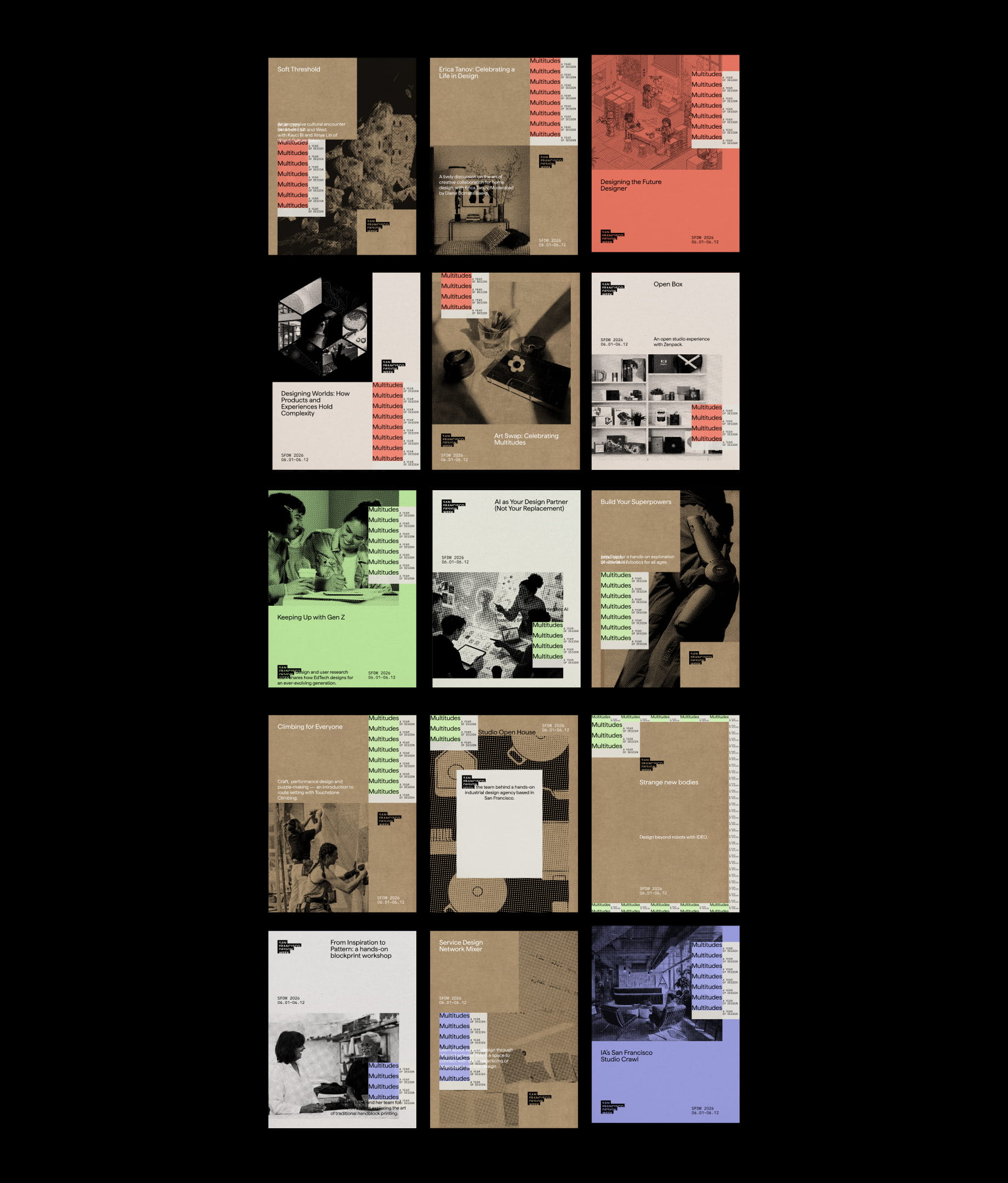
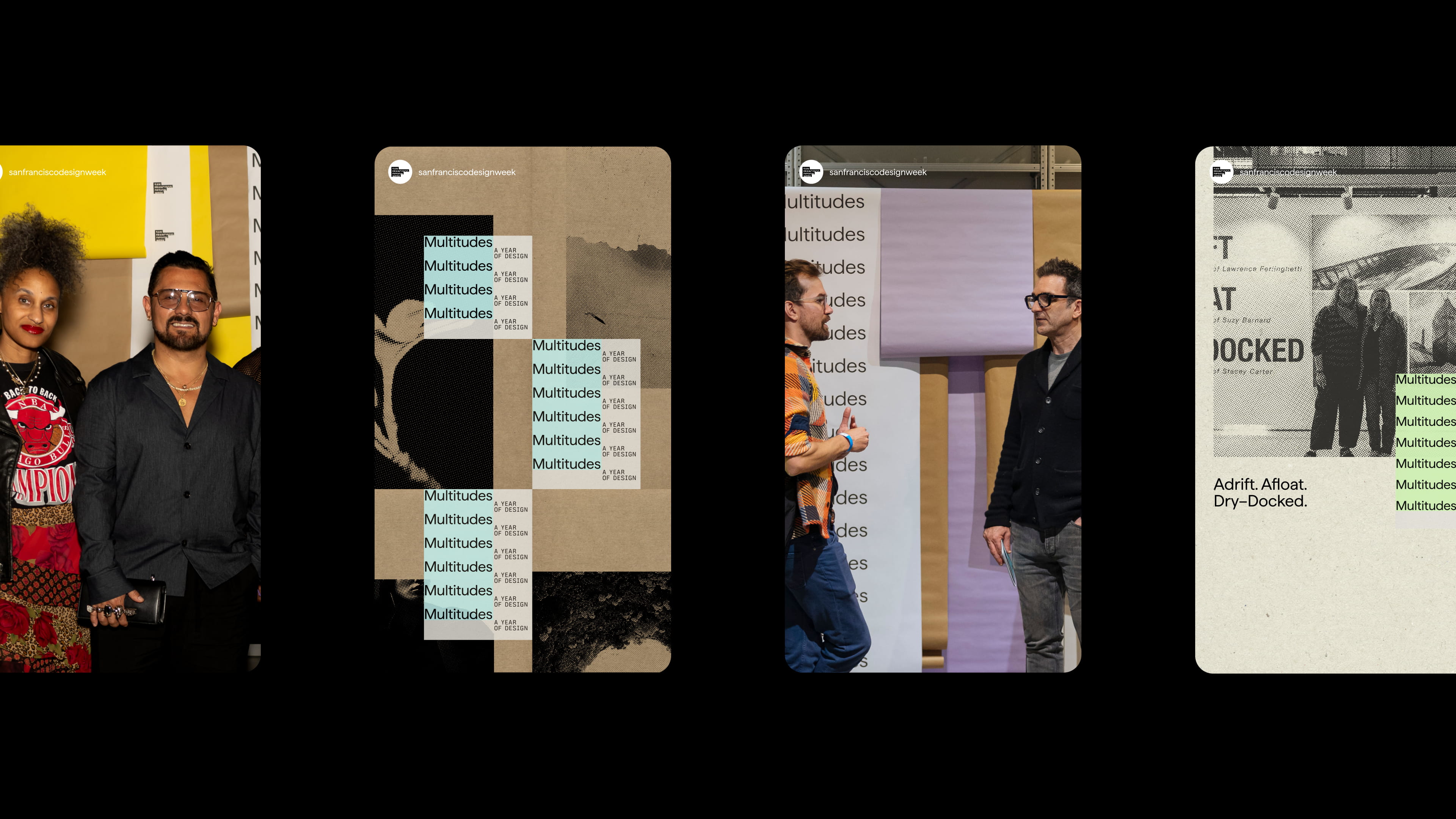
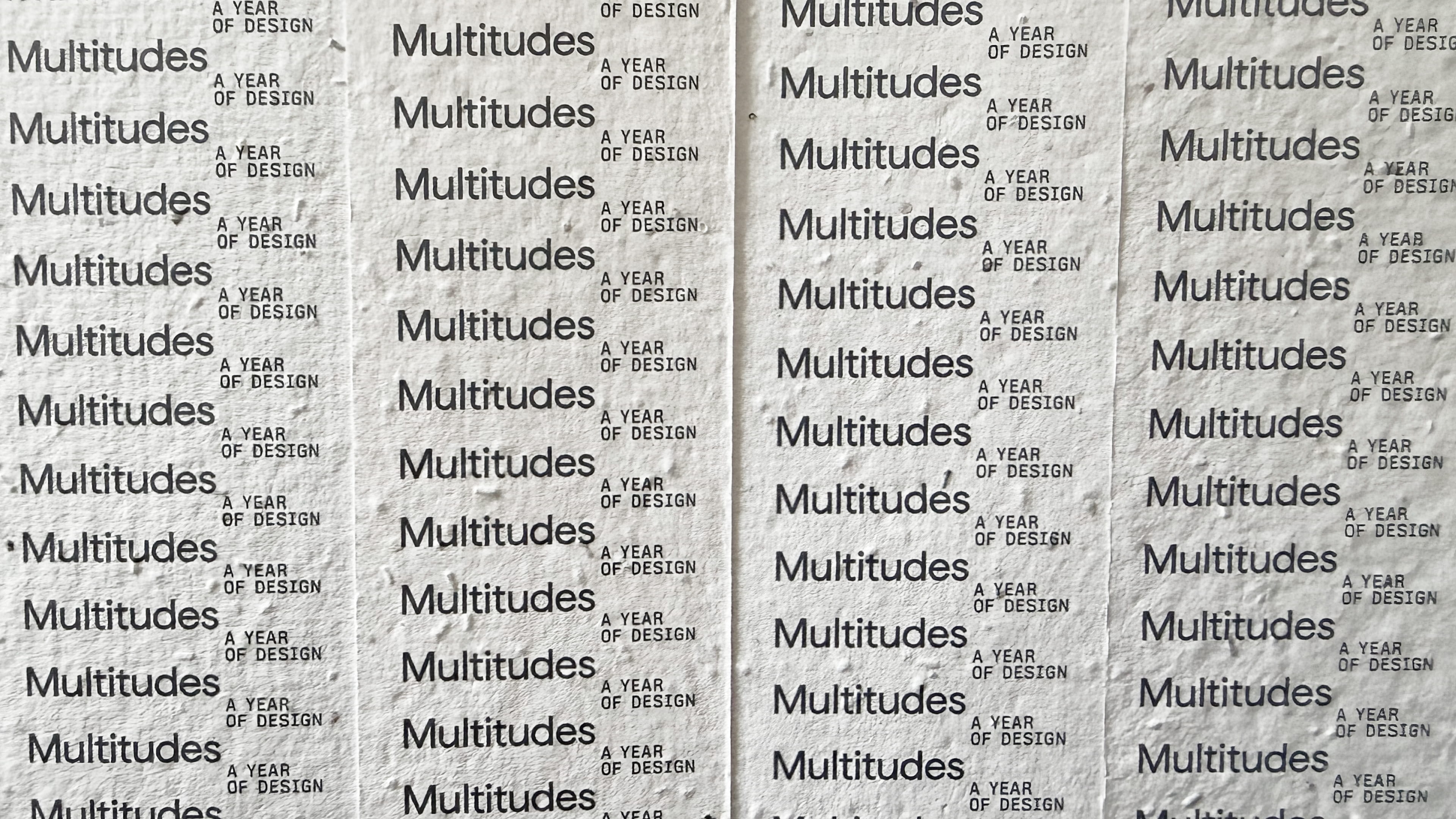
Many small things coming together. The word Multitudes repeats and multiplies, stacking into columns paired with "A Year of Design," with a wide, shifting palette on a palette of kraft papers. The imagery is all built from halftone dots: many varied images that come together to form a larger "Multitudes" in script. Every layout unfolds a little further, layering and multiplying across the region's varied design languages, from Design Oakland to Design Healdsurg. Every piece was made with as little waste as possible: paper not vinyl, modular not single-use, and materials that can be planted or composted.
Voice
The voice is intentionally plural, always "we," never one voice, and always warm, human and inviting. "Celebrating the power of plurality" is the overarching tagline, and “A Year of Design" marks the shift from one week to a full year of celebration across the region. Each local edition can carry its own line under the same theme, like Design Oakland's "Designing Relevance.”, but the messaging always honors twenty years of shared history and keeps the focus on what comes next.
At the core of our system is a single lockup that duplicates and cascades down the page: Multitudes, A Year of Design, Celebrating the Power of Plurality. As it falls, the lines interlock like threads, each one revealing the next, until the repetition becomes a woven type texture.
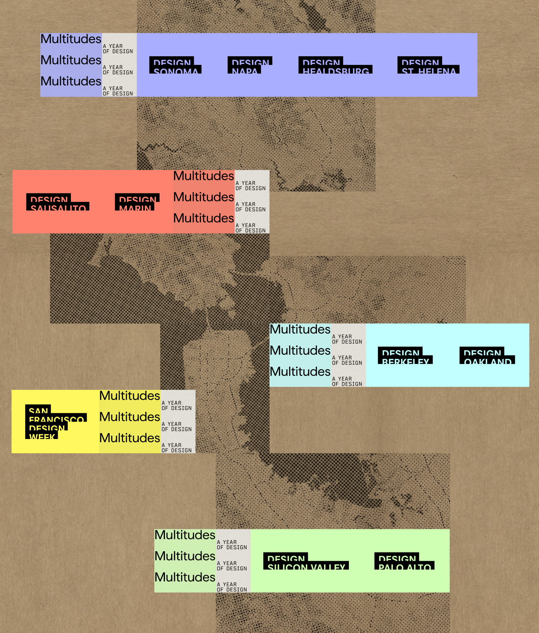
For San Francisco Design Week's anniversary, it's going all out, as in, all over the region. We took our color system and applied rhyme and reason to it for the rest of the year, each color symbolizing a different region, later used by DBA to color-code events outside of SF.
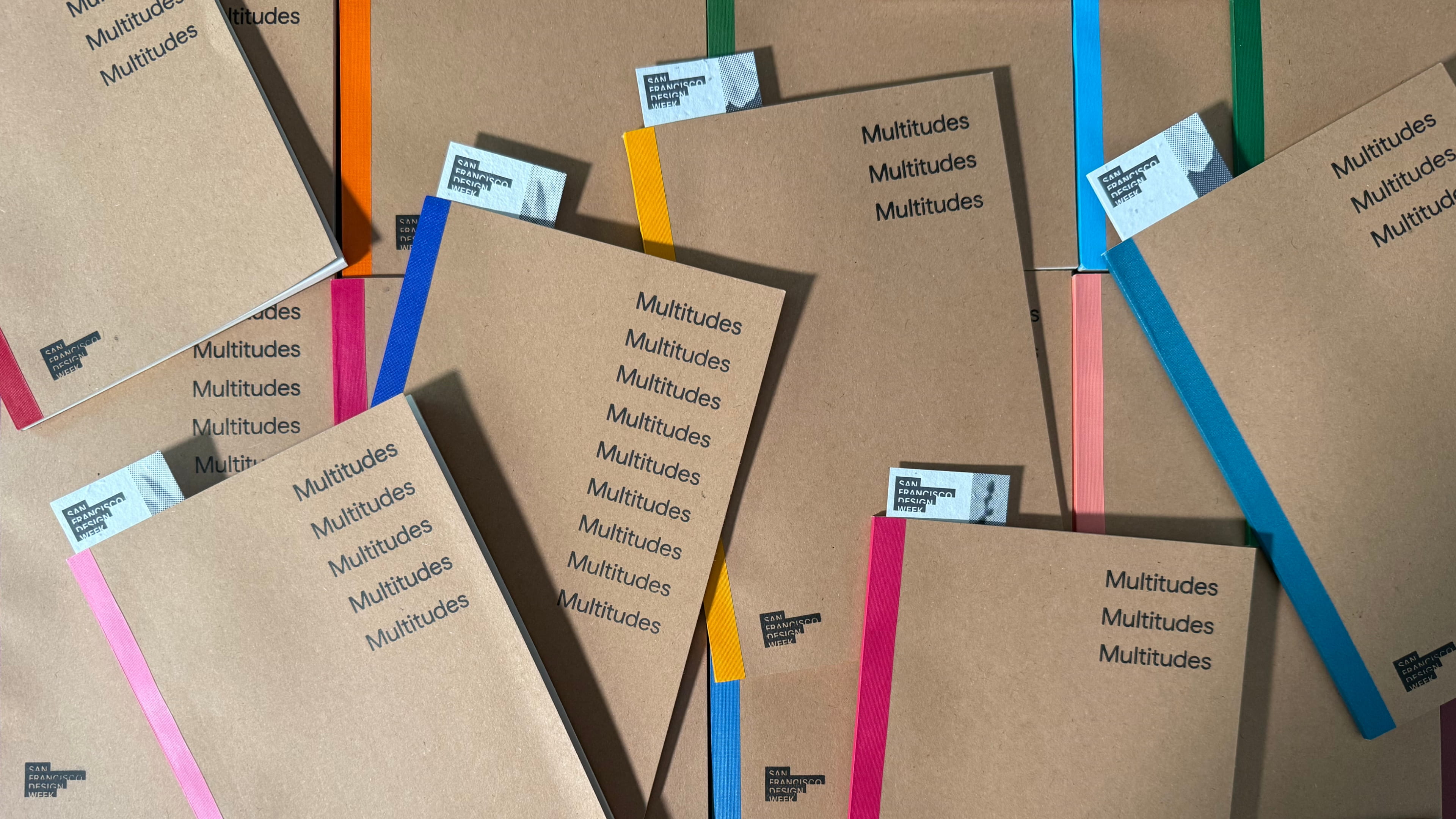
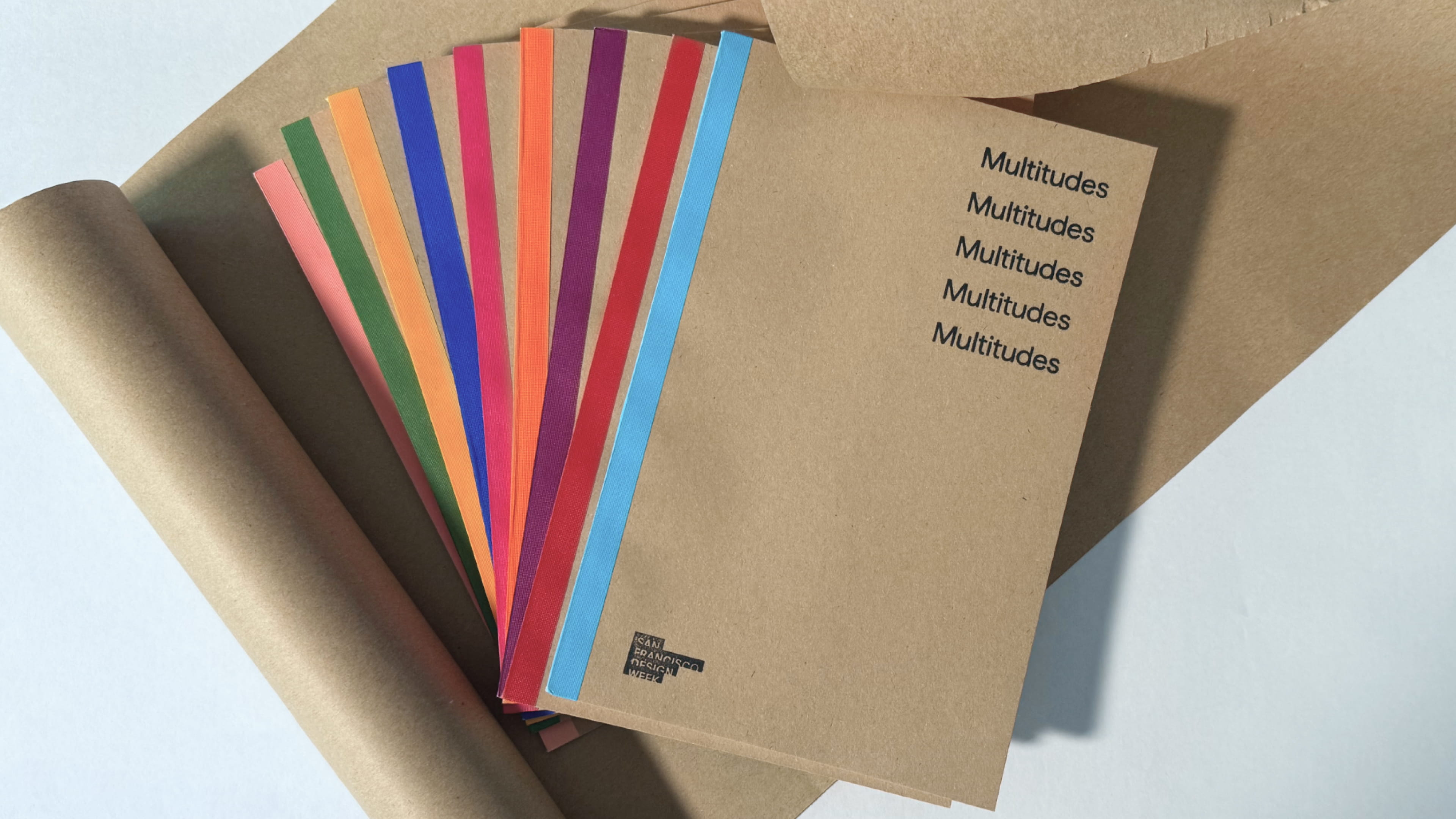
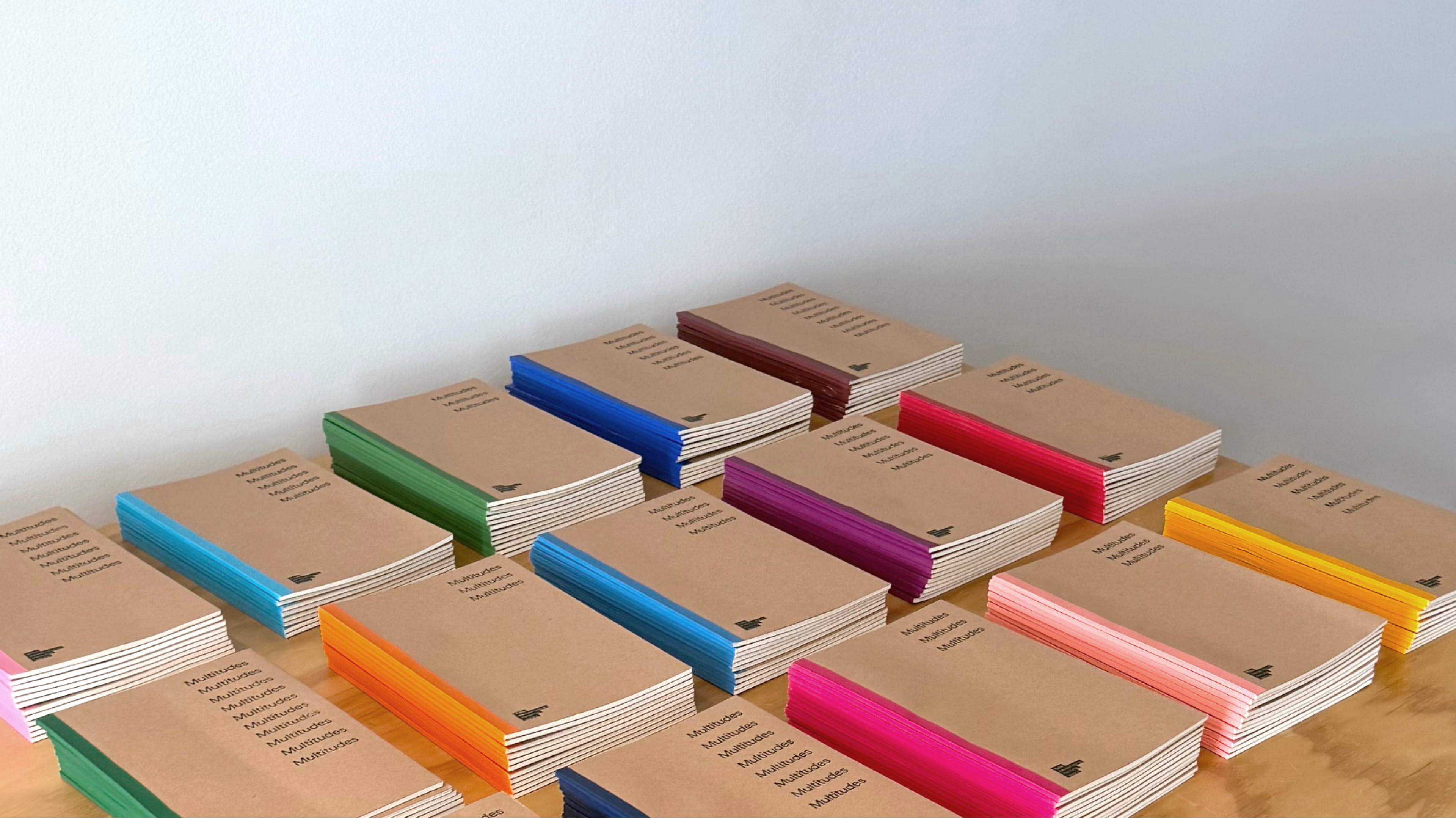
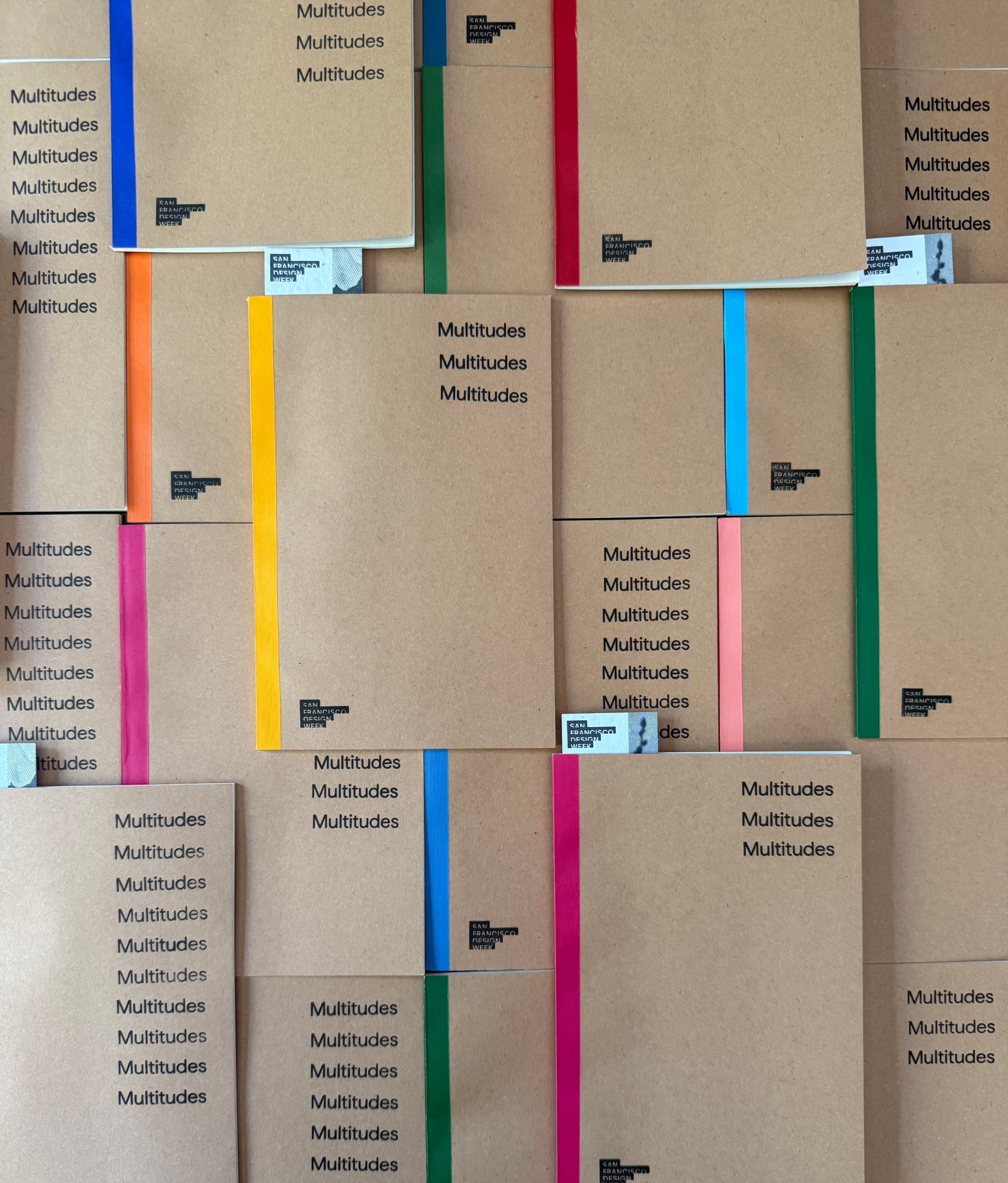
Boxes of kraft notebooks were stamped one by one, each with a different number of Multitudes, so no two covers came out the same. The coasters got the same treatment, but party-ready: less structure, more play, with stamps piling up and overlapping freely. Tactile and a little imperfect, made by the community instead of a print run, with stamps that can be reused event after event.
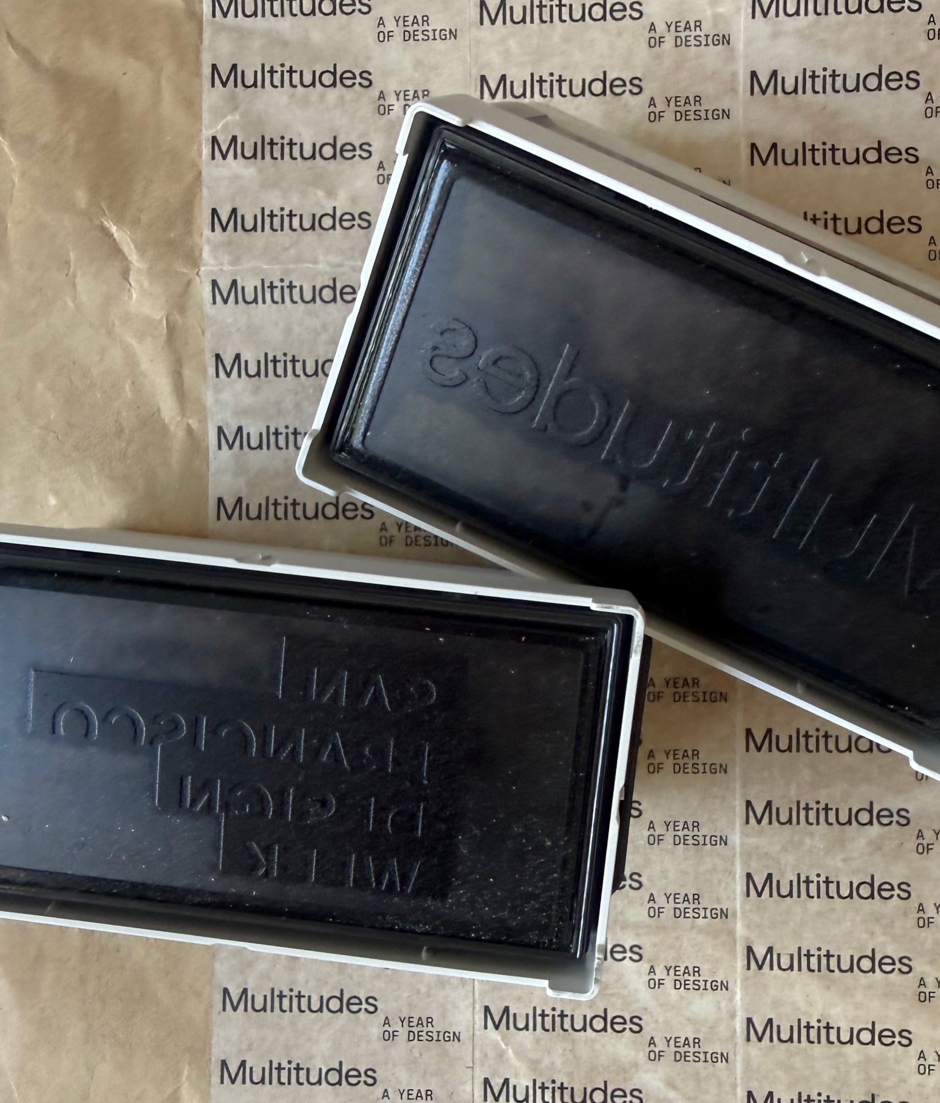
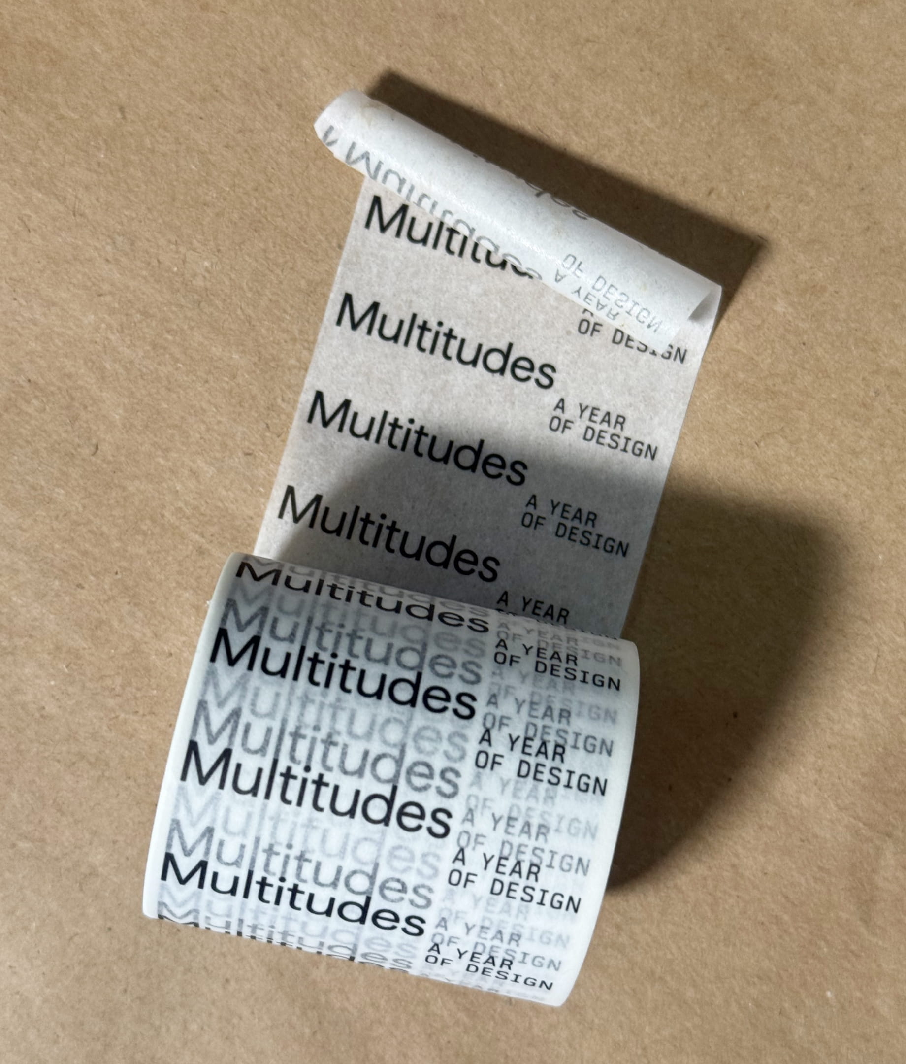
Multitudes on a roll, and lots of it. Compostable washi tape printed with the repeating lockup, used to wrap, seal, hang and decorate across every event. Abundance without waste.
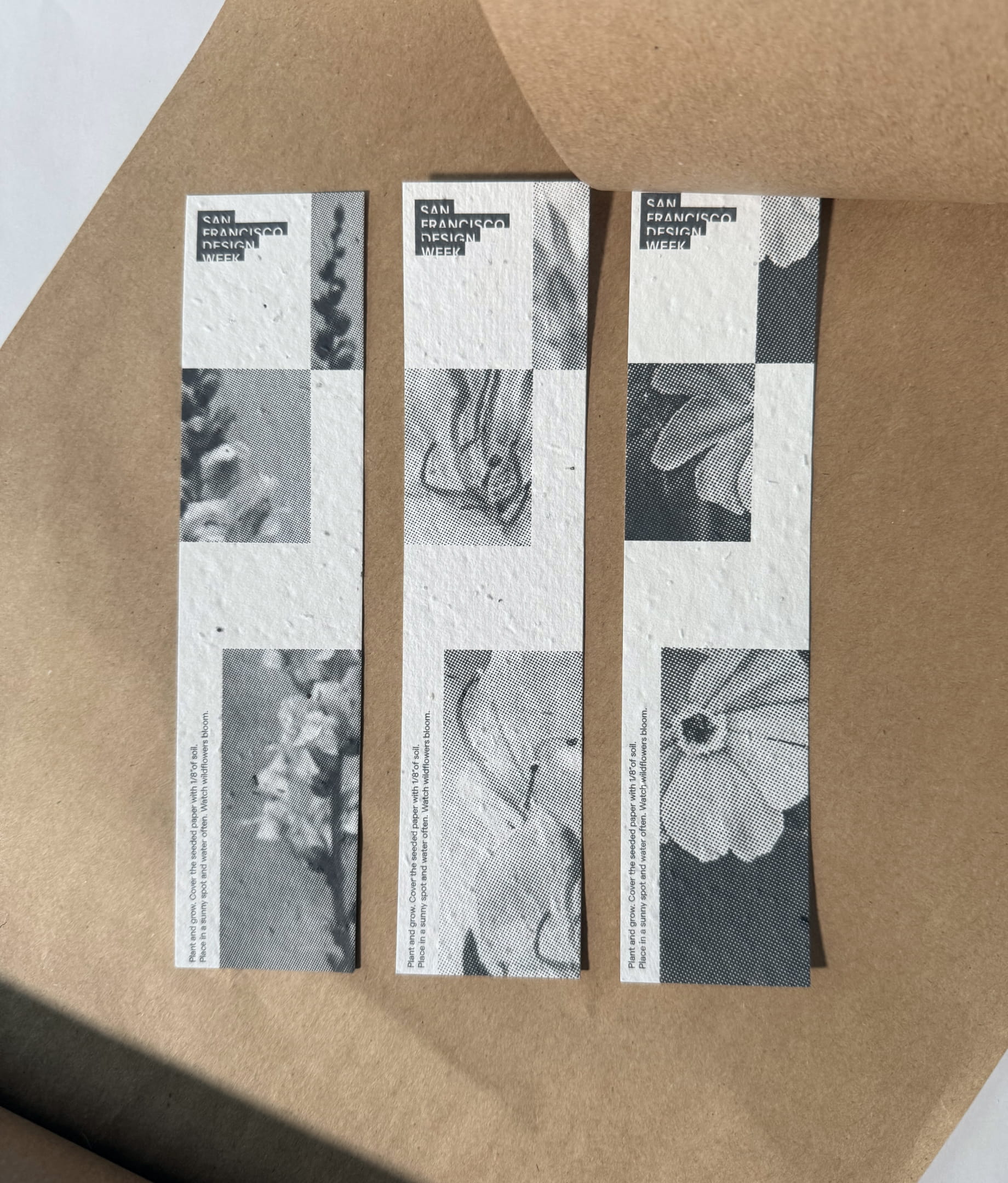
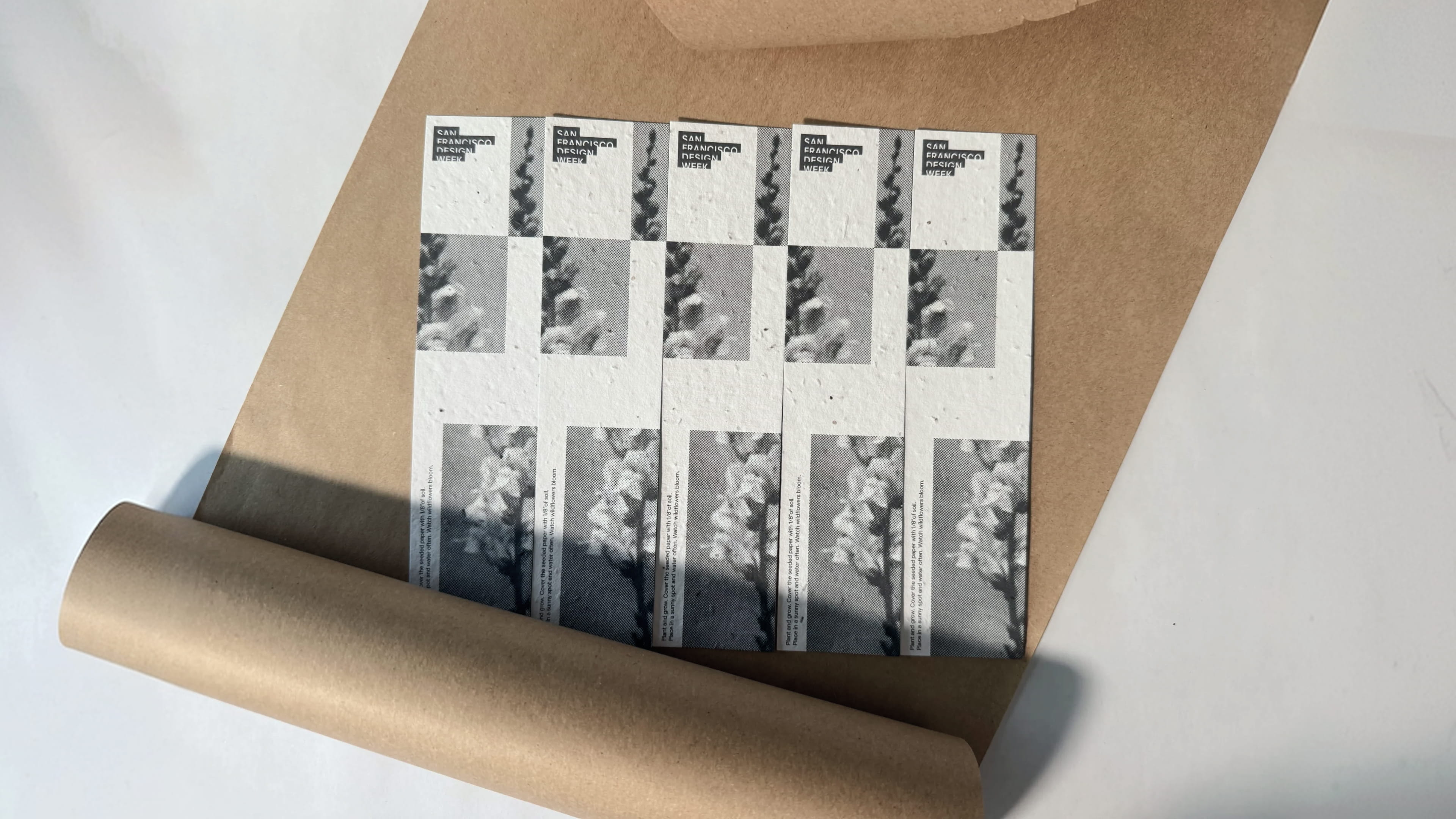
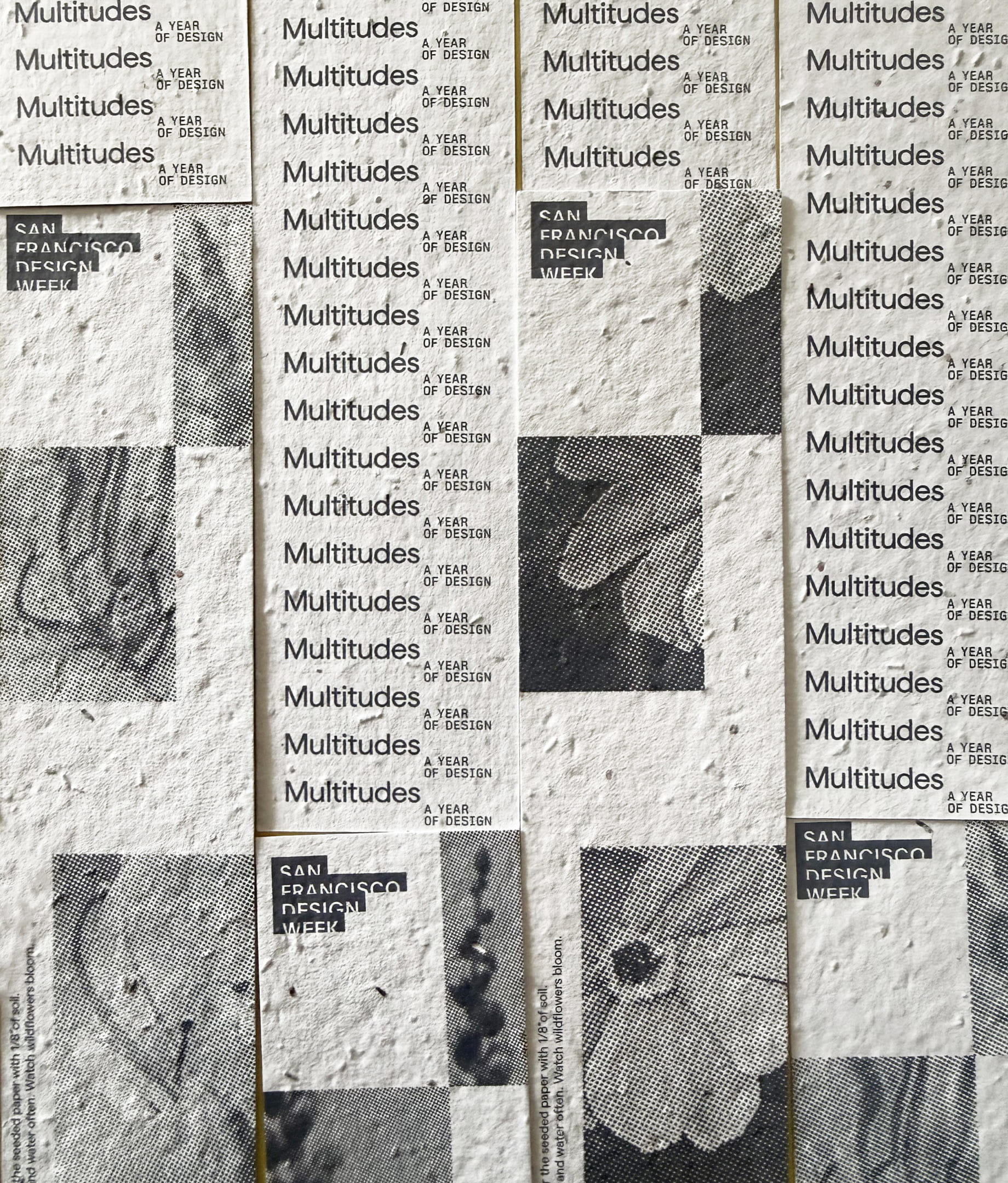
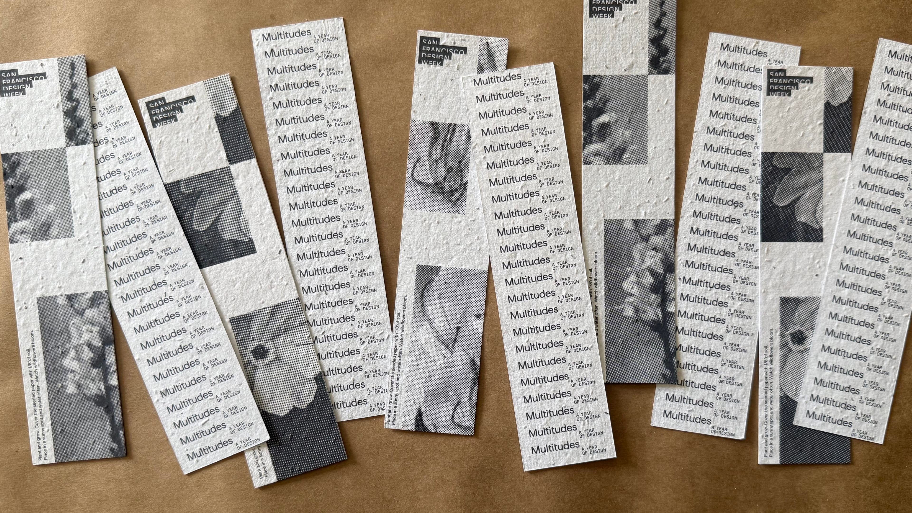
Printed on paper embedded with wildflower seeds. Plant it, water it, and watch wildflowers bloom. Tactile, a little magic, and nothing left behind.
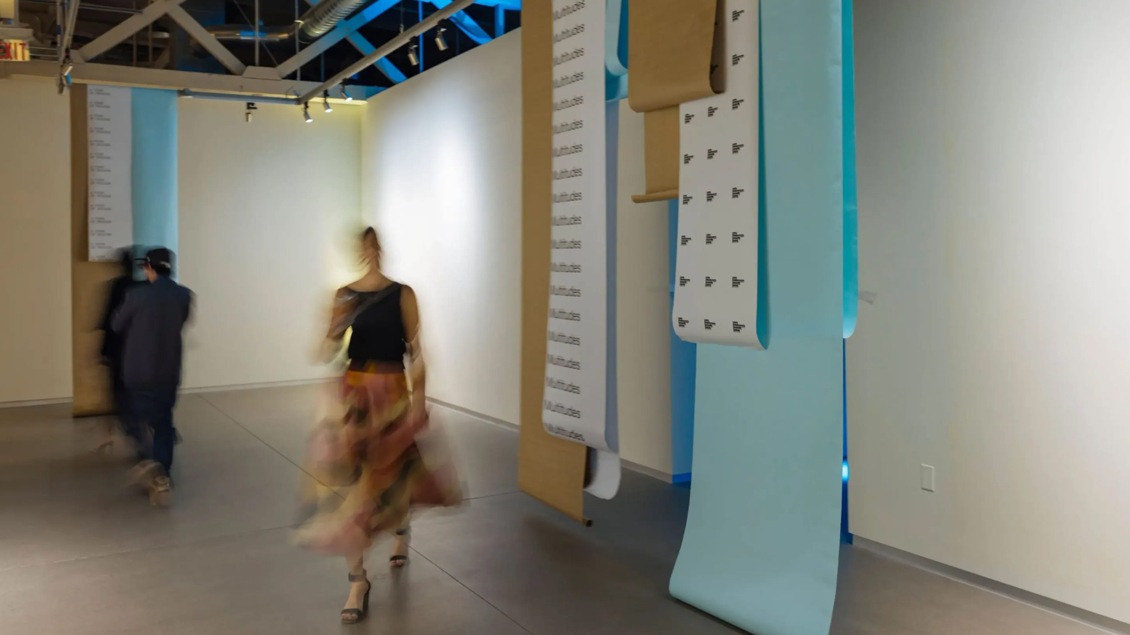
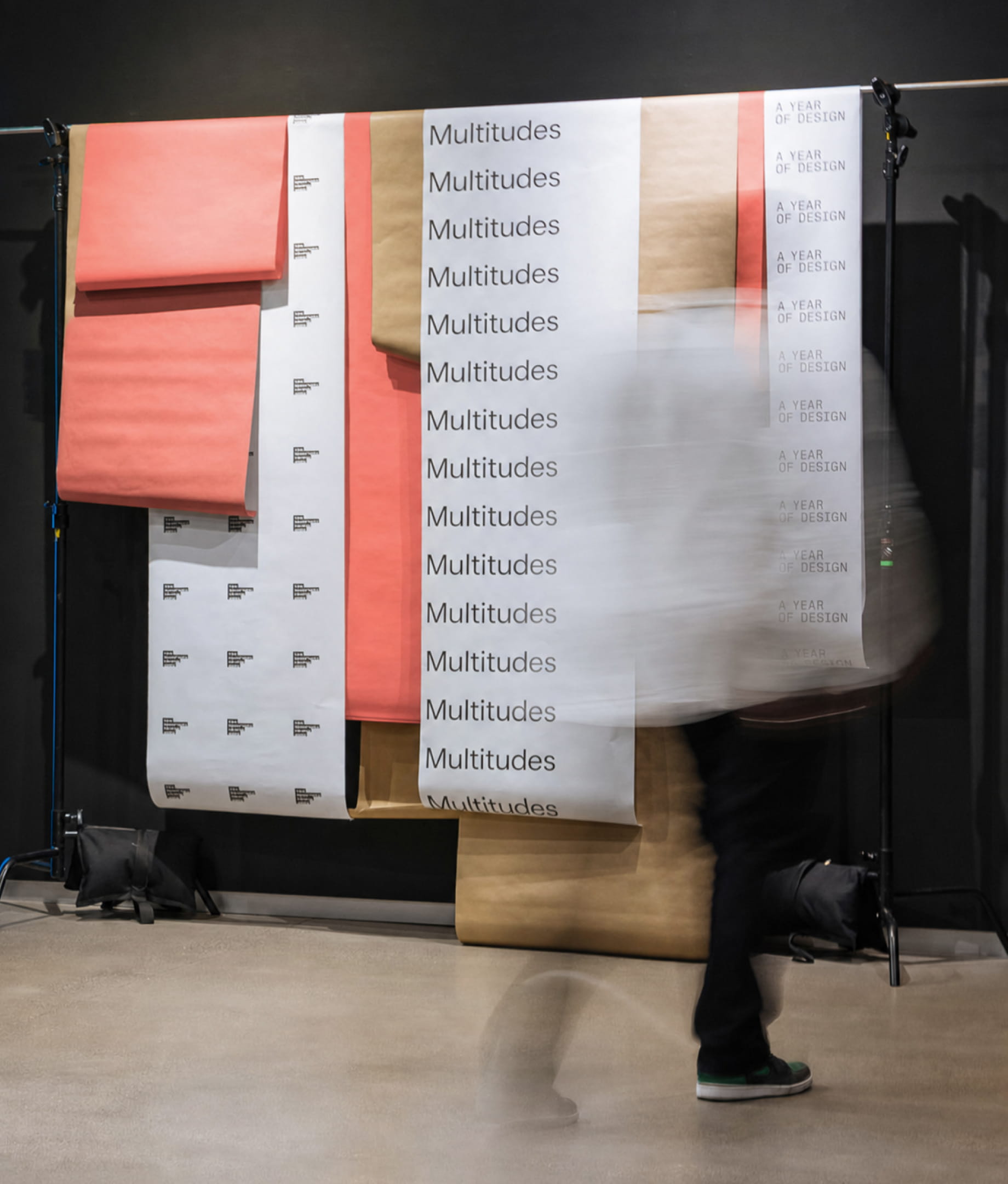
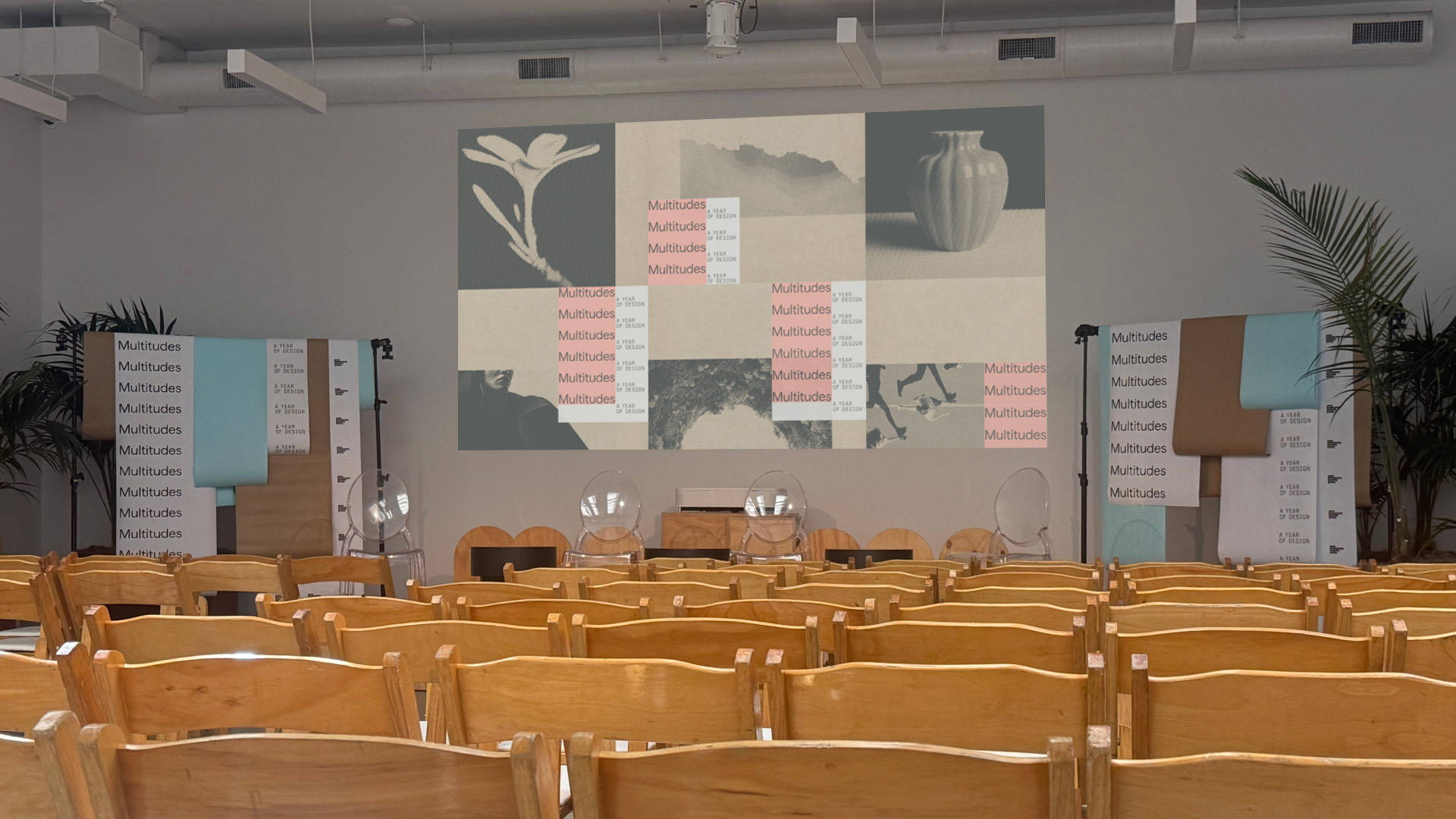
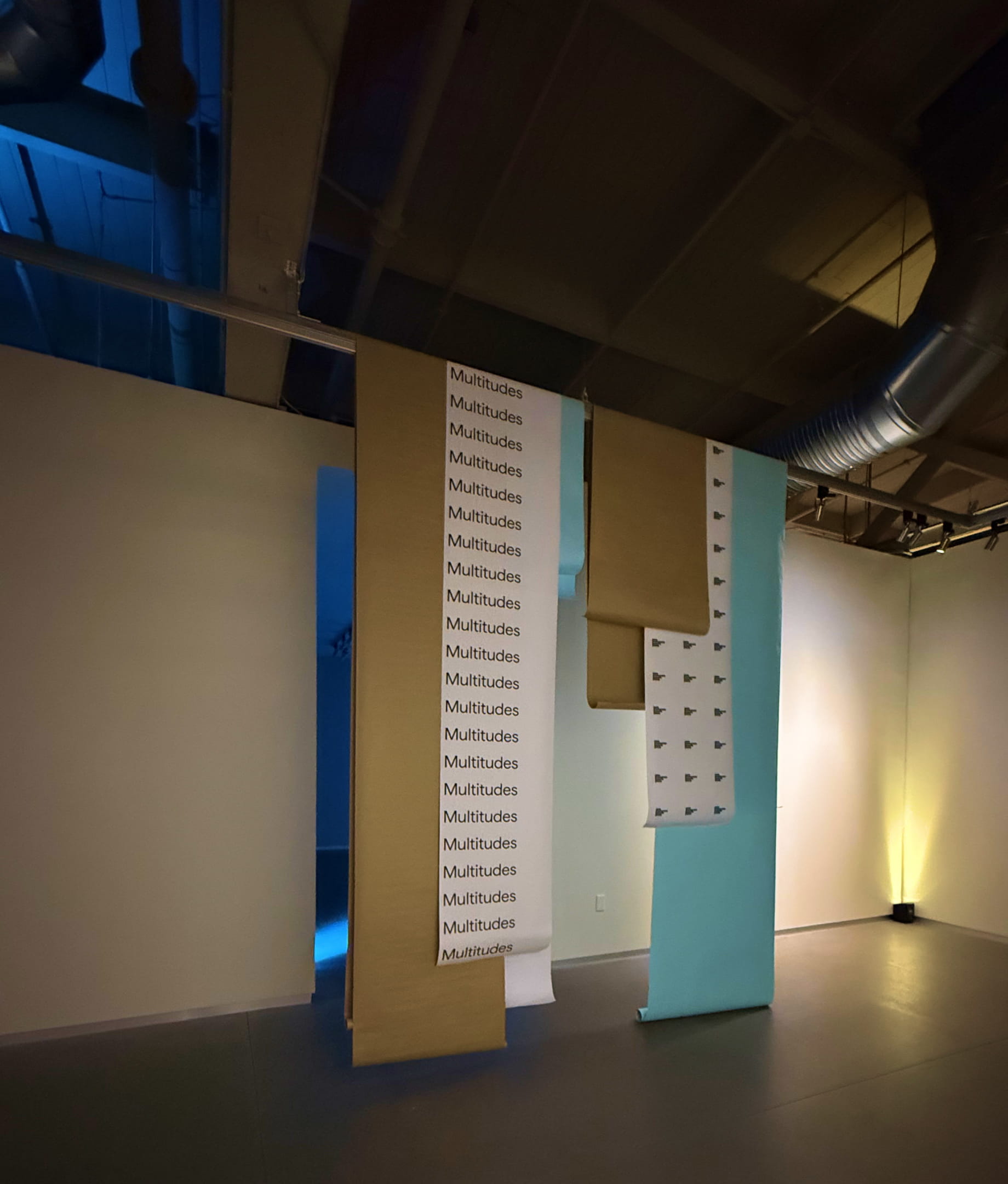
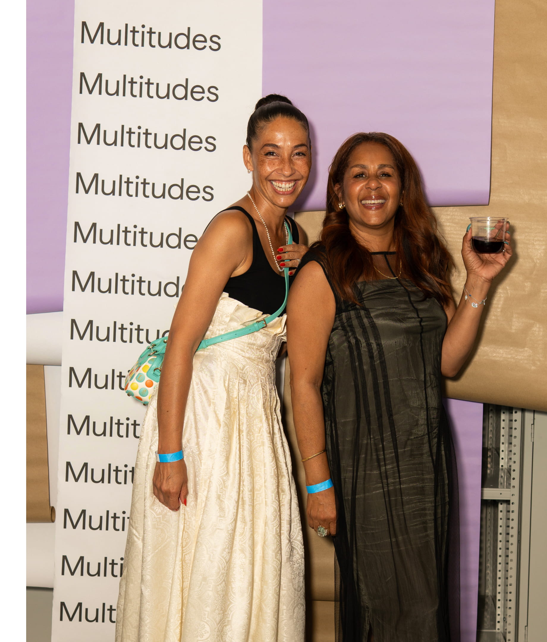
Waterfalls of paper became a flexible, low-waste system for stage design, decoration, entryways and photo backdrops. The drapes flex between spaces, in width and in height, hanging on their own from photo rigs or draped over whatever was already in the room. Considerate of each venue, and designed to work with what was there.
FROM THE CLIENT
SHOUT-OUTS
Natalia Kowaleczko / Tony Mingo / Michelle Weed / Michelle Busy / Katherine Chui / Sarah von Stenberg / Mia He / Yunwen (Tutu) Tu / Rob Villanueva

