Rovial
Delivering content to the edges of the world.
Brief
Rovial delivers high-quality, bandwidth-intensive content to users in places previously thought to be unreachable via advanced satellite systems. While in development and launch mode, they wanted a modern B2C-leaning brand identity that could flex into the future states of their business.
Audience
Consumers who want rich media in traditionally low bandwidth environments, and traditional content delivery networks who want to improve their users’ experience and extend their reach.
Opportunity
Build a flexible brand that can navigate and define a new technology and lifestyle landscape.
Concept
Moving from place to place often means not knowing if content will be available enroute, or even at your destination. Rovial delivers rich content to the farthest-flung places on Earth and everywhere in between. Meaning your orbit of content is with you no matter where you are.
Design
We built an overall design system that is spontaneous, energizing, and full of possibility, befitting the use case of the brand. The logo mark, built out of flexing orbits, can take on so much character in how it is applied or animated to grow with the landscape of the business. The color palette is bright and energetic for the consumer audience and can be toned down for the B2B audience or where needed.
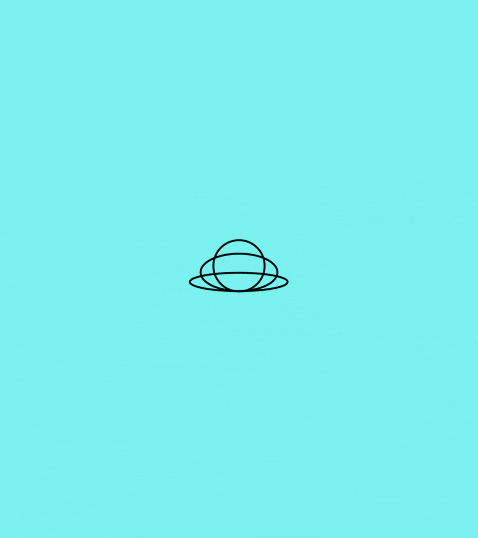
The Rovial logo has been built from three flexing, independent orbits that in motion can take on a lot of personality and exude different attributes of the brand. These modular elements can expand and contract, rotate and interact to communicate various emotional states and brand messages, from focused efficiency to dynamic growth. The logo's animated potential transforms it from a static mark into a living brand expression that adapts to context and audience, creating deeper engagement through its kinetic storytelling capabilities.
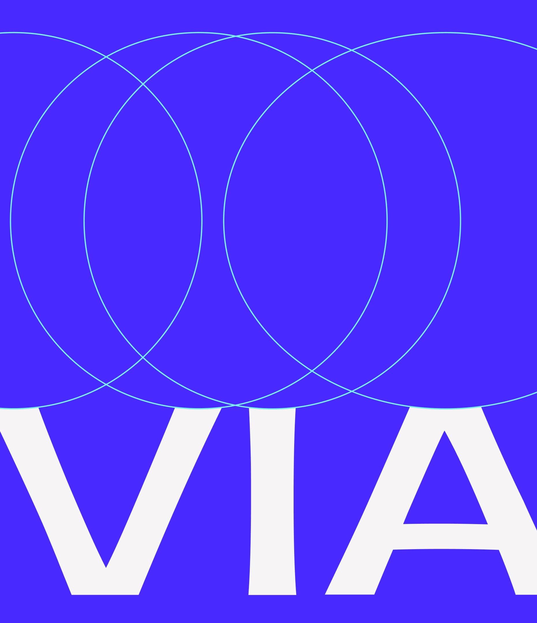
The Rovial wordmark has been customized to incorporate the curvature of the orbit within the typeforms themselves. This integration creates a cohesive visual system where the brand identity directly reflects the core technological concept of orbital data transmission. The letterforms themselves become carriers of meaning, with their curved geometry echoing the fluid pathways that define the content delivery network's aesthetic language.

The idea of the flexing, living logo expands into the entire system, where the orbital pathways become a dynamic representation of content delivery. The system employs dynamic orbital pathways that visualize data streams in real-time transit across the network. The illuminated endpoint serves as the focal destination where all converging data streams successfully reach their target. The system's flexible architecture is active, playful and energetic while communicating seamless content delivery and maintaining the signature orbital aesthetic throughout.

The adaptive color palette seamlessly transitions between corporate authority and consumer appeal through strategic distribution of electric blues and vibrant cyans for technological credibility, while luminous yellows and energetic magentas inject approachability. This spacey, neon-inspired aesthetic intelligently adjusts color ratios based on audience context—amplifying cooler tones for B2B presentations while elevating warmer hues for consumer touchpoints.


The type system embraces multiple dimensions to match the brand's adaptive nature, with Recife bringing humanity and warmth as display, Zoom providing spatial feel, and Univers offering flexibility for commercial applications.
This flexible typographic architecture allows the brand to shift seamlessly between emotional connection and technical authority, creating a multifaceted communication approach that works across every touchpoint—from punchy consumer moments to expansive B2B presentations.


FROM THE CLIENT
SHOUT-OUTS
Natalia Kowaleczko / Tony Mingo / Sofia Llaguno / Guide & Anchor / Cosma Schema / The Naming Group

