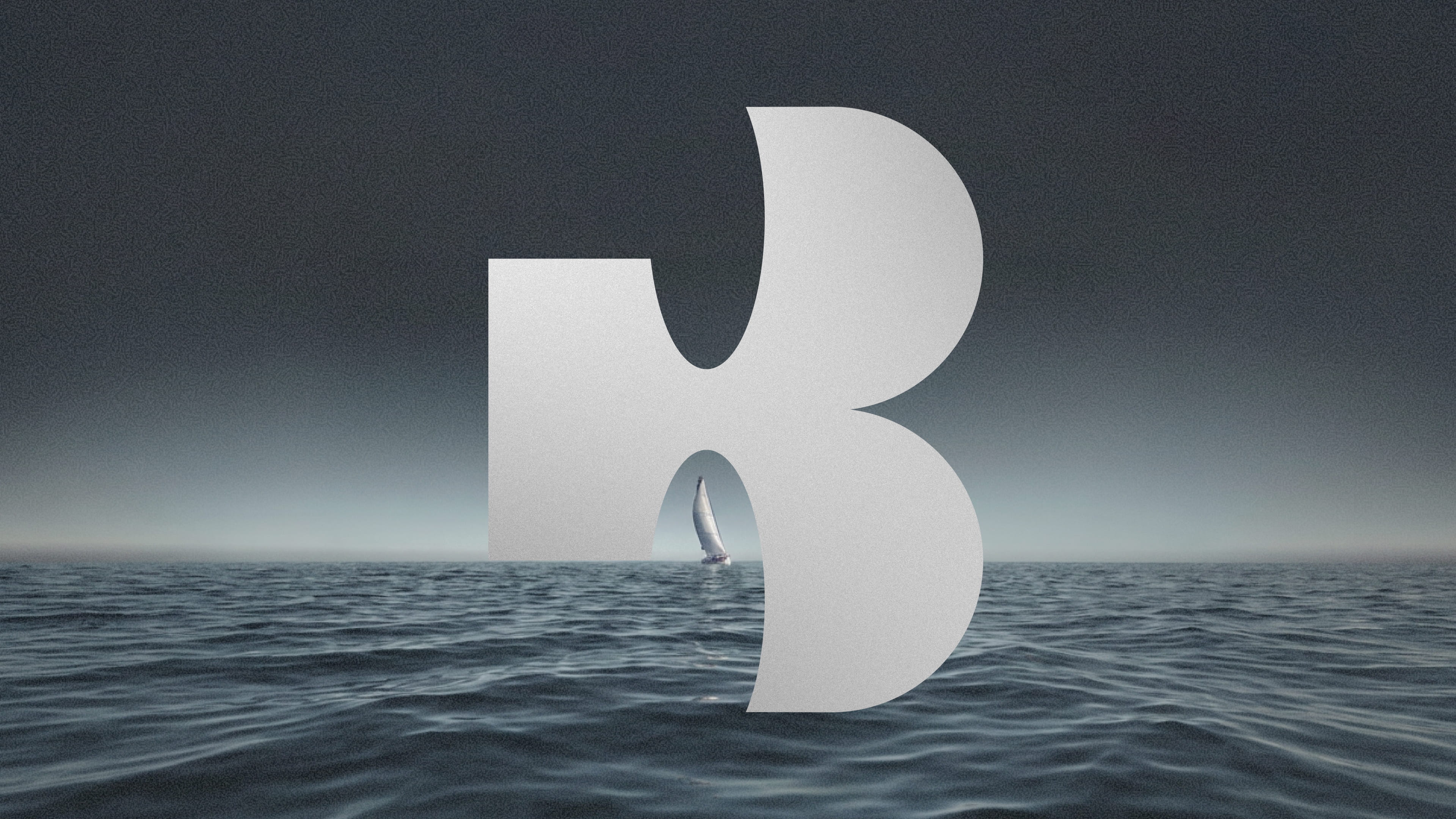
Baluga
Blowing fresh air into a stale category.
Brief
Baluga is a 100% aluminum sailboat based in Royan on France’s Atlantic coast. It’s owners came to us with a name and sketches of the boat that was being built, and asked for an identity that would help elevate the sailing experience for themselves and guests who charter the boat for adventures along the Atlantic and Mediterranean coasts.
Audience
Charter guests, who judge a boat by its details as much as its specifications, and sailors, who think about the specs first, but appreciate the polish of a thoughtful, clever identity.
Opportunity
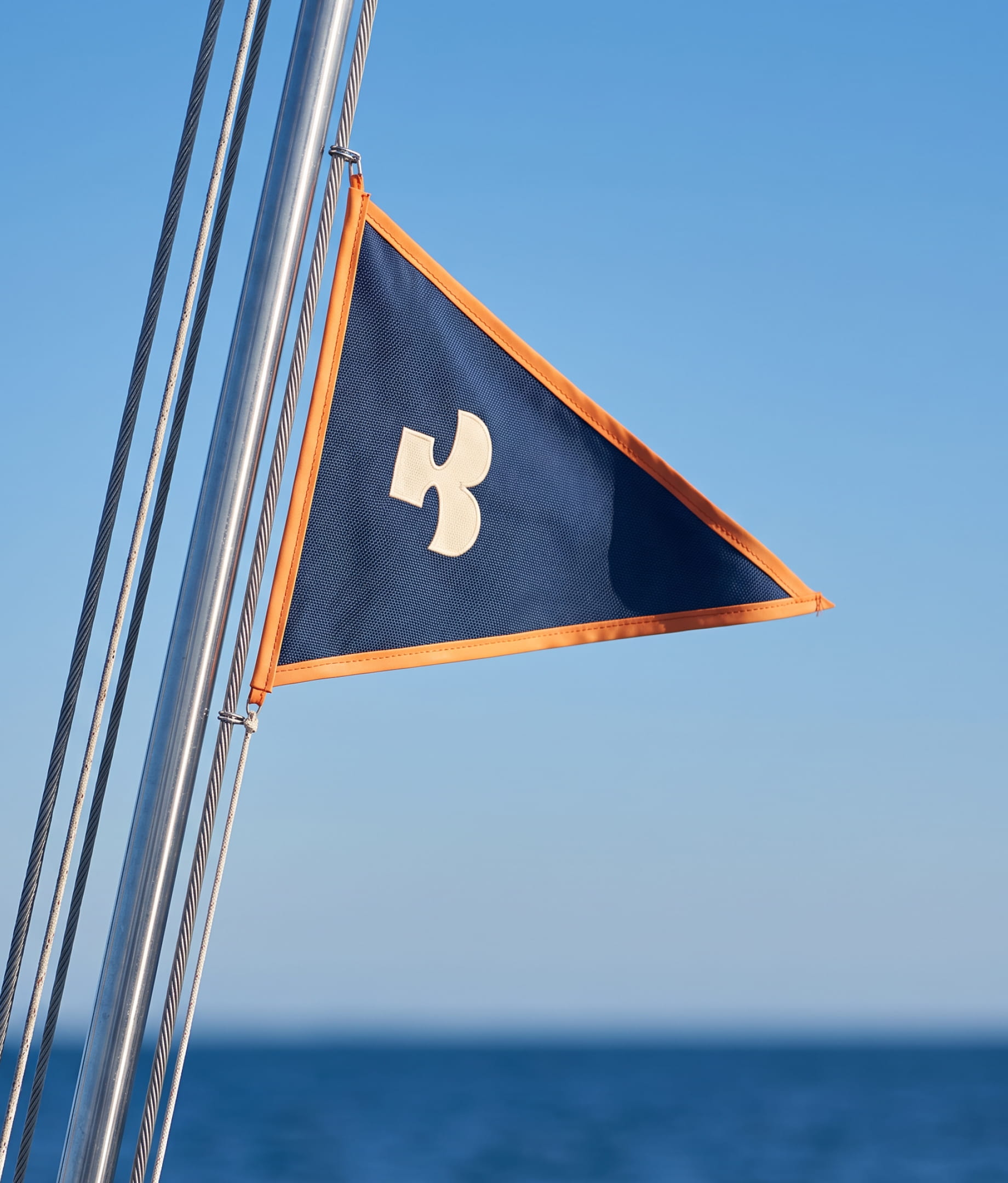
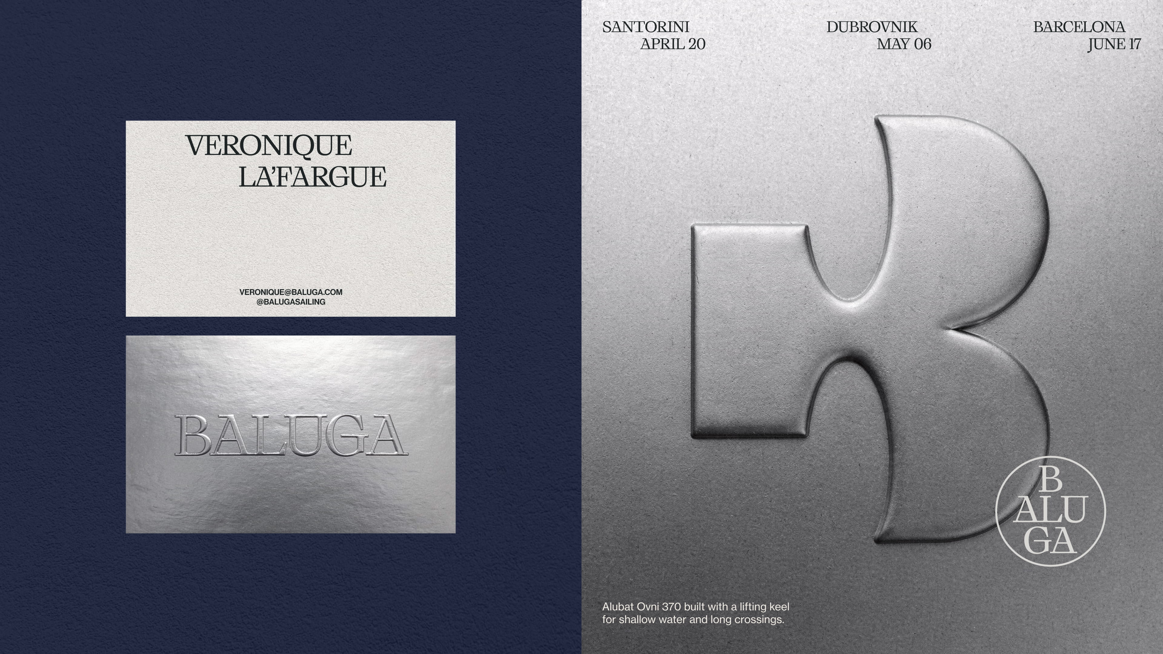
Sailing has a genuinely good visual language. Navy and silver, engraved serifs, badges and burgees, a formality that comes from a long tradition of doing things properly. The problem is that the category has been repeating it without thinking for fifty years, so every boat ends up looking like the one moored beside it. The opportunity was to create an identity that was on par with an evolved sailing community. To create something that felt more like a hospitality experience than a salty old sailing cliché.
Concept
The name is the first bit of cleverness. Baluga, a play on Beluga, contains the letters ALU, which are borrowed from aluminum, the very material the boat is made of. From that seed, we created AL, a whale mascot, and a system of precise curves and hard edges that mimic features of the boat itself. Elements of sailing tradition are present, but reimagined in a modern, fun, and comforting way.
Design
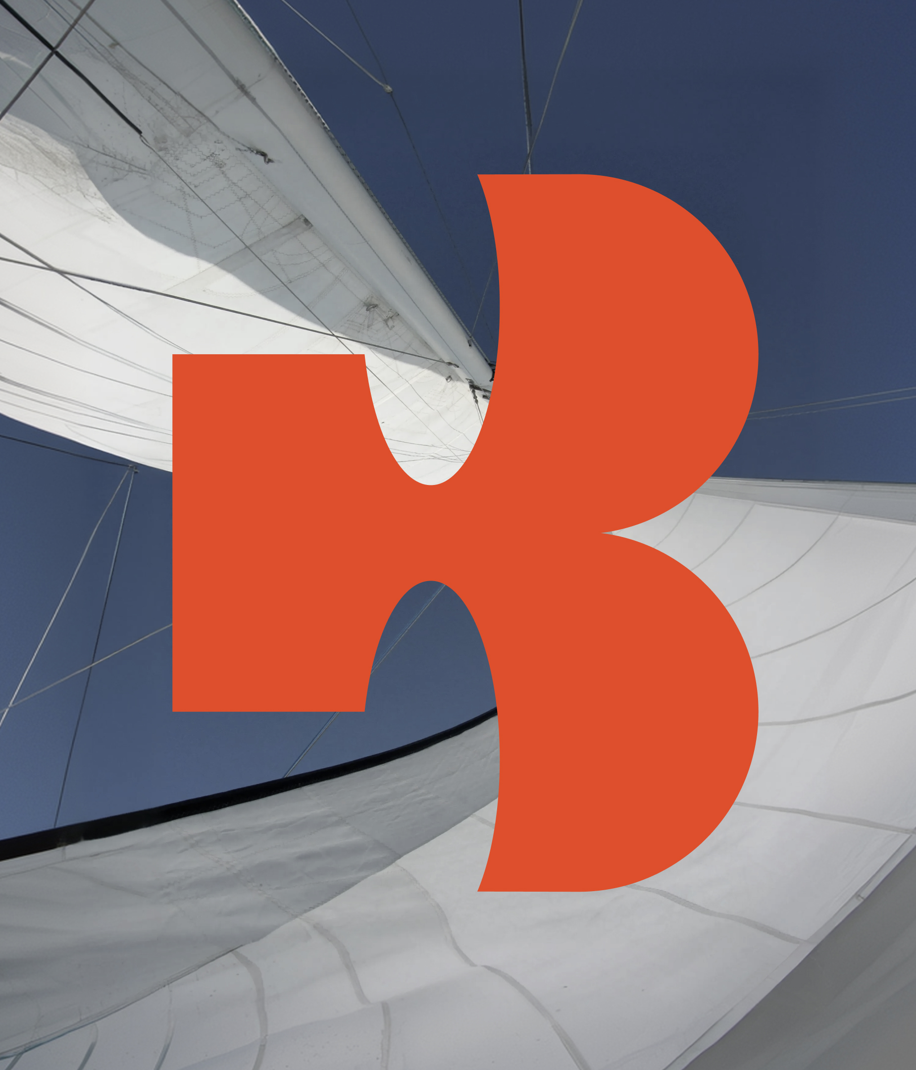
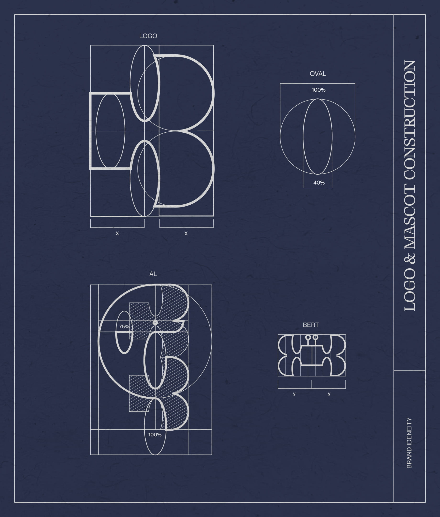
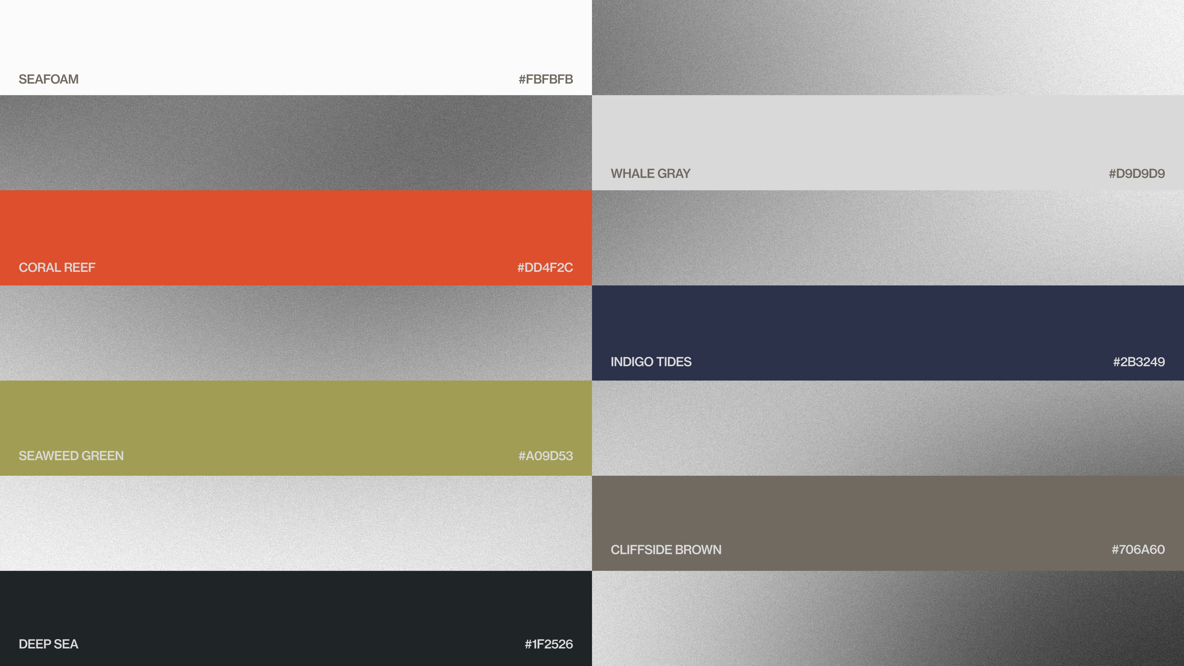
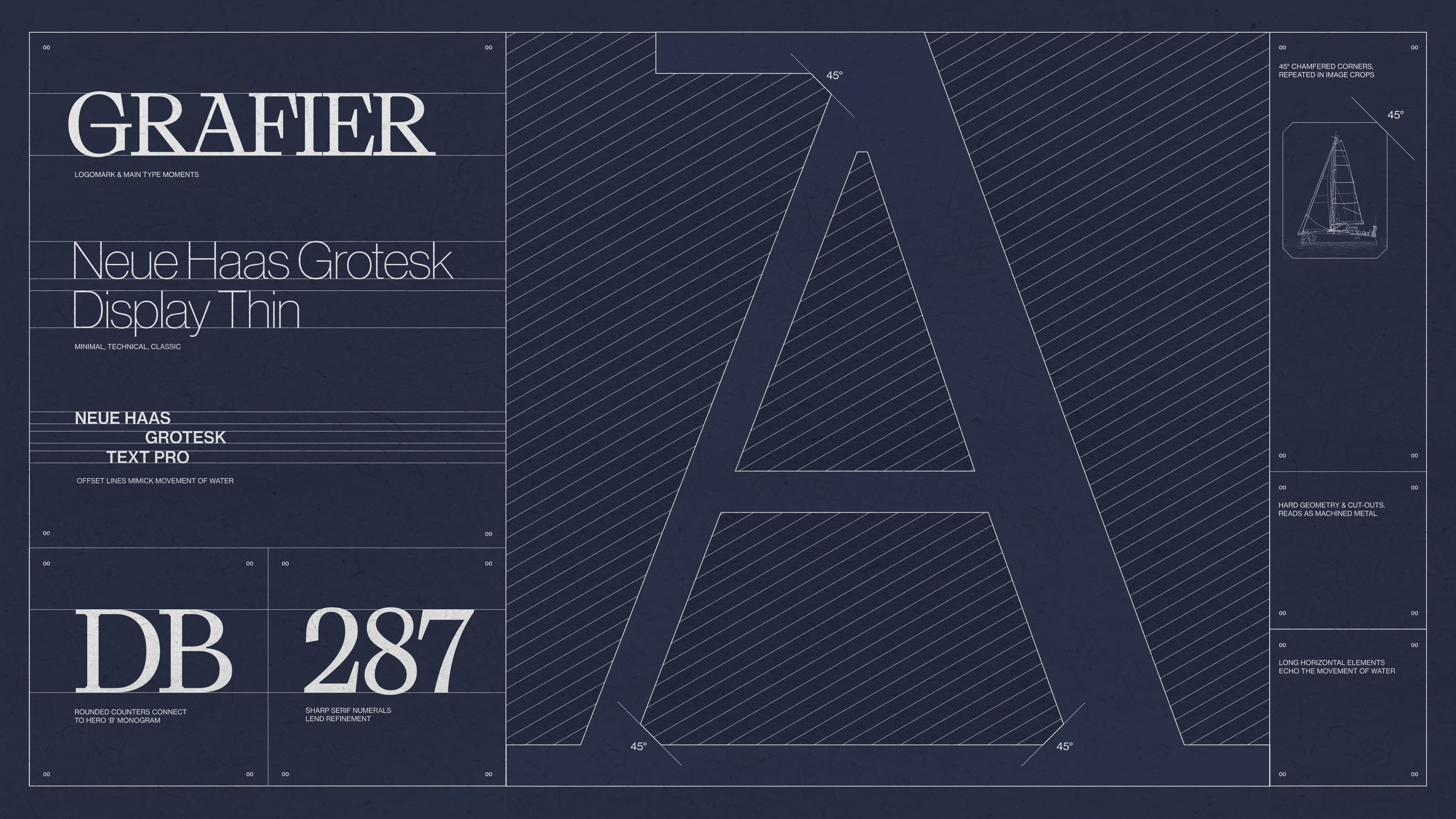
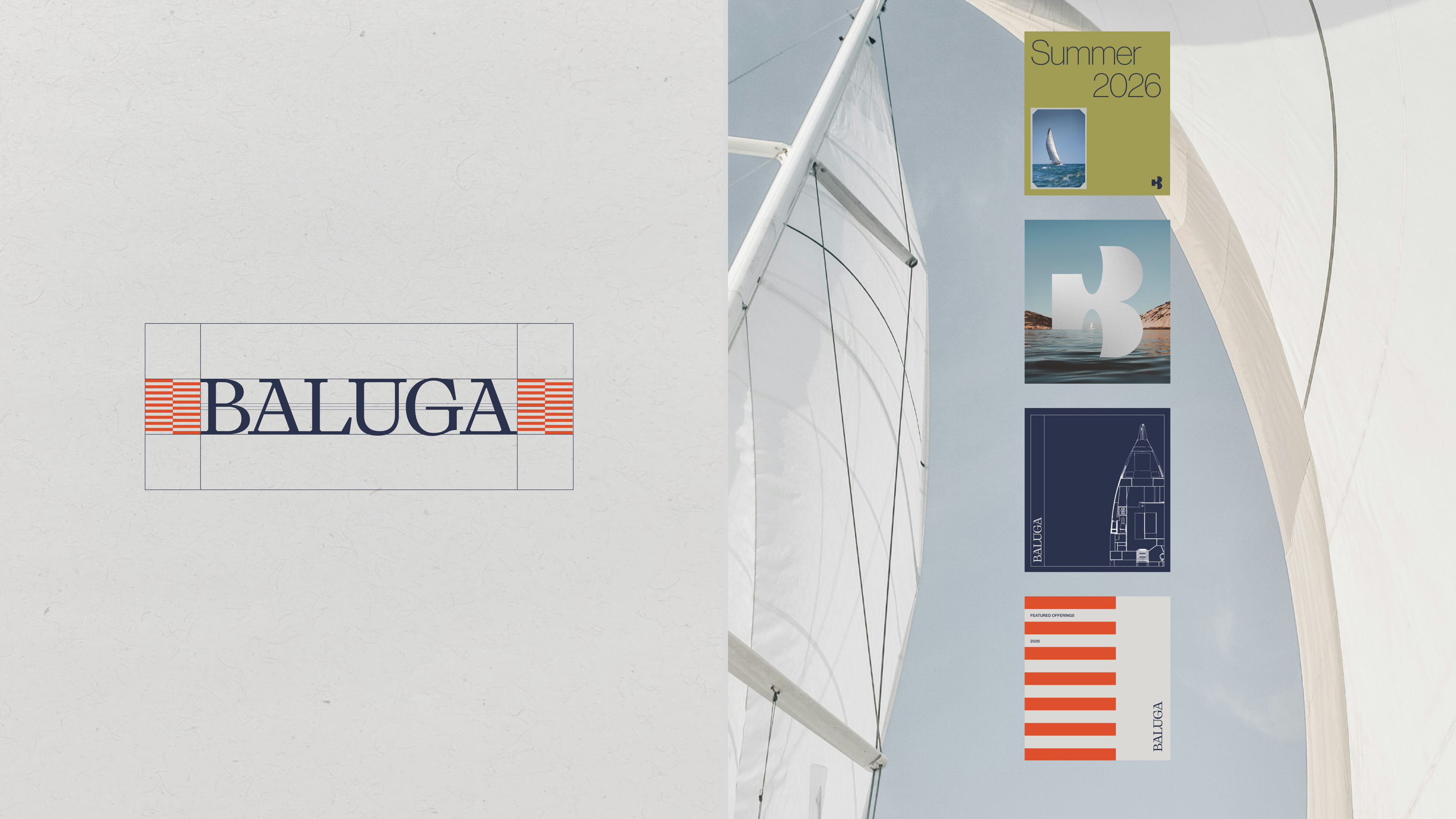
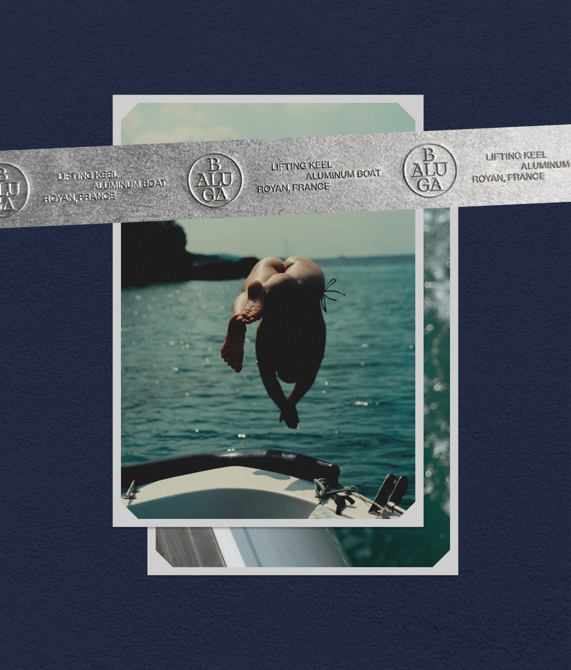
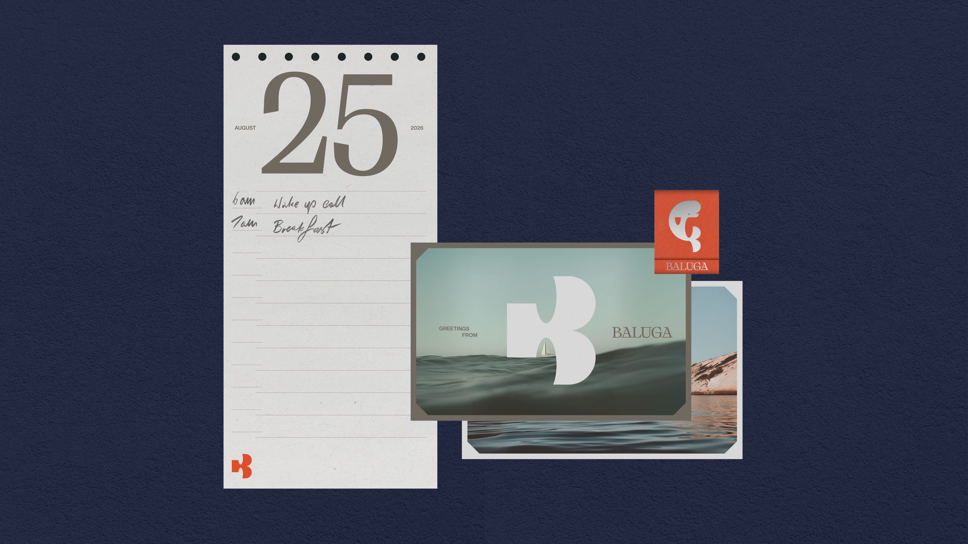
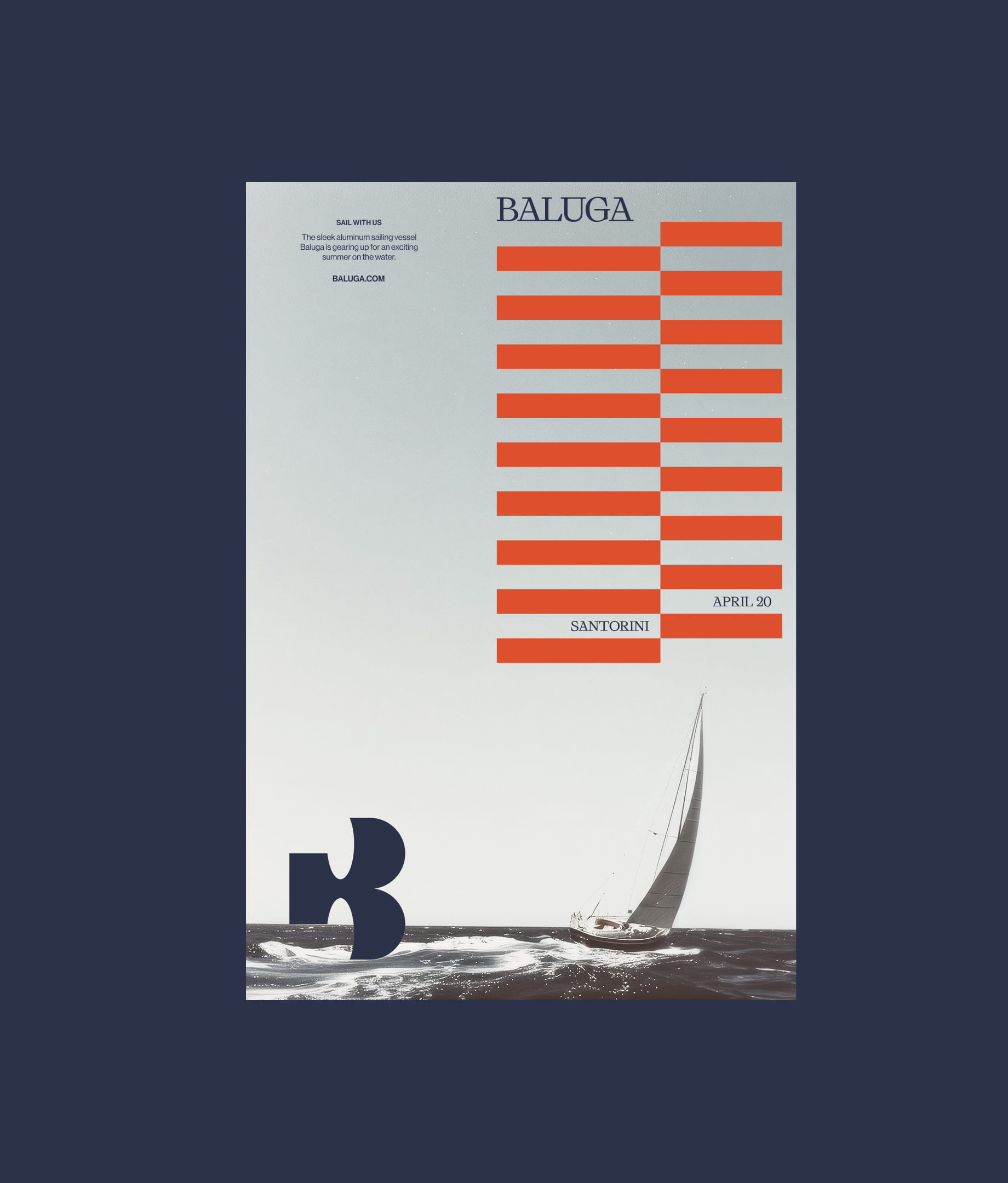
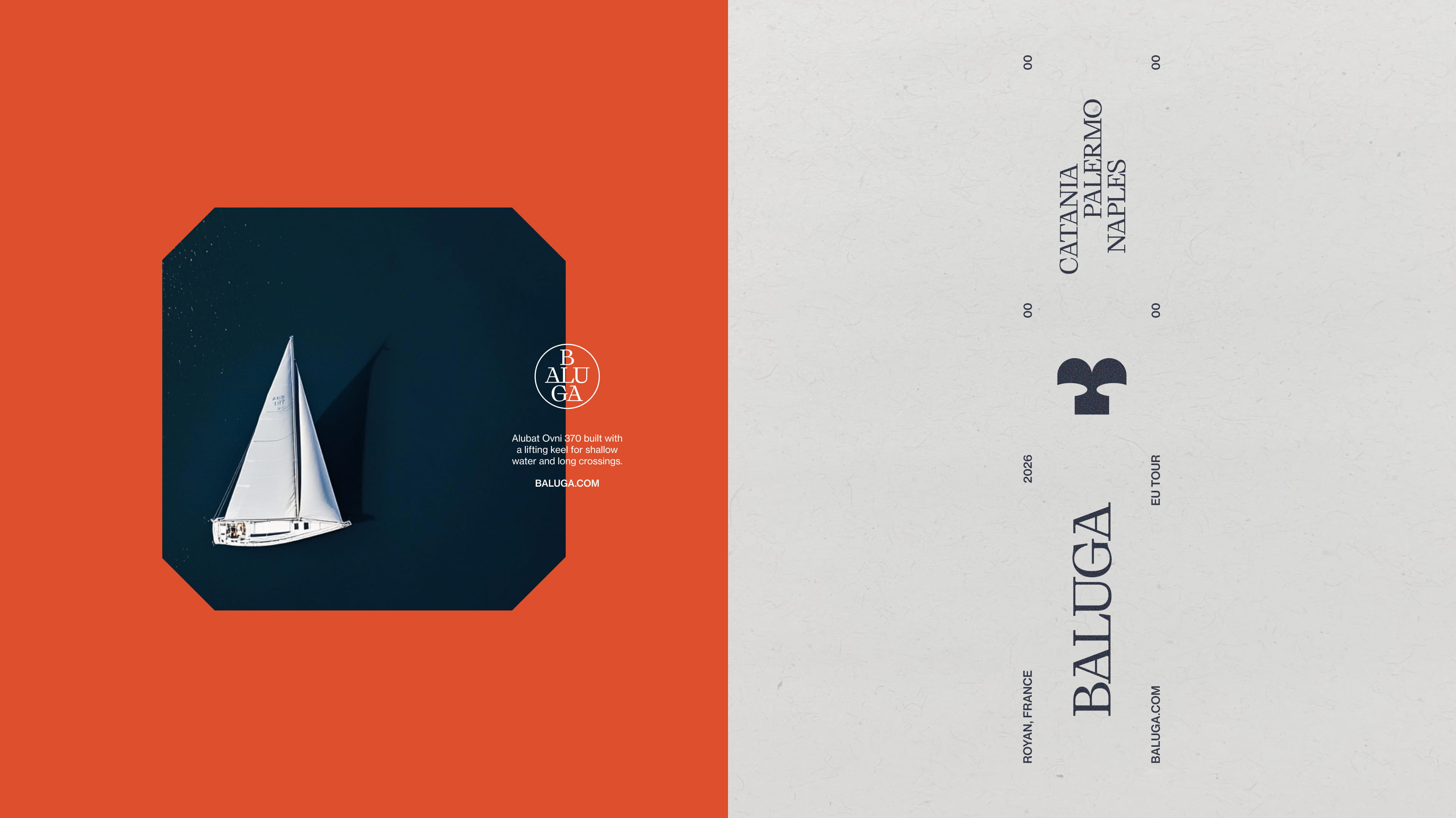
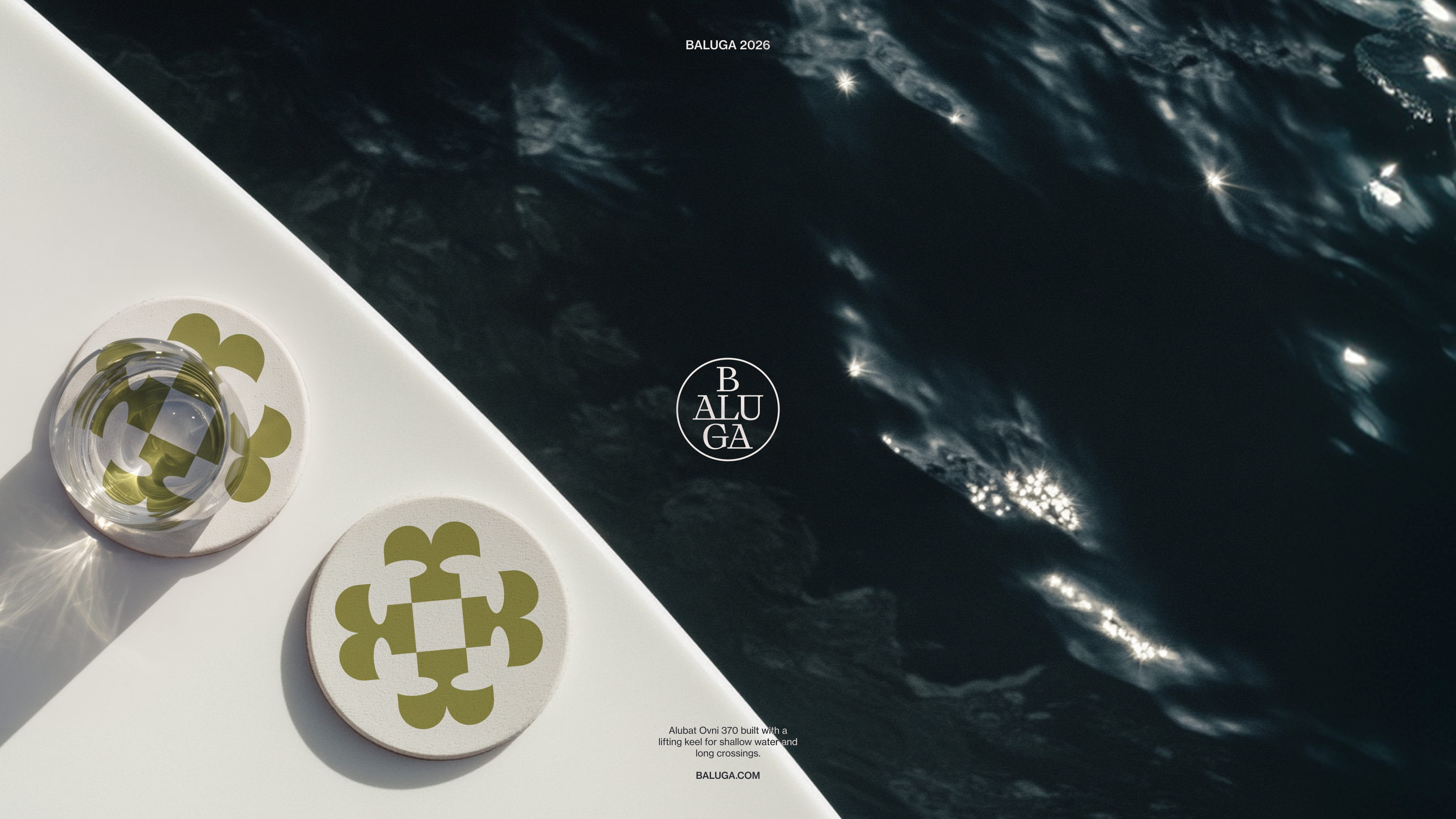
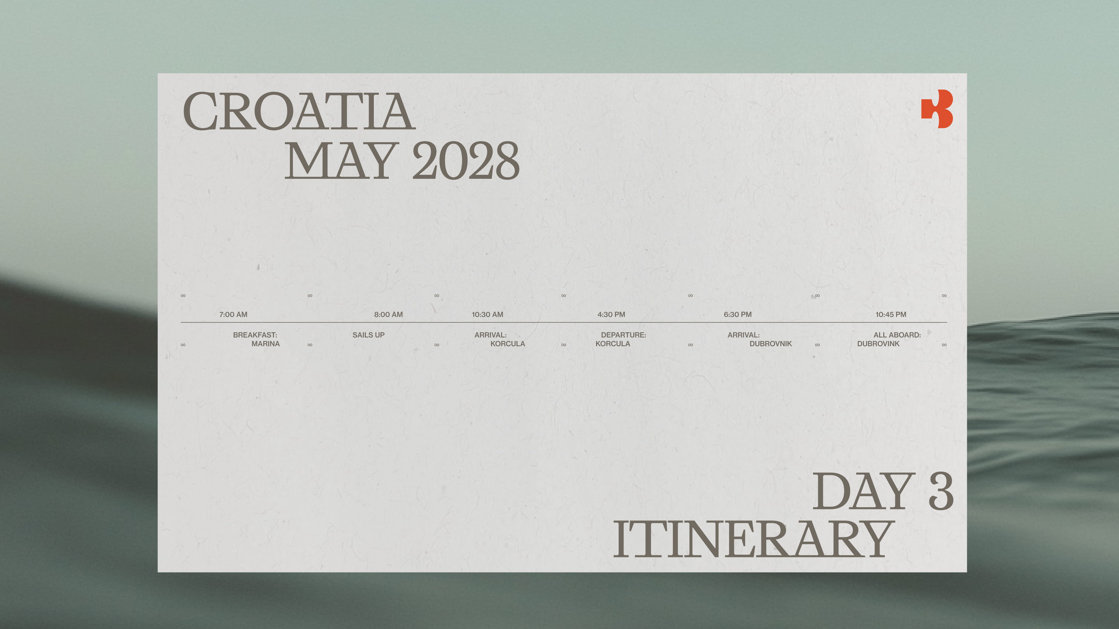
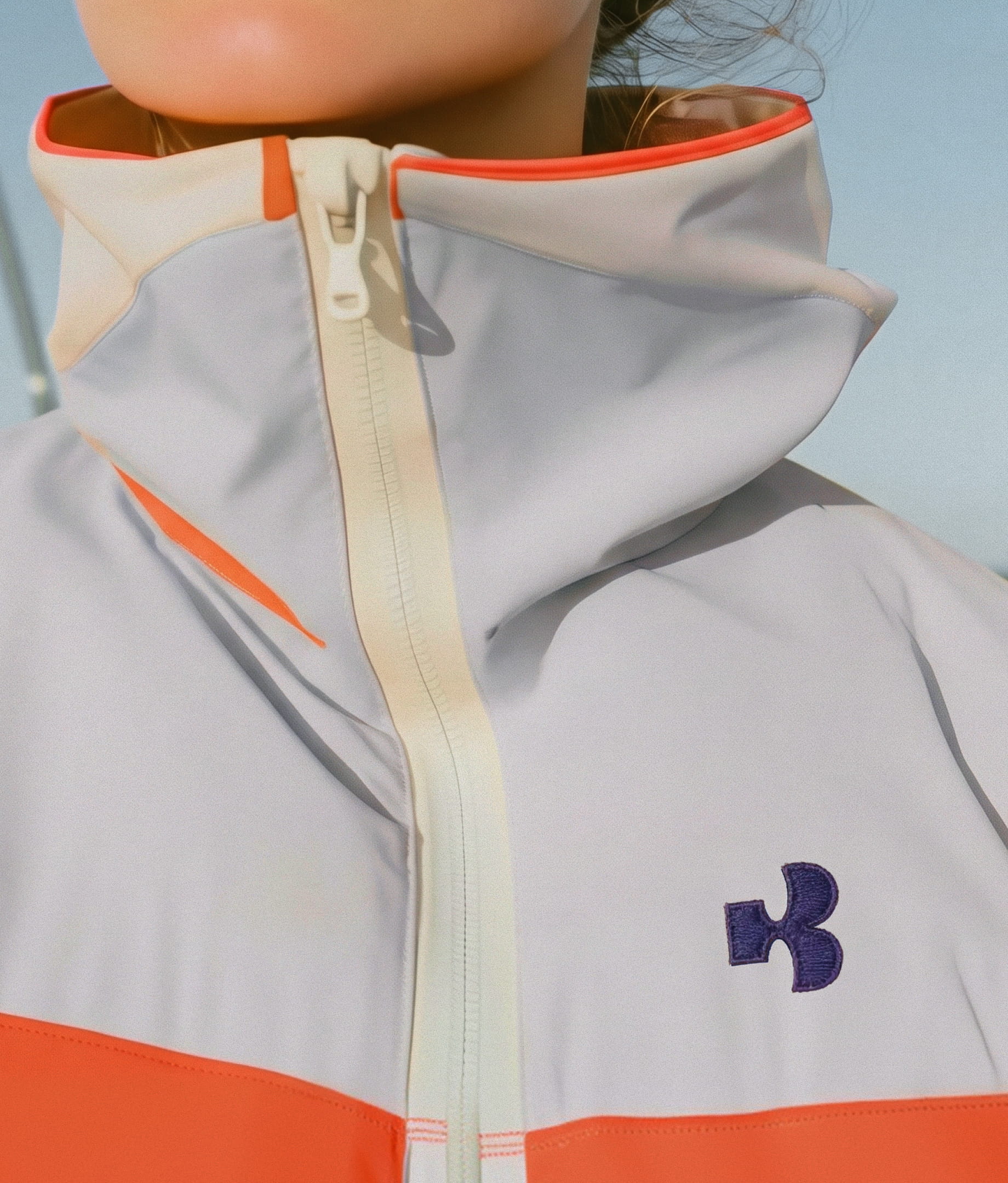
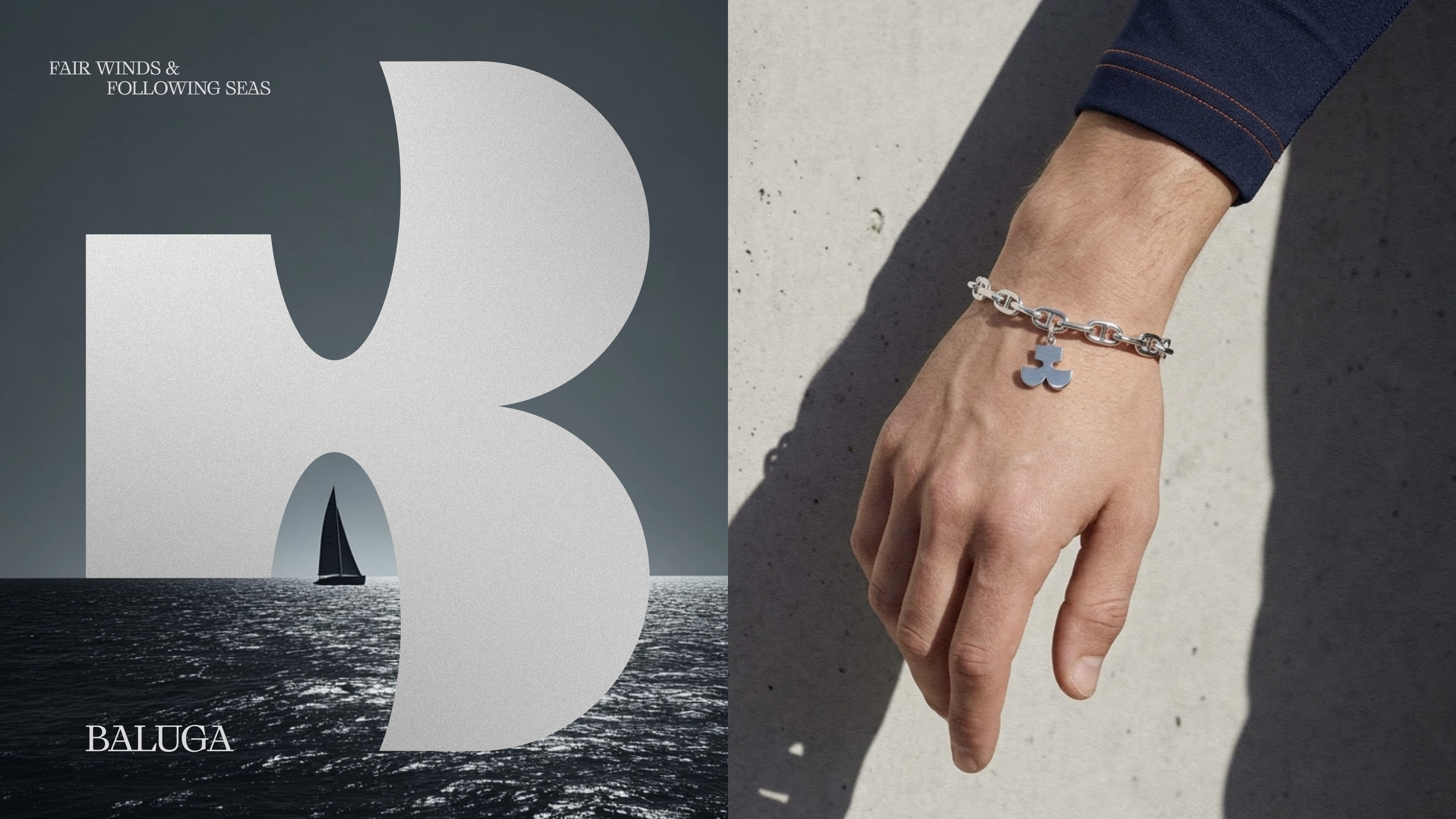
The core of the system is built on a single piece of geometry. The same ovals can be found in the ‘B’ monogram and the mascot, creating an almost unconscious familiarity between the two. The 45° angles in the serif logotype finds its way into the corner cuts of photography. Repeated horizontal lines of type shift in imitation of the waves below, and traditional maritime colors like navy, silver, and gold are brought up to speed with a rich, reef orange and seaweed green.
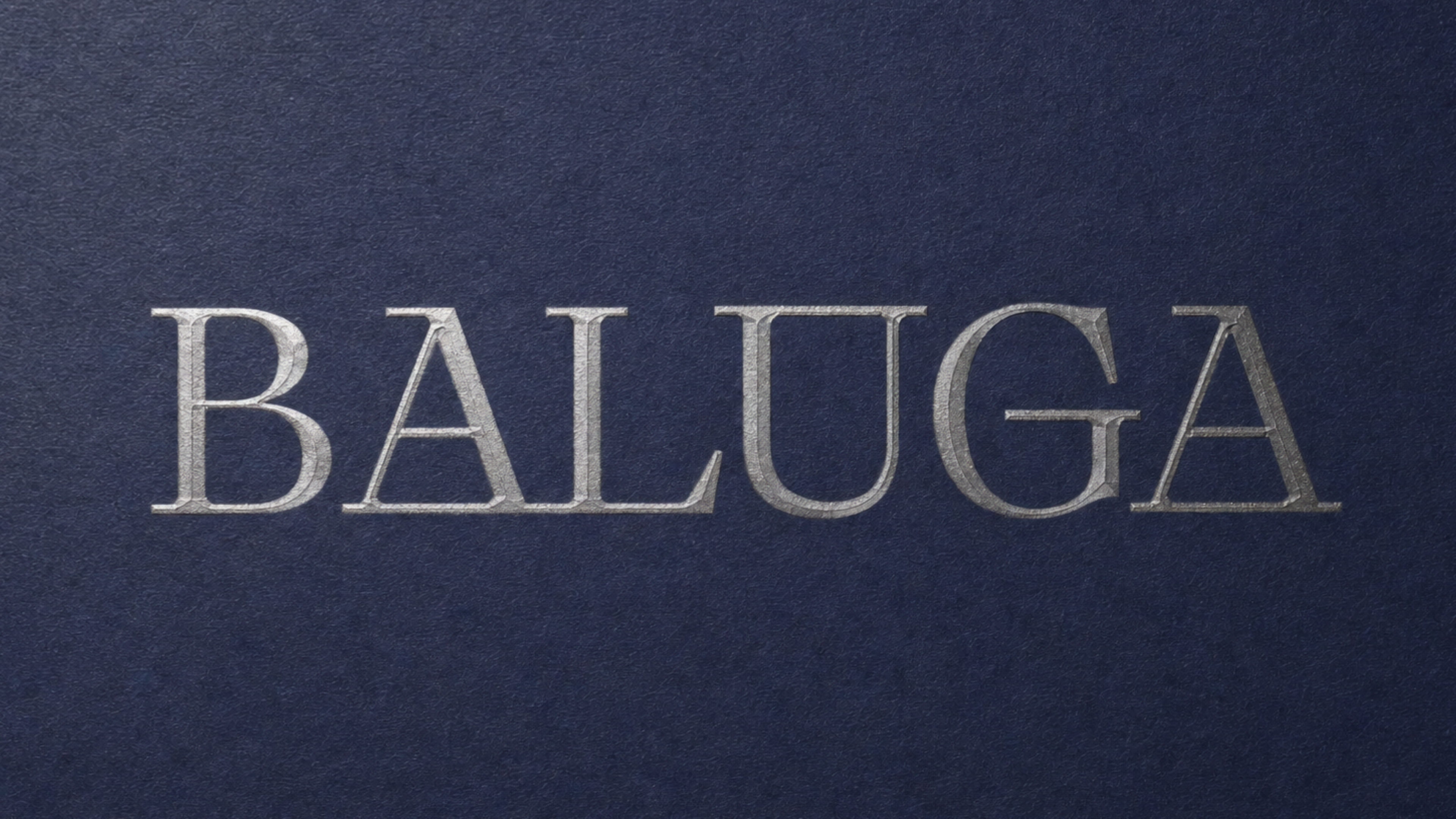
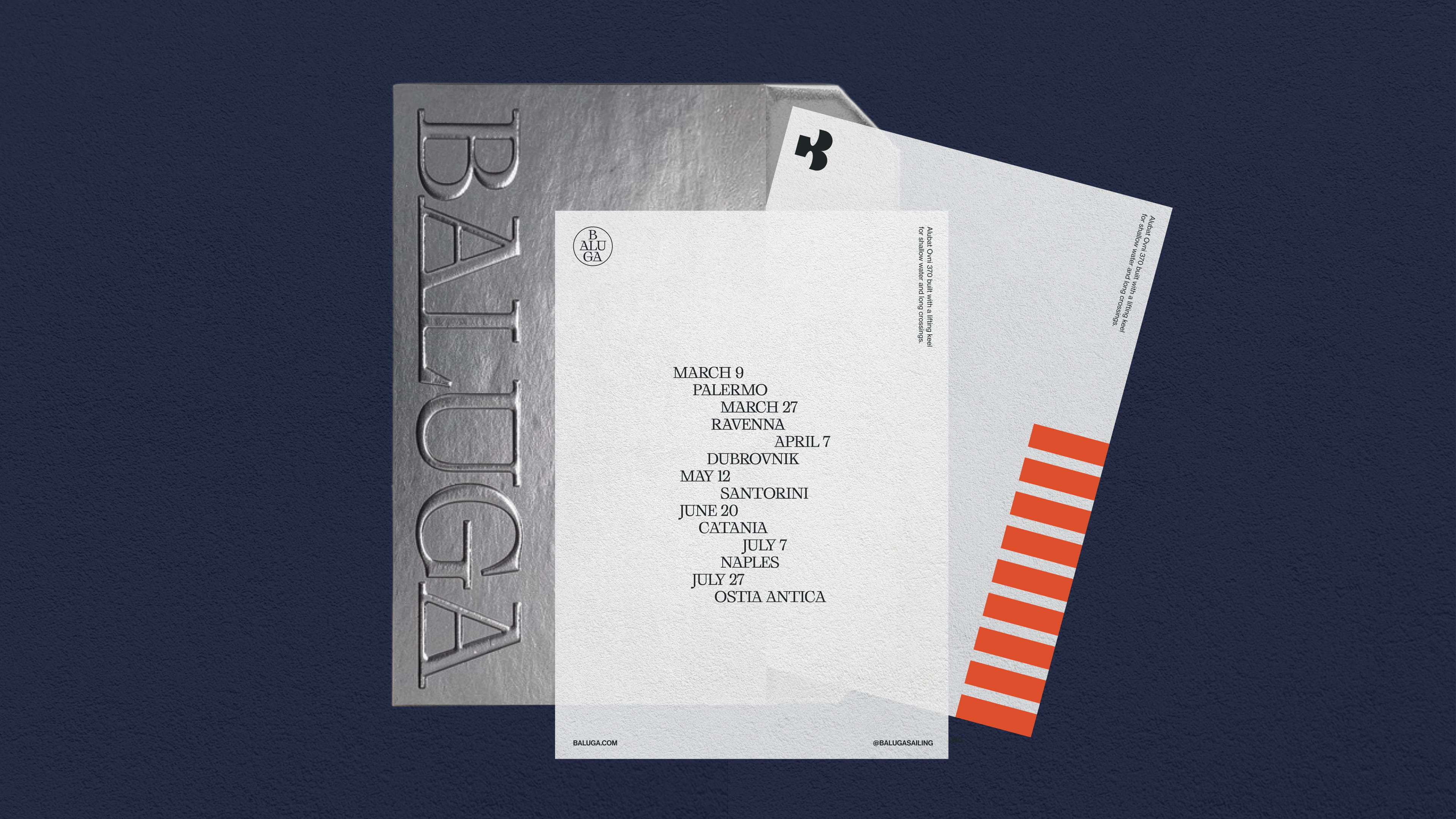
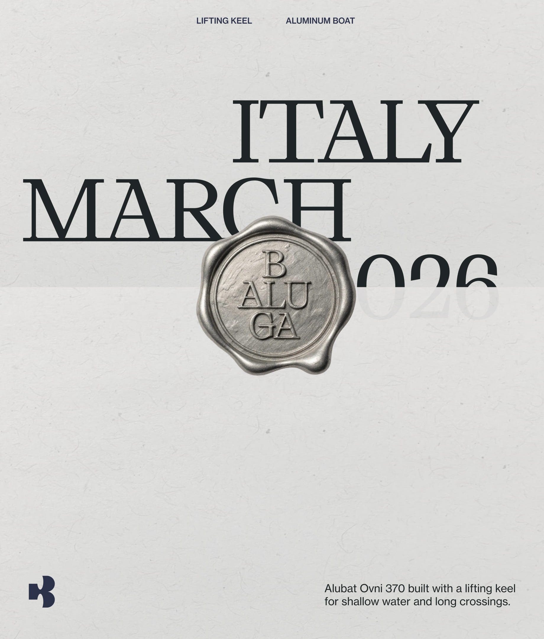
The Baluga typemark is crafted from a typeface with nice angular details, blending elegance with technical, constructed feel that caputres qualities of the boat itself.
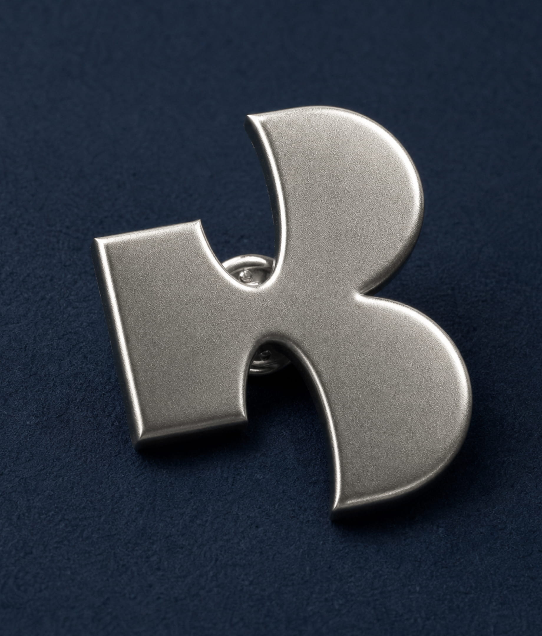
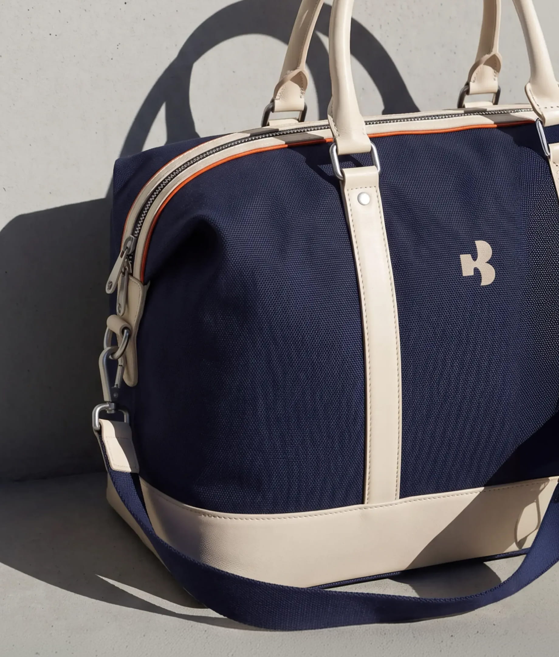
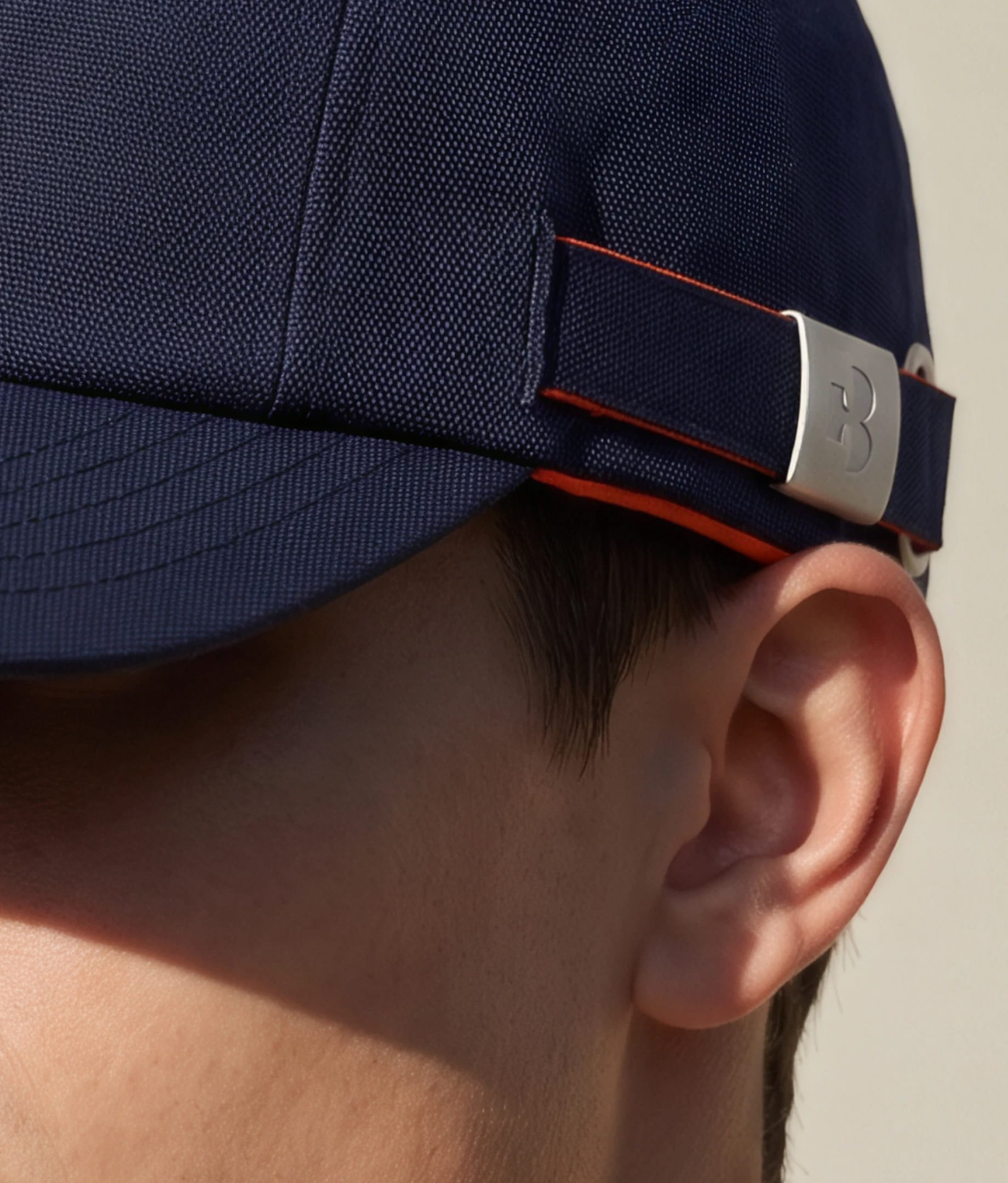
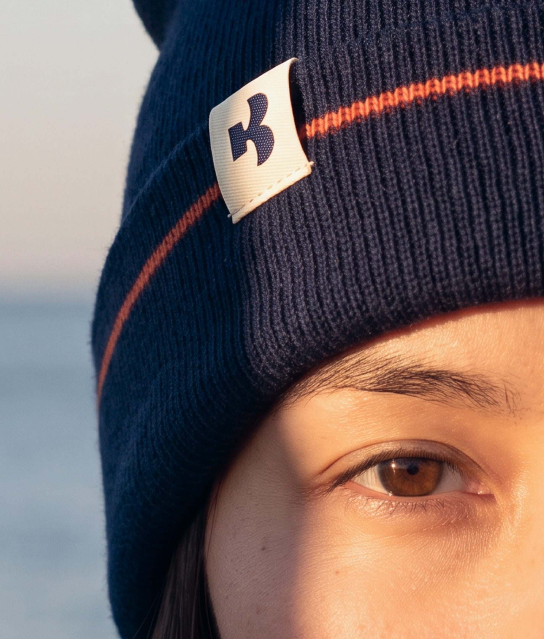
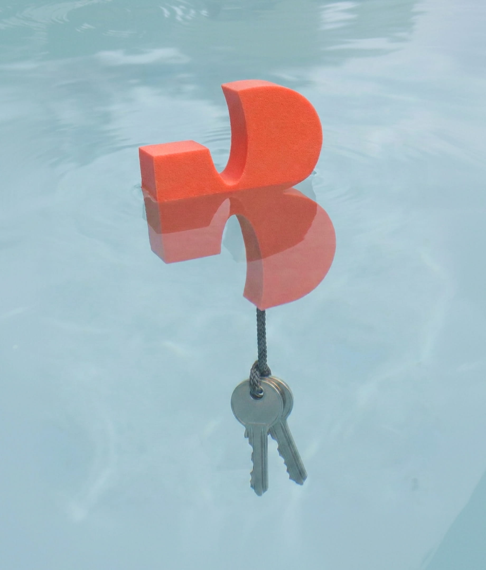
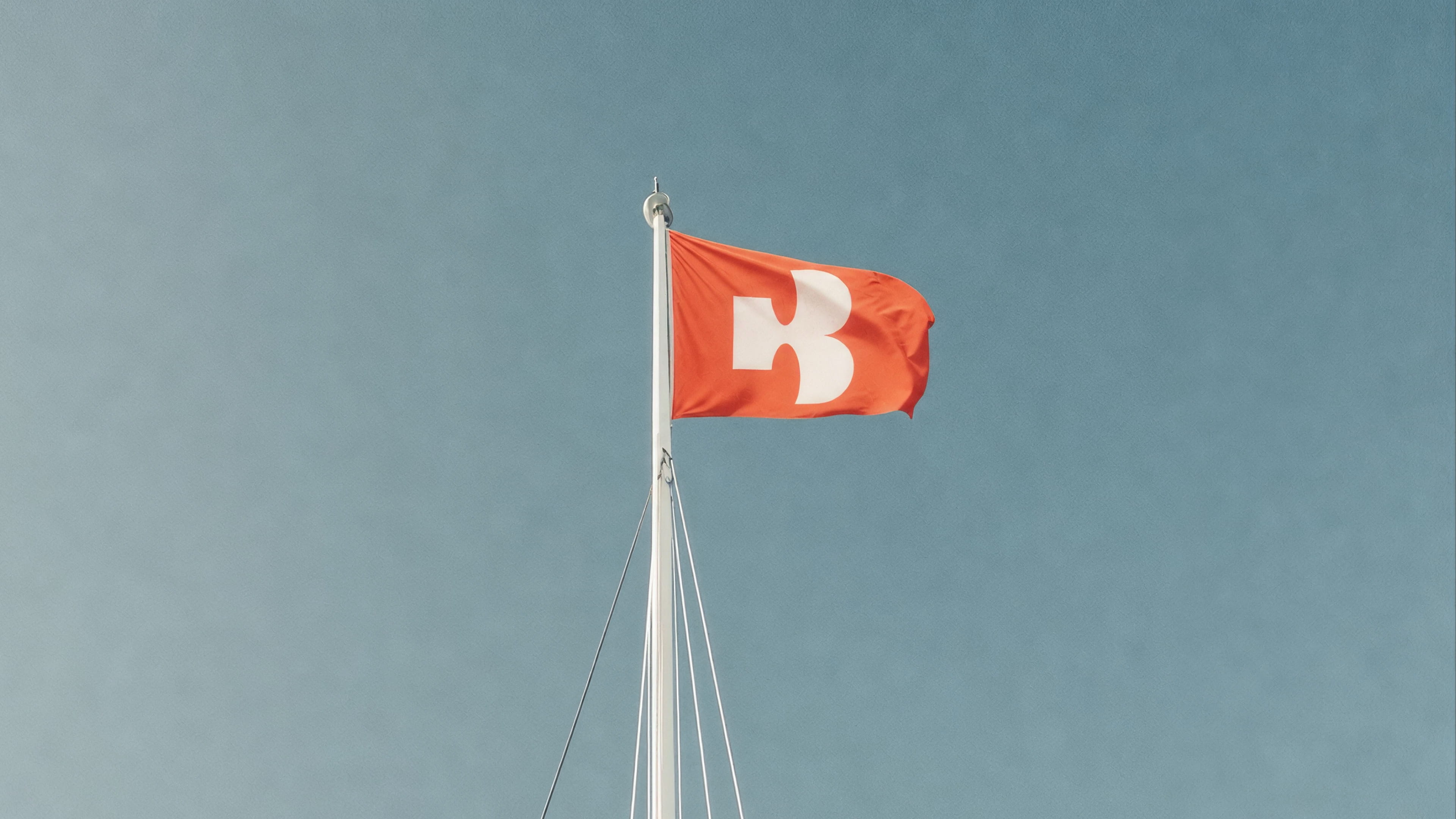
The main Baluga mark combines an upper case B, a tail, and shapes inspired by sails blowing in the wind. Organic yet structured, it anchors the entire identity and becomes a starting point for other elements found within it.
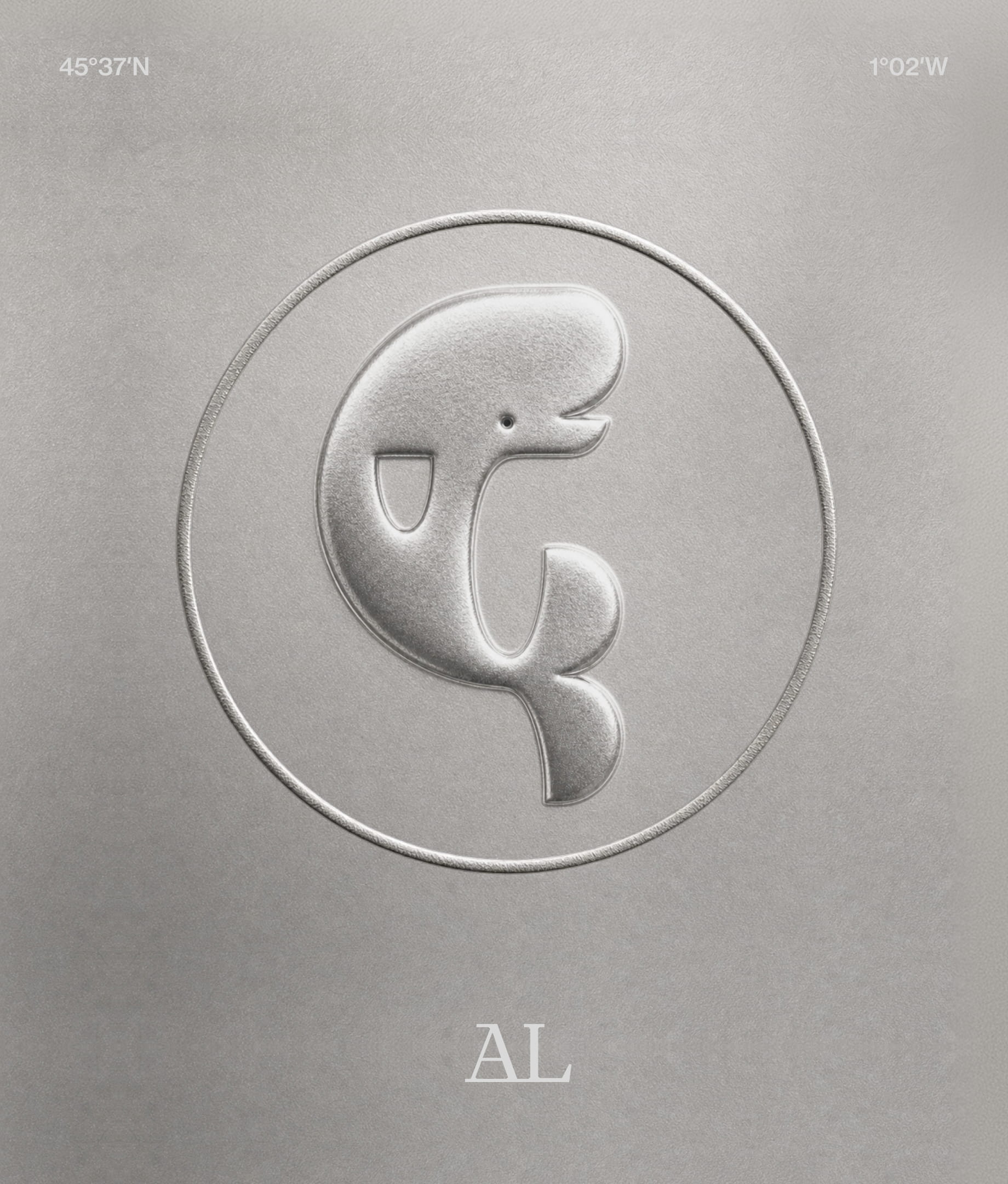
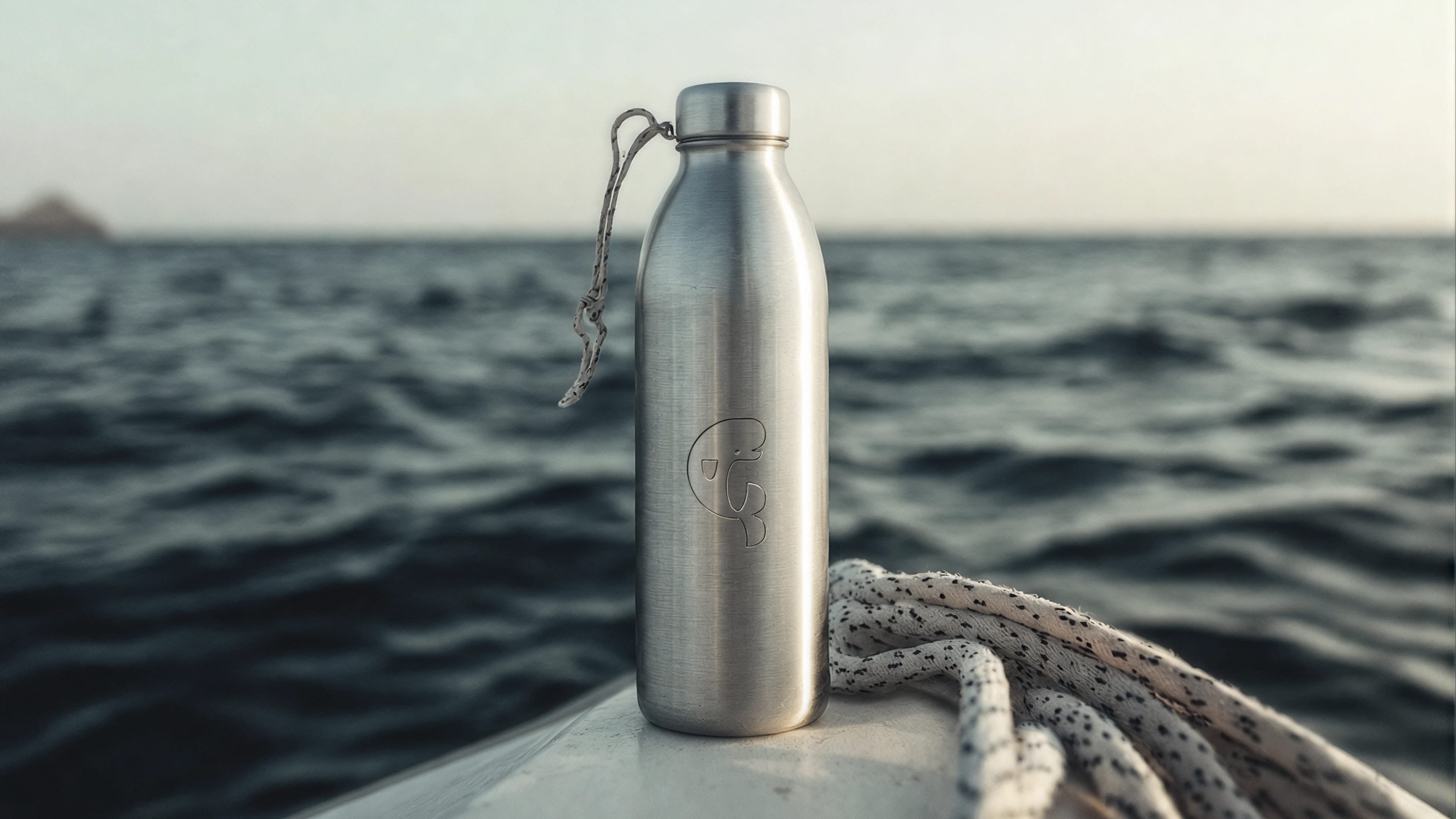
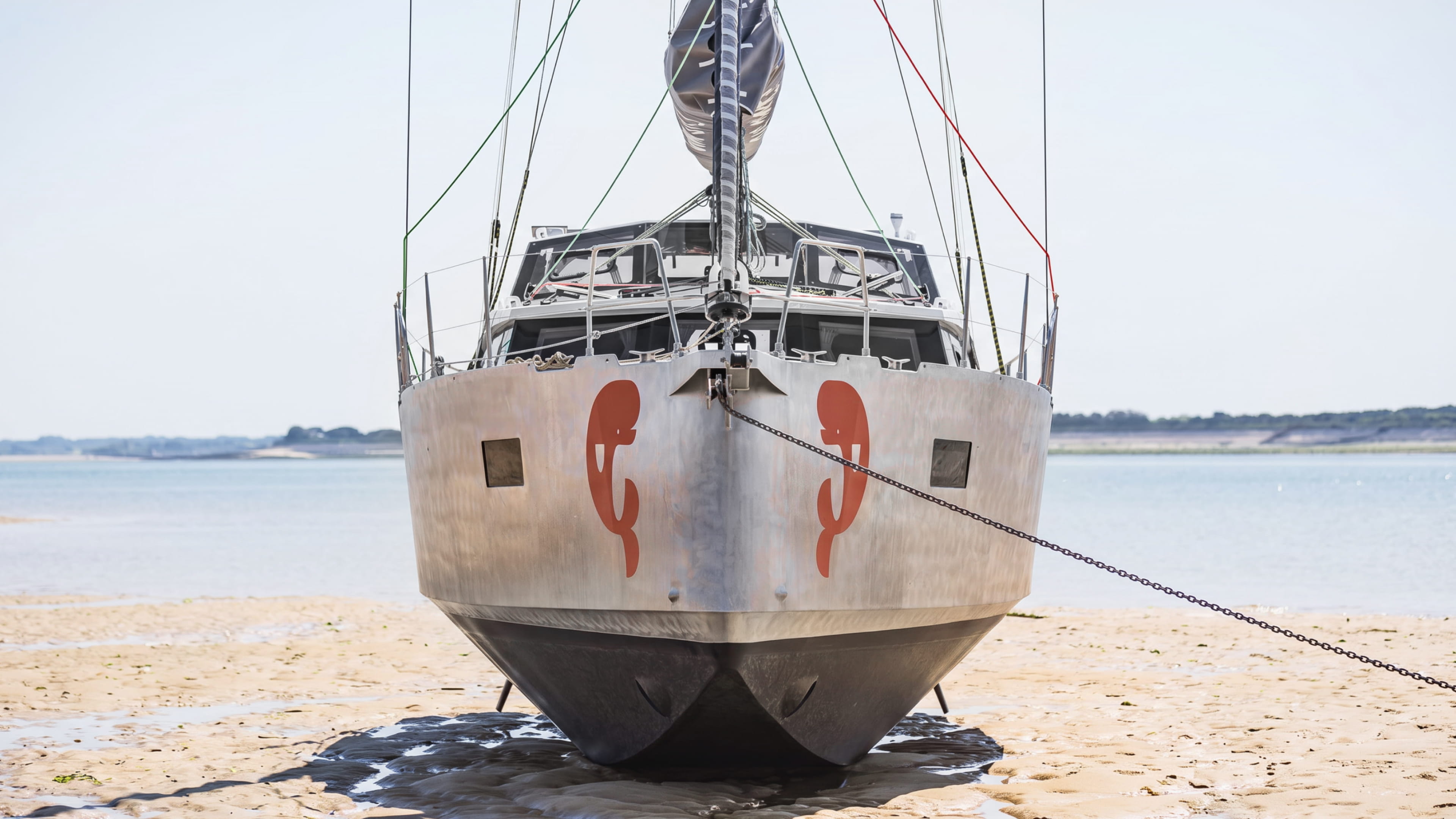
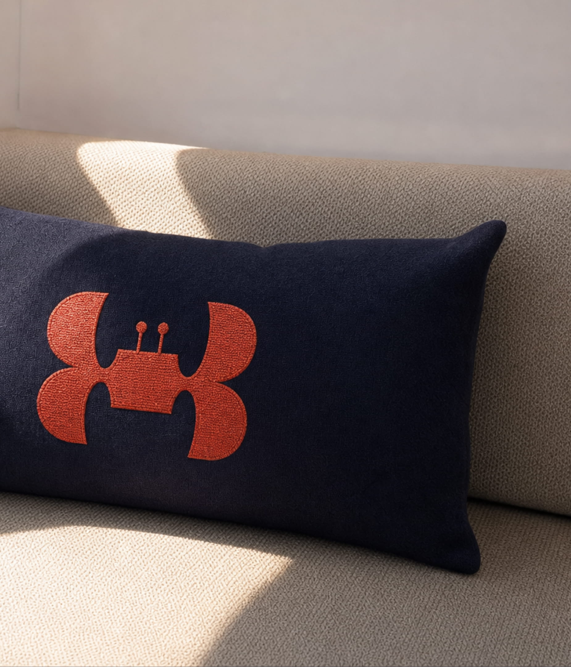
To comlement our B tail logo, we crafted AL, the friendly mascot for the boat. AL quickly got so belowed that he earned his place on the front of the boat, and gets to guide it through the seas every day.
The two main visual elements have been crafted based on the same geometry to create a sense of unity and precision. Bert, Al's sidekick, also carries the same construction principles.
KIND WORDS
SHOUT-OUTS
Natalia Kowaleczko / Tony Mingo / Michelle Busy

