AoPS
Creating a space to think.
Brief
AoPS leadership came to us with a multi-faceted problem. After 20+ years, the brand had become fragmented, lacked visual coherence, and didn’t communicate their rigor, impact, or identity. And while the company was originally built around mathematics, it had long since expanded into other subjects like science and language arts, which added another layer of inconsistencies in sub brands, design system strategy, and high-level messaging clarity. They were seeking a rebrand that captured their unique blend of warmth and performance, clarity and intellectual challenge, humor and discipline.
Audience
Art of Problem Solving students span grades 1–12, but the primary audience is parents who want to give their kids the opportunity to become better thinkers and find joy in solving hard problems.
Opportunity
Double down on the tangible. The elite education space has blown up in recent years, but AoPS has been doing this, and dominating global math competitions, for 20+ years. Memorization isn’t the answer. Space to explore and learn and try things on for size with like-minded kids is. Against a backdrop of formulaic tech and instant answers, Art of Problem Solving is providing kids space to think.
Concept
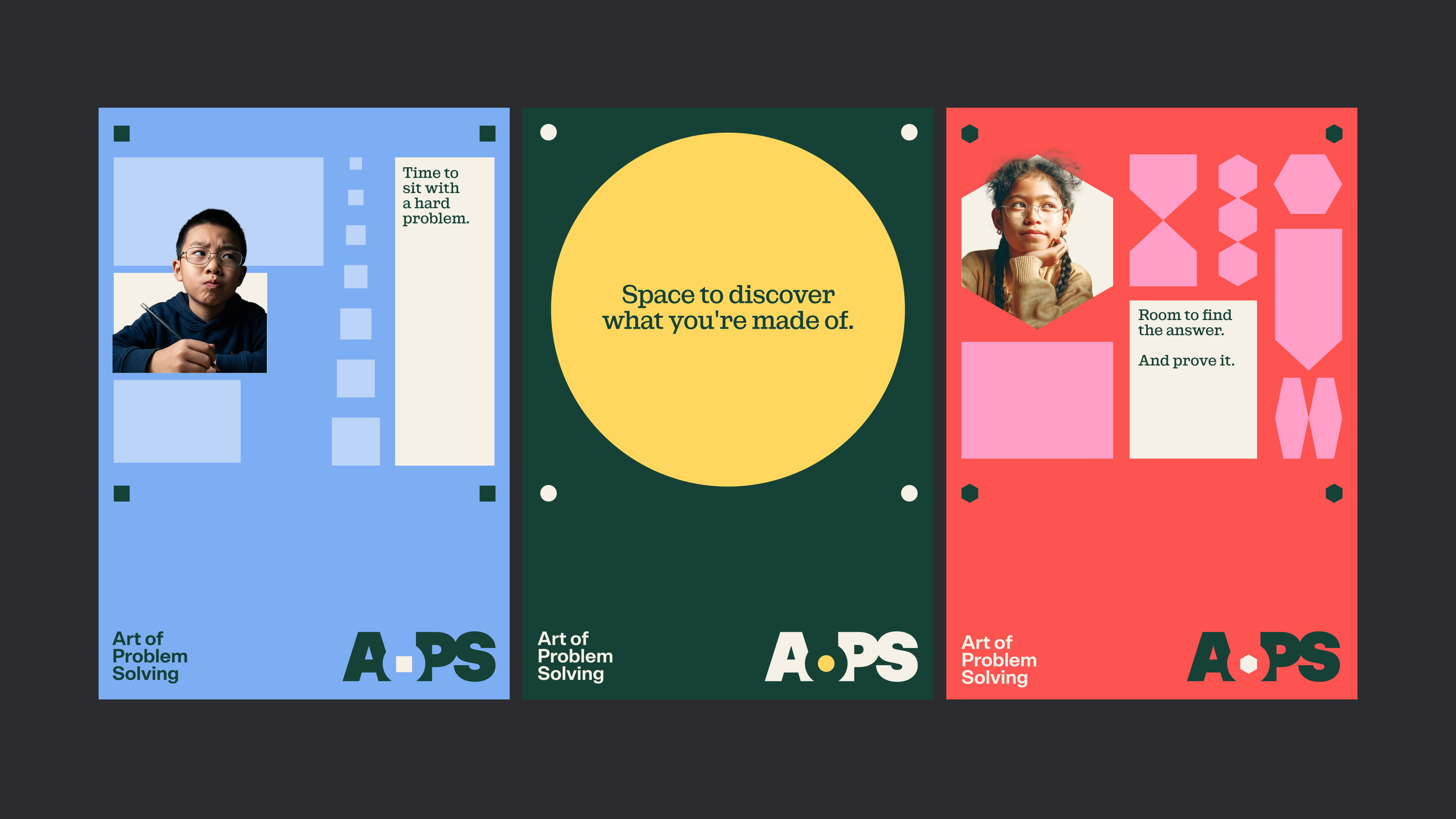
Today, most education is about eliminating the unknown as quickly as possible. Get to the answer. Fill in the blank. Remove the uncertainty. Art of Problem Solving does the opposite. They invite kids into the unknown of a hard problem and give them space to find out what lives there. Their curiosity. Their strengths. Thinking they didn't know they were capable of. With space to think, kids learn to reason, not just calculate. To question, not just solve. To sit with a hard problem until they see what others miss.
Design
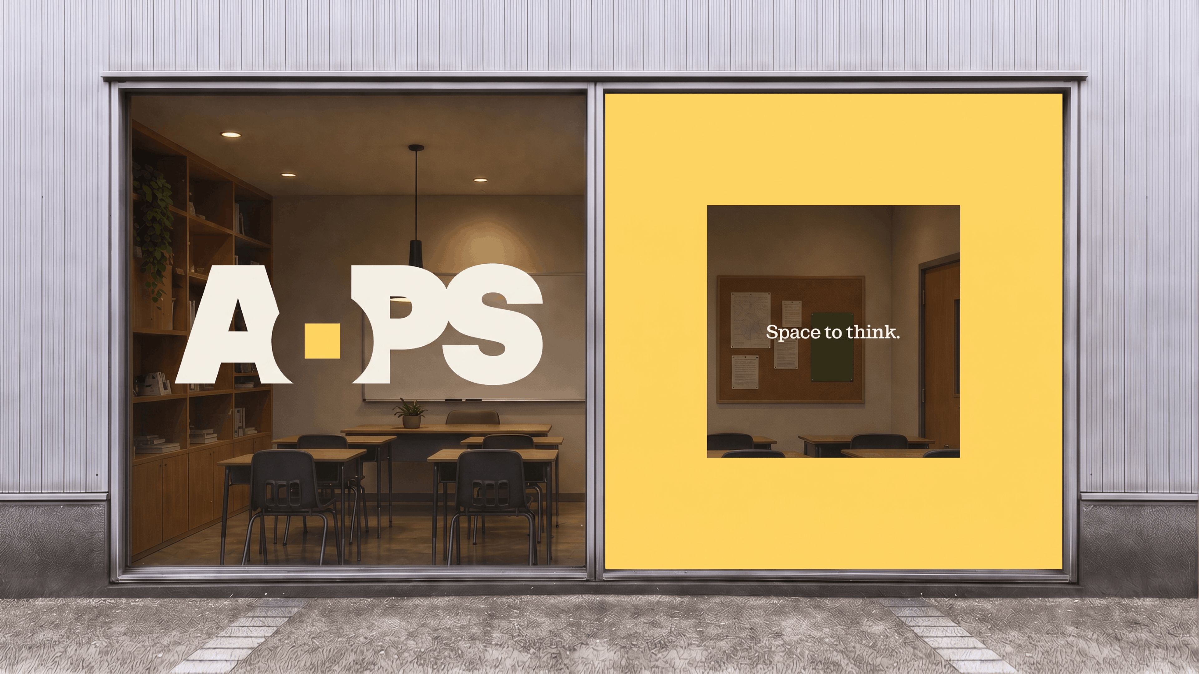
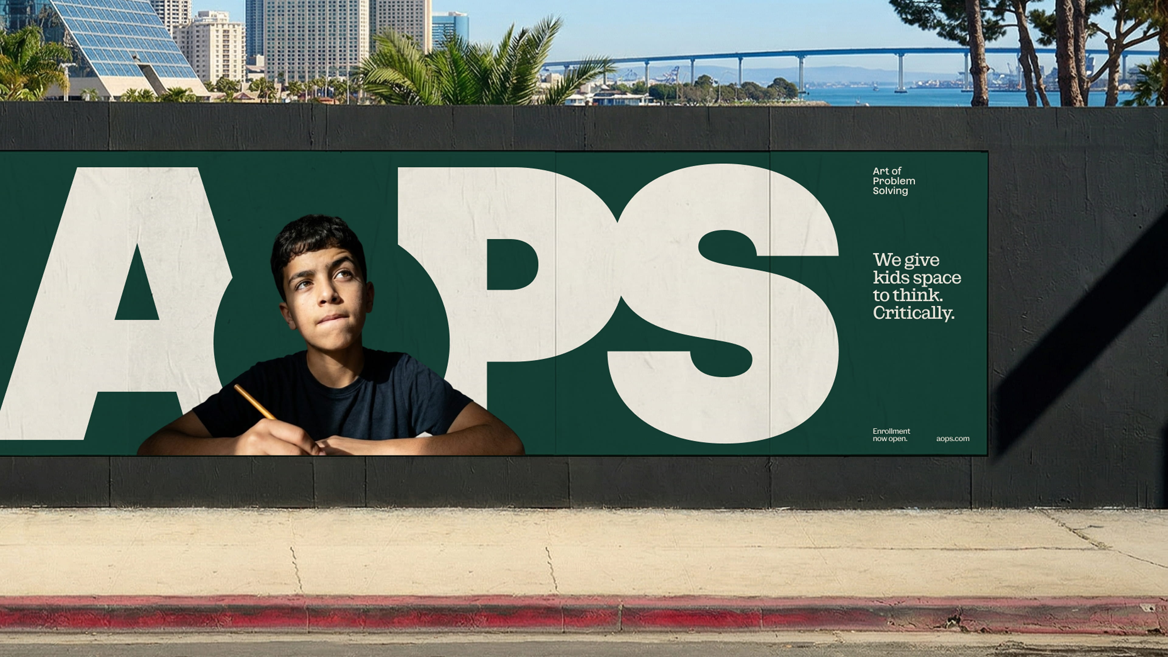
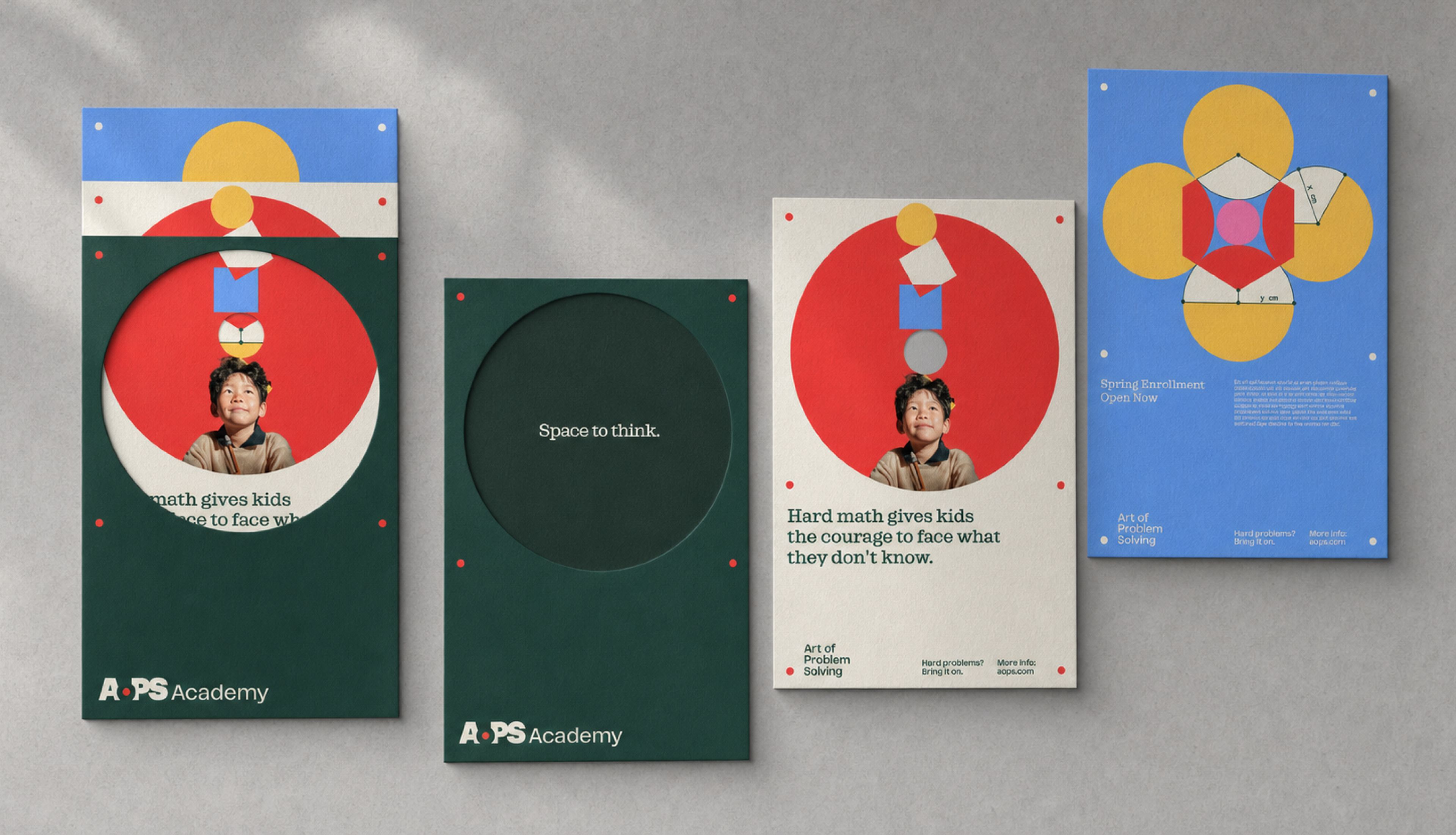
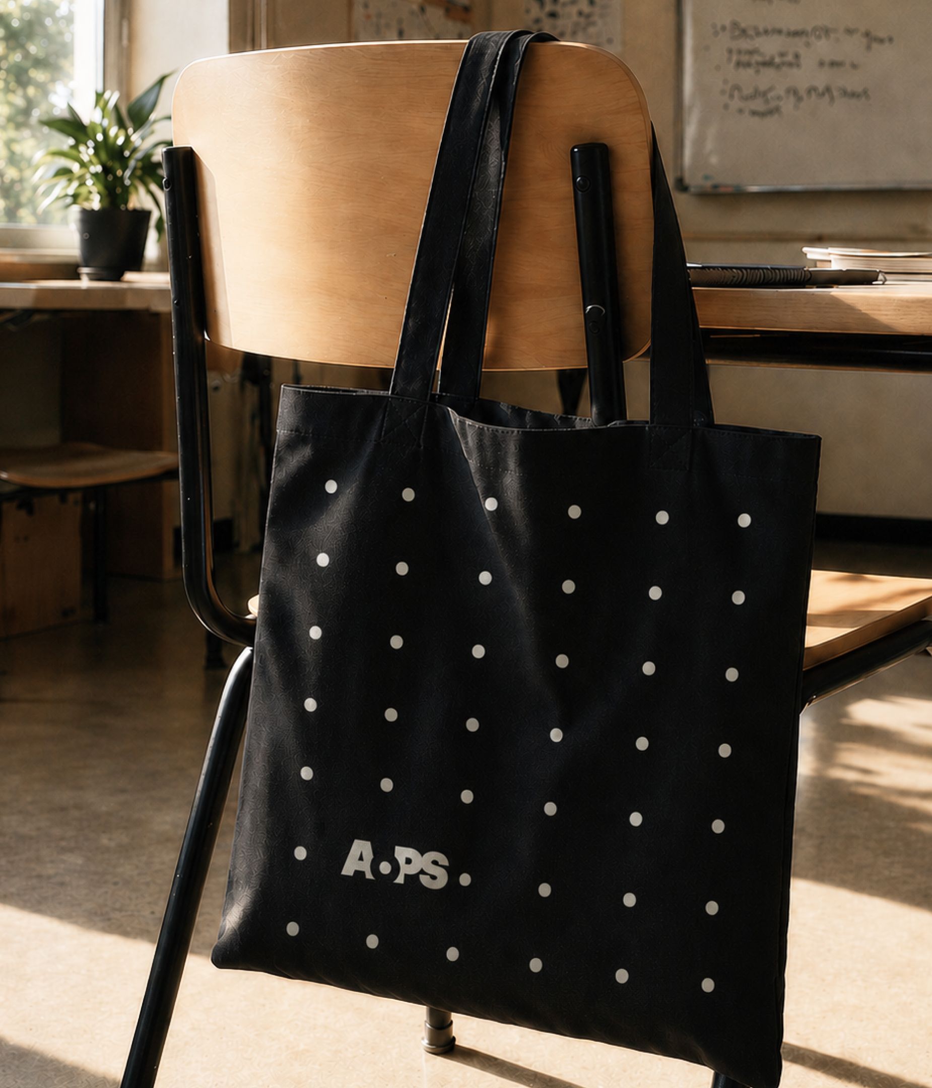
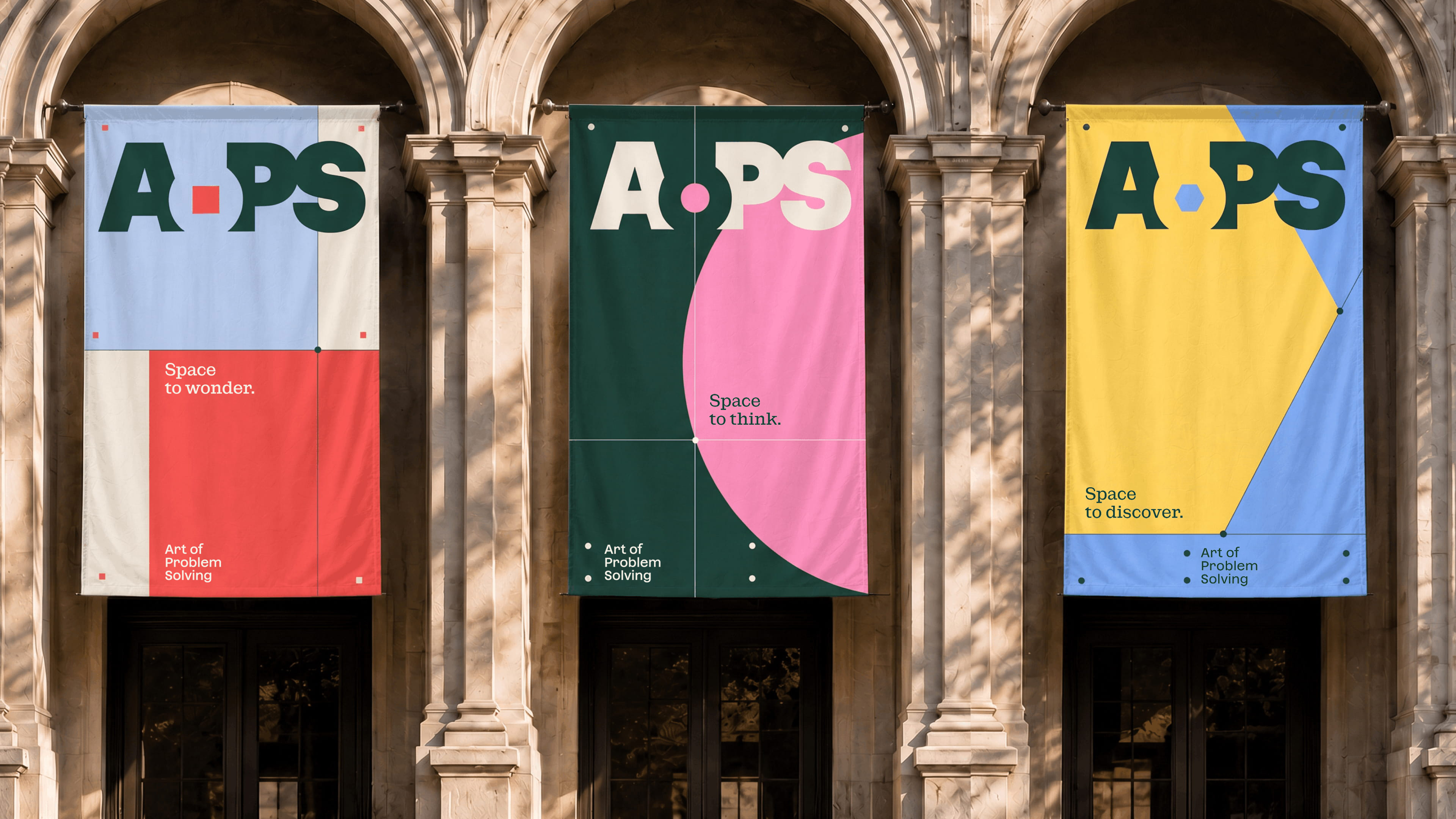
While the old AoPS logomark was beloved for it’s reference to math, the new one represents the core of what AoPS is really about: providing space for high-performing kids to think deeply and discover the joy in solving difficult problems of all types. What happens in this space is quintessentially AoPS. It might contain a simple circle, square, or hexagon; a mathematical diagram; a photograph of a kid on the verge of discovery; but the idea is the same: when AoPS creates a space to think, anything is possible. The new logo system, color palette, and graphic elements evolve across sub brands, and a shared typographic system keeps it all ties together.
Voice
Ingenious, quirky, steadfast, encouraging. We crafted a brand voice that spans the entire Art of Problem Solving organization, with variations that give each sub brand and product brand a unique tone based on their specific audiences.
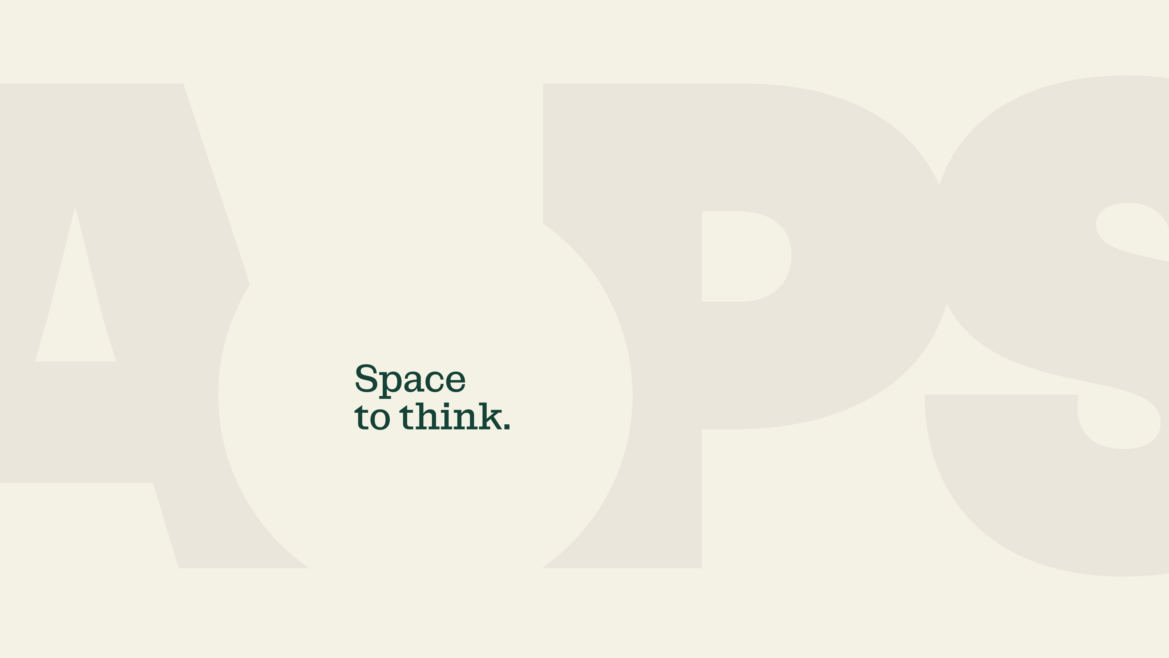
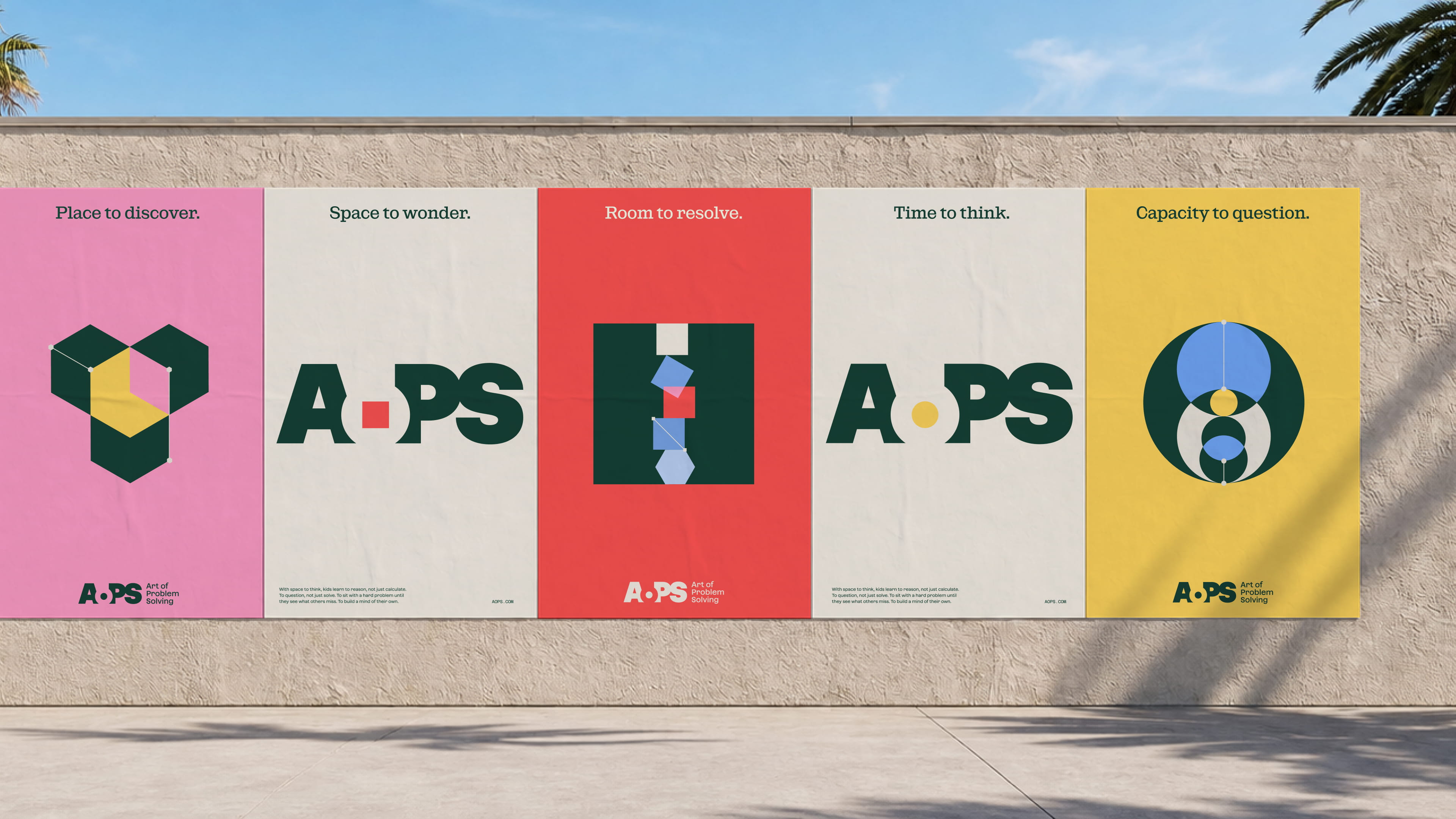
With space to think, kids learn to reason, not just calculate. To question, not just solve. To sit with a hard problem until they see what others miss. To build a mind of their own.
At the core of the visual identity is the idea of space.
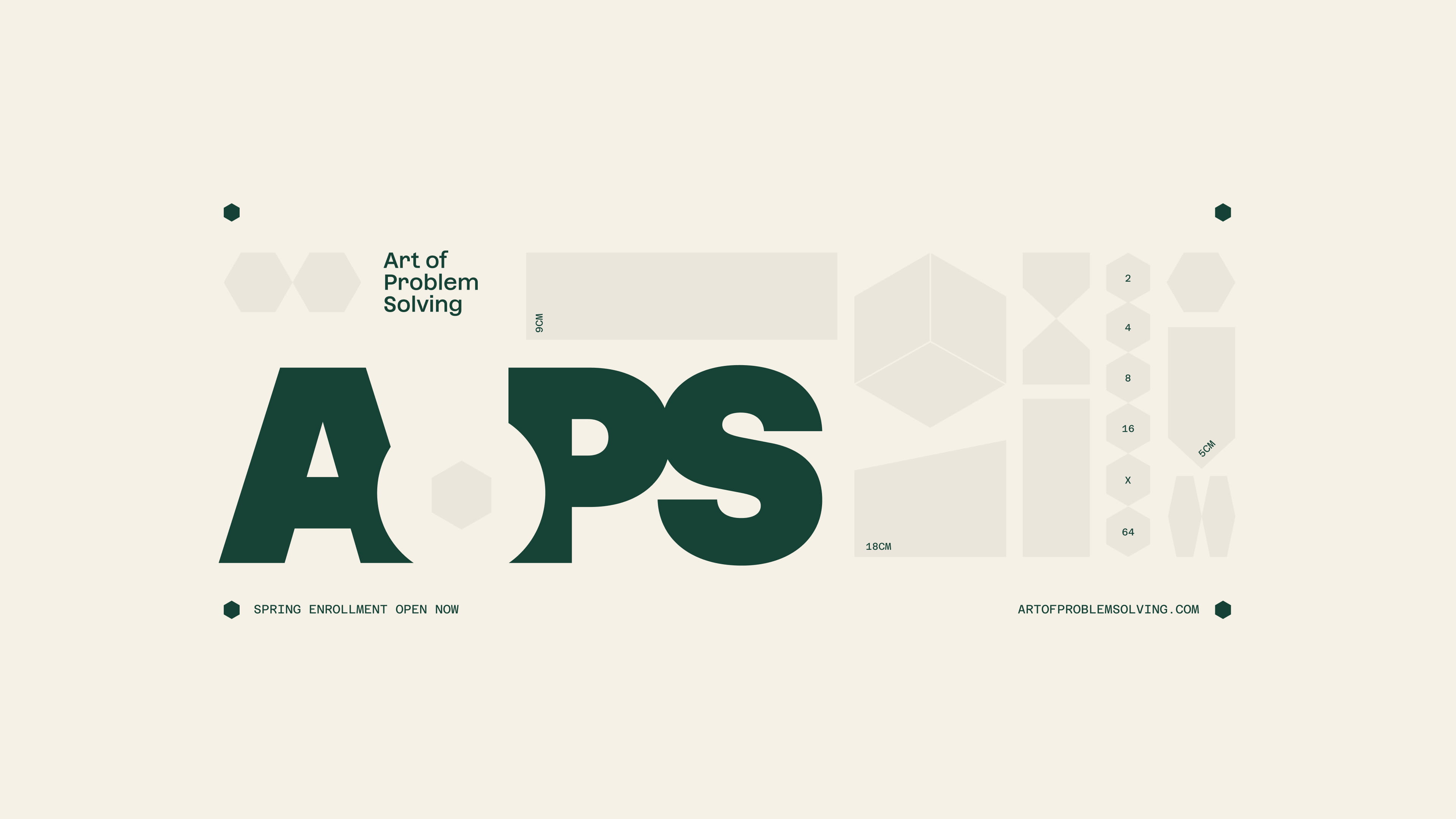
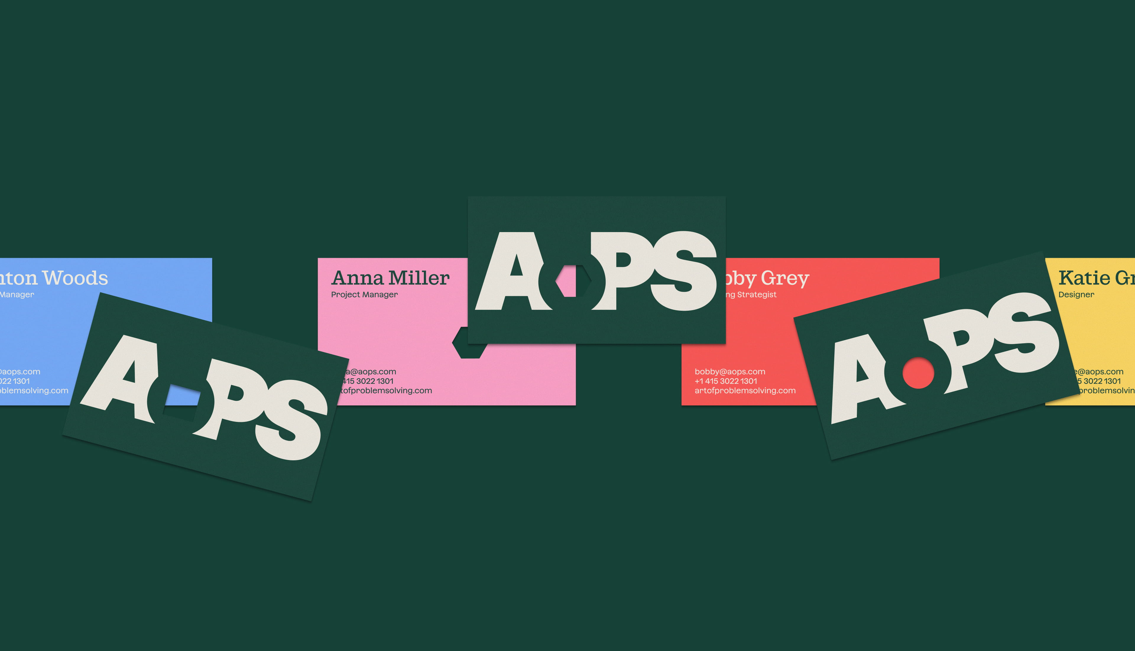
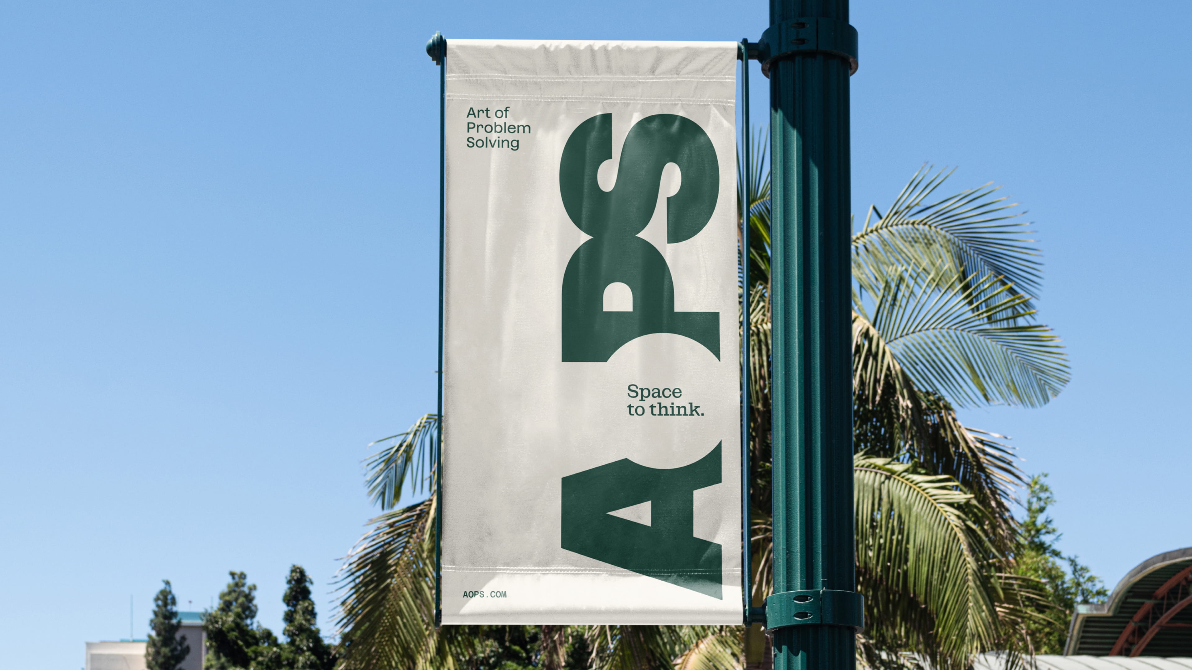
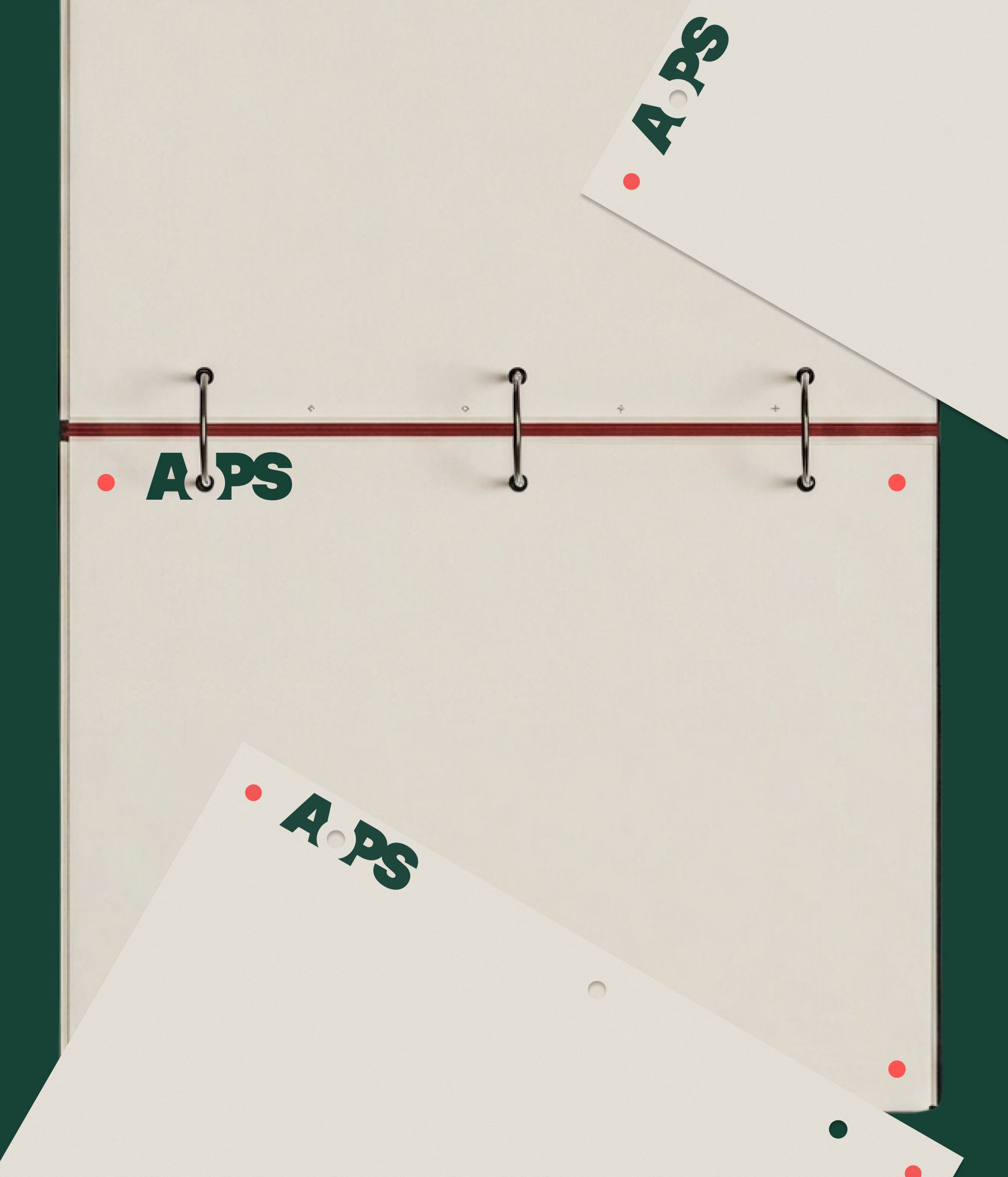
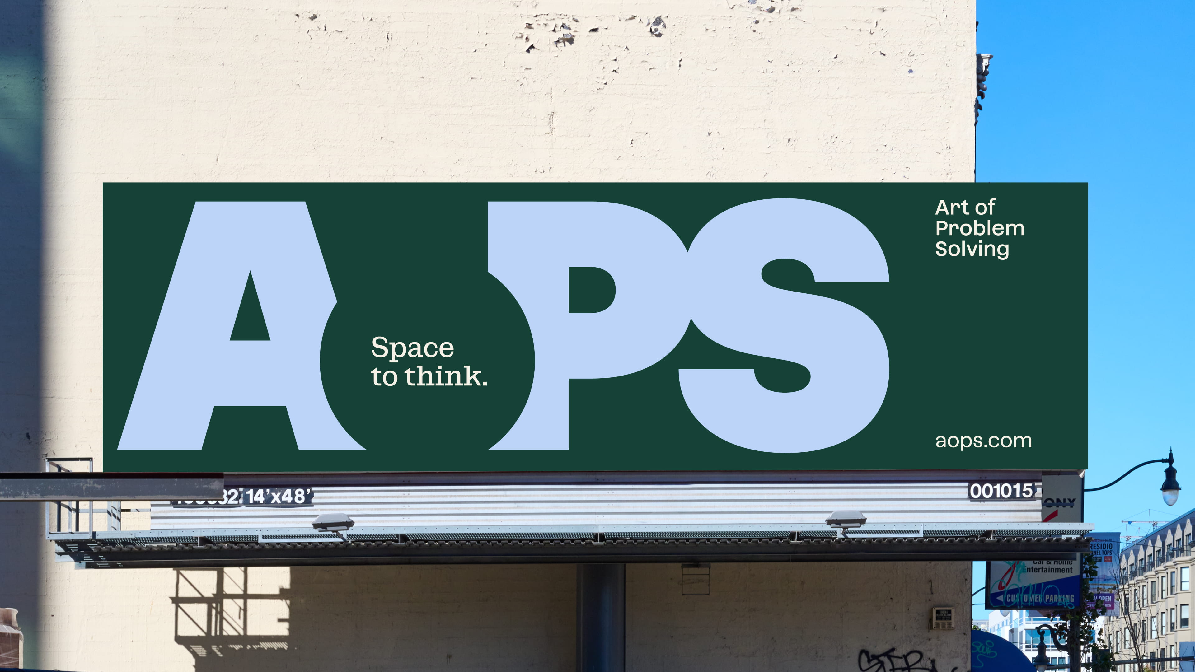
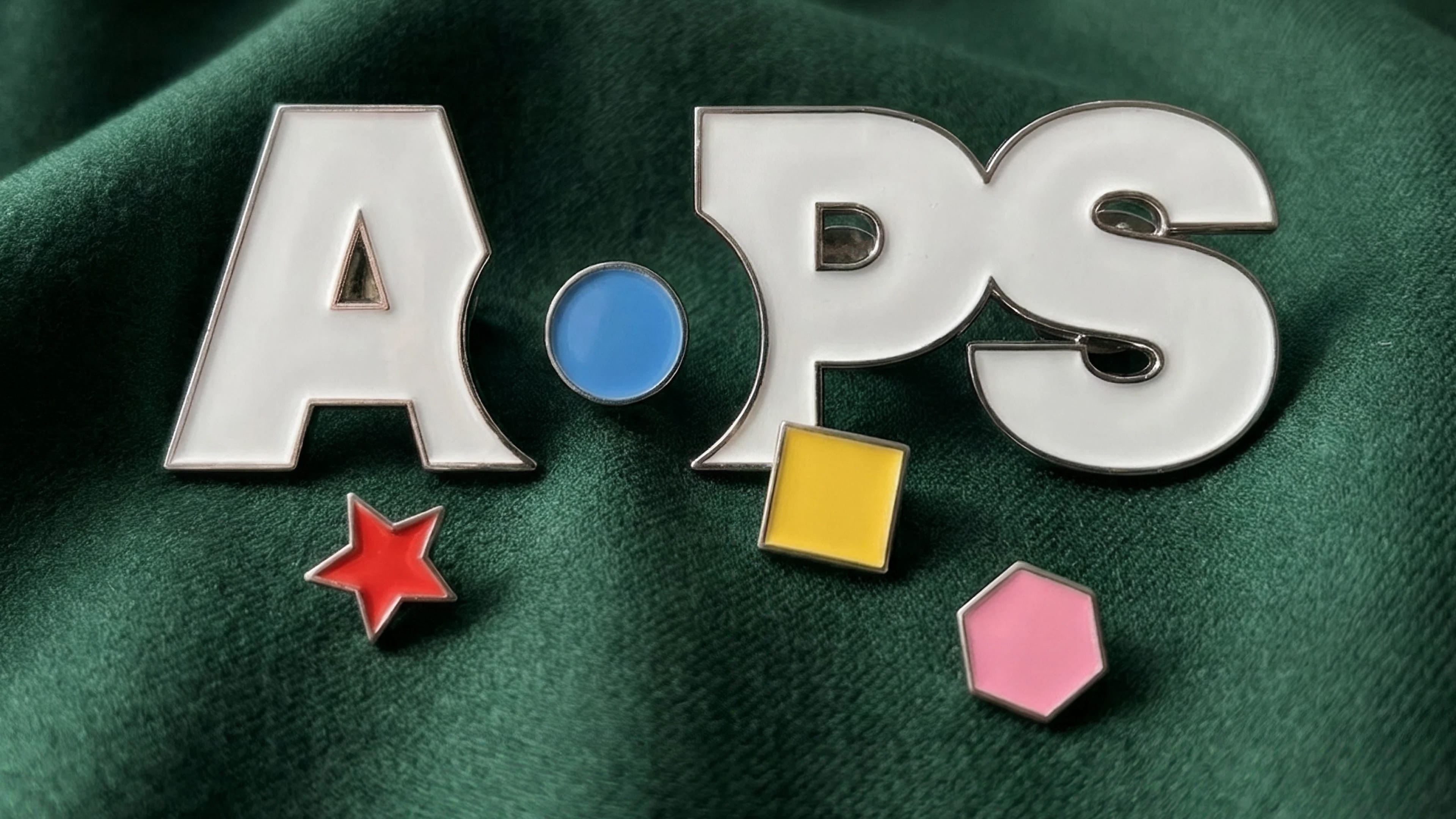
The logomark itself is built around a counterspace meant to be filled with a world of intellectual challenges, possibilities, and focus.
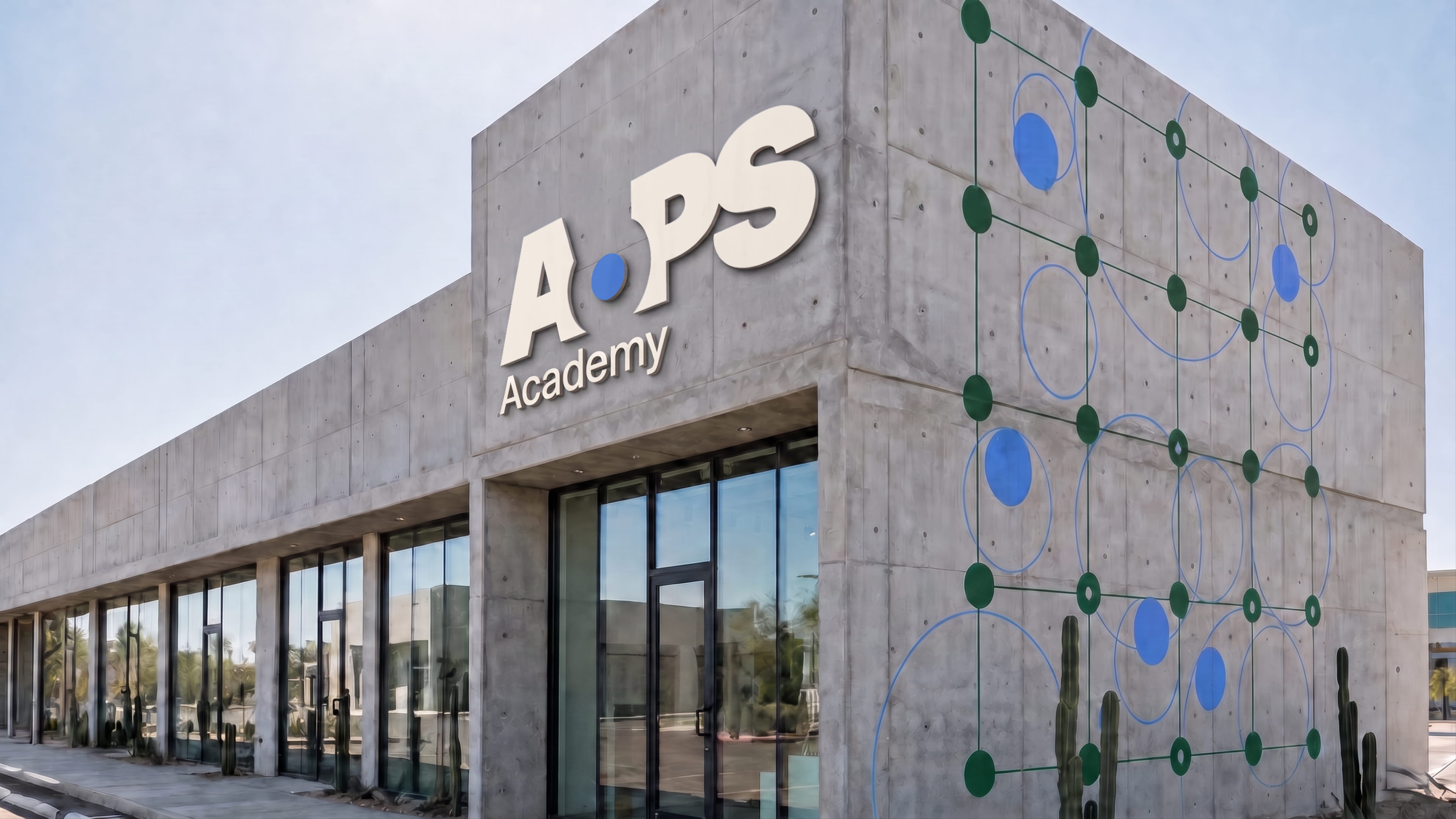
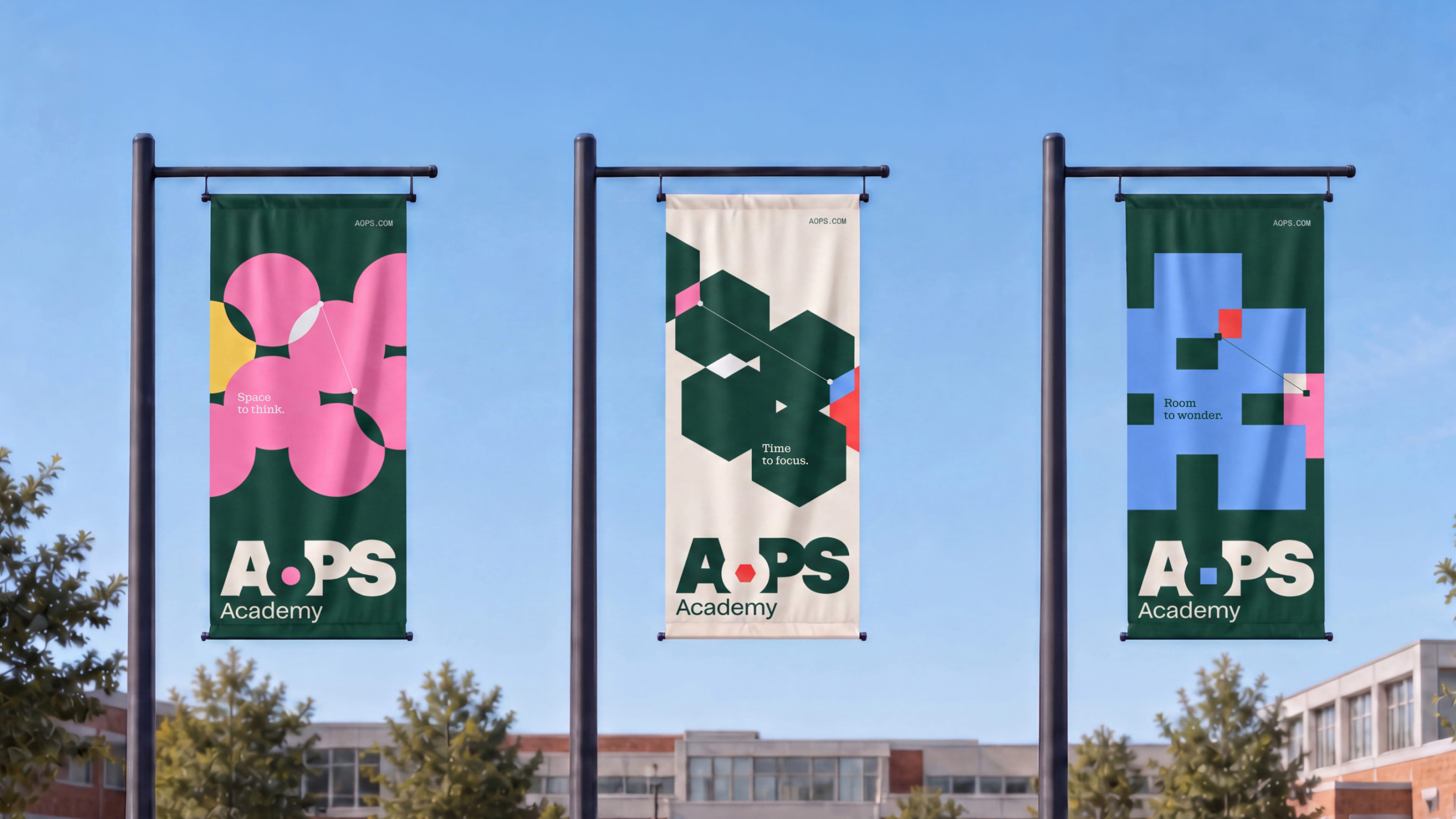
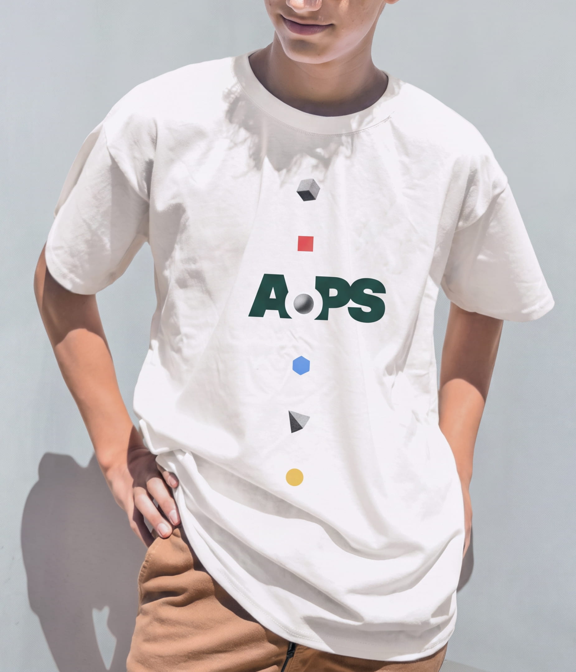
Outside of the logomark, shapes like circles, squares, and hexagons create and hold additional space for thoughts and ideas.
The AoPS tone of voice reflects the brand's personality and stands apart in the education space.
Its “steadfast” and “encouraging” traits give it conviction and warmth, while its "ingenious" and "quirky" traits provide a unique edge and originality to its messaging that feels novel in the category and unmistakably AoPS.
Along with these personality traits, we created comprehensive writing guidelines that describe and demonstrate the principles, structural patterns, and vocabulary behind the verbal system so internal and external teams can foster brand messaging across everything they do going forward.
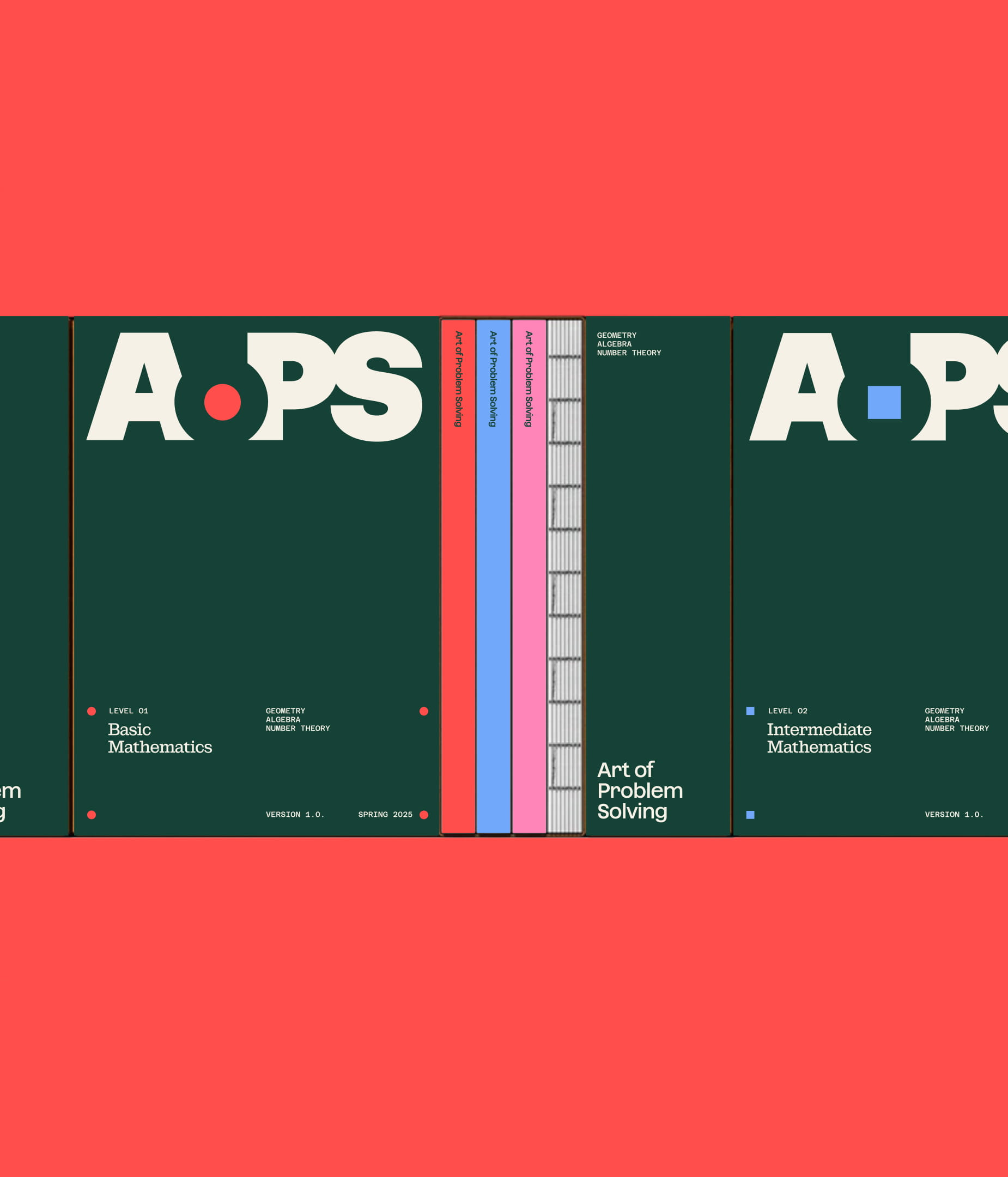
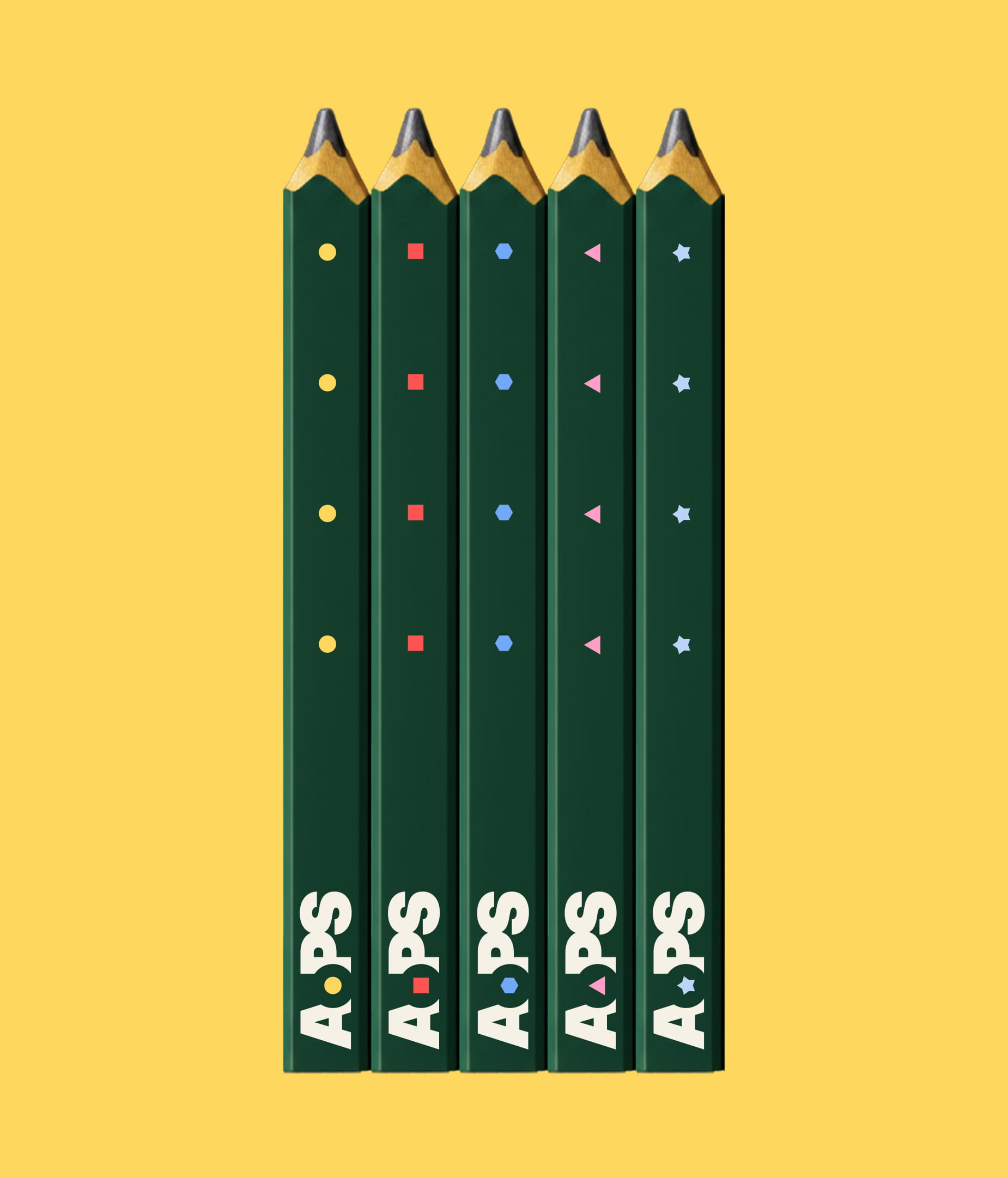
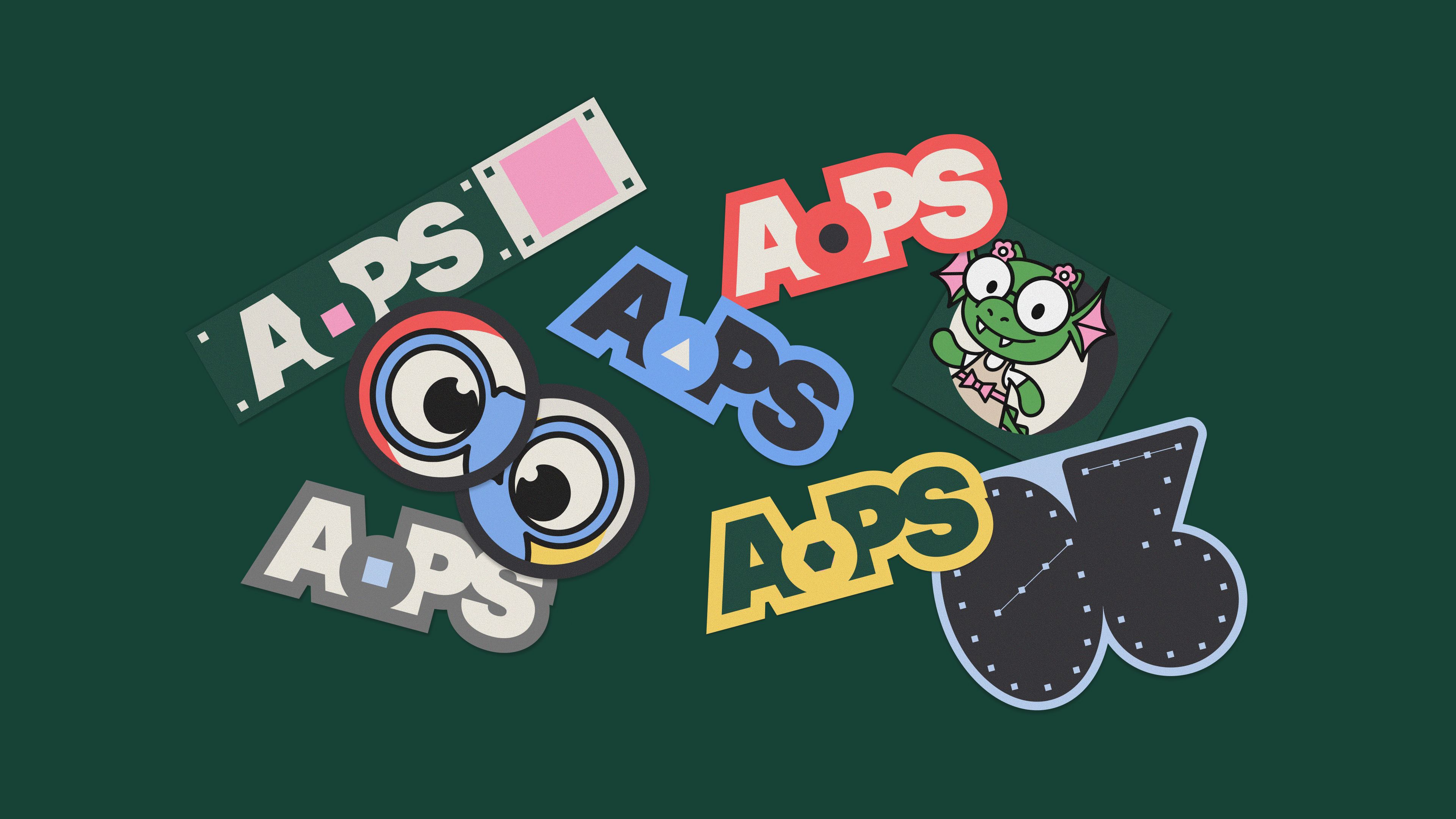
The default counter is a circle, but can be replaced by other shapes to convey a new problem or idea, and tie together visual themes and ideas across brand expressions.
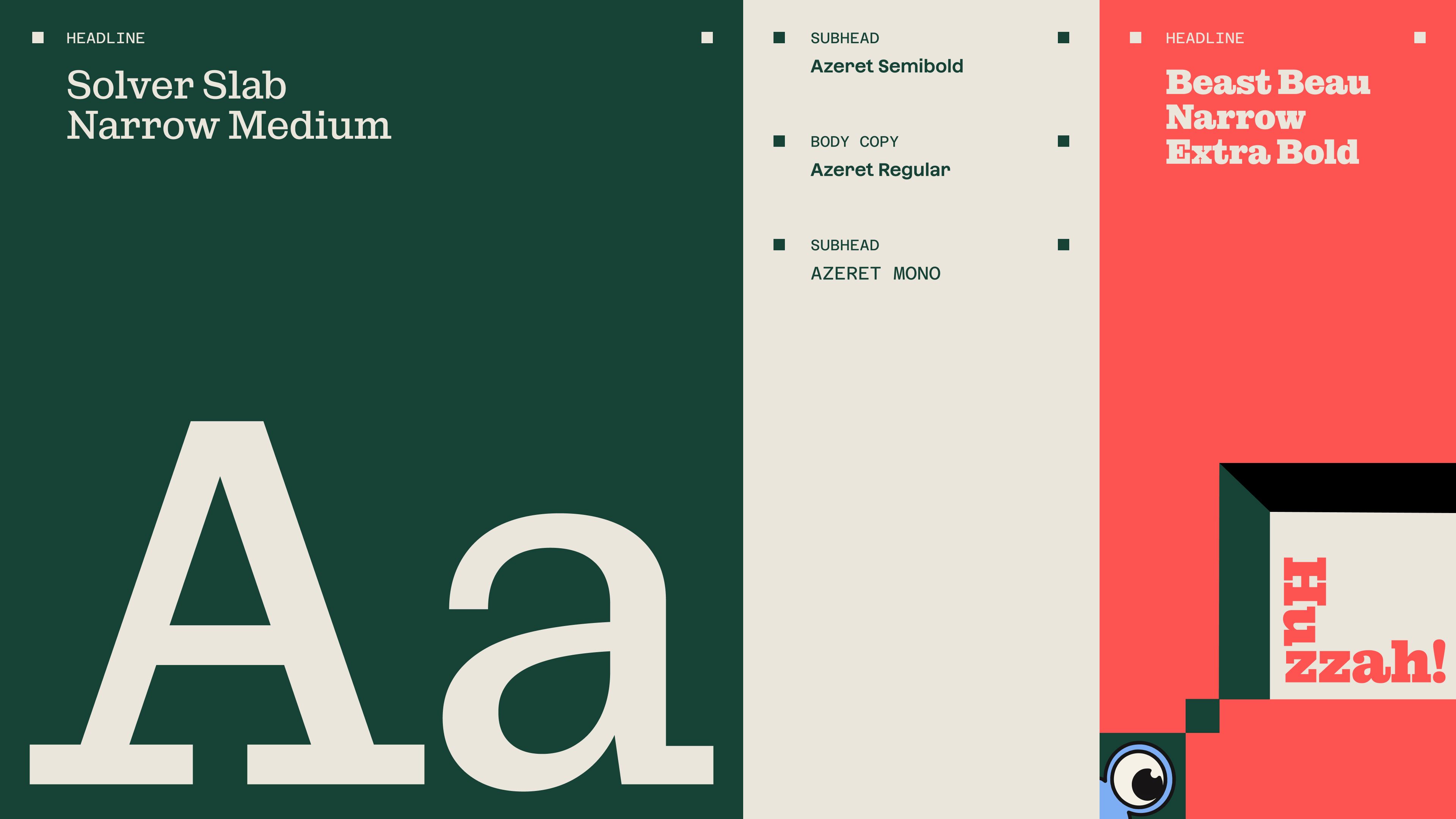
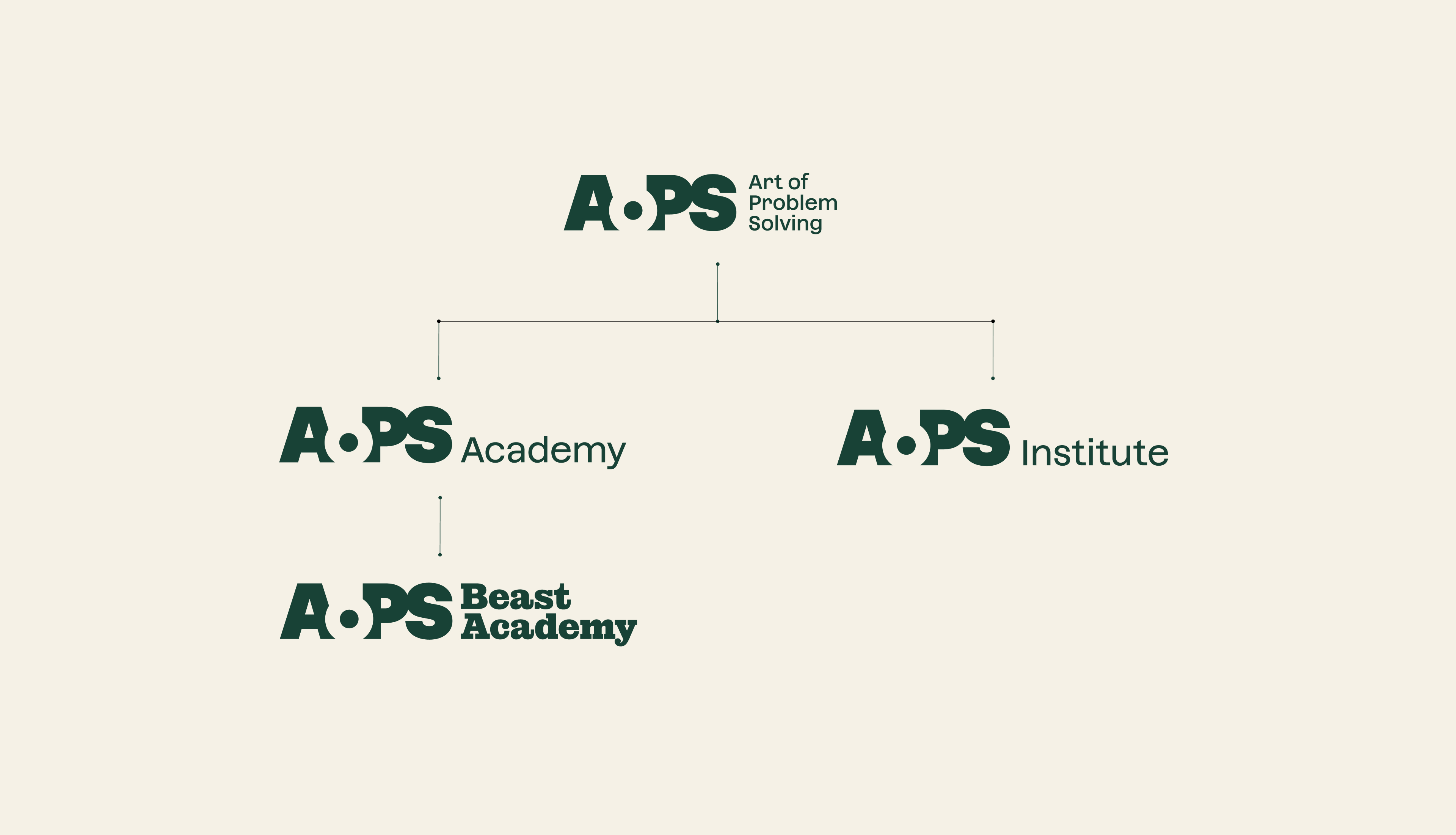
Twenty years of growth in all directions had created a lot of fragmentation and confusion about what was actually a brand, what was a sub brand, a product brand, or simply a resource or tool that needed to be absorbed or discontinued entirely.
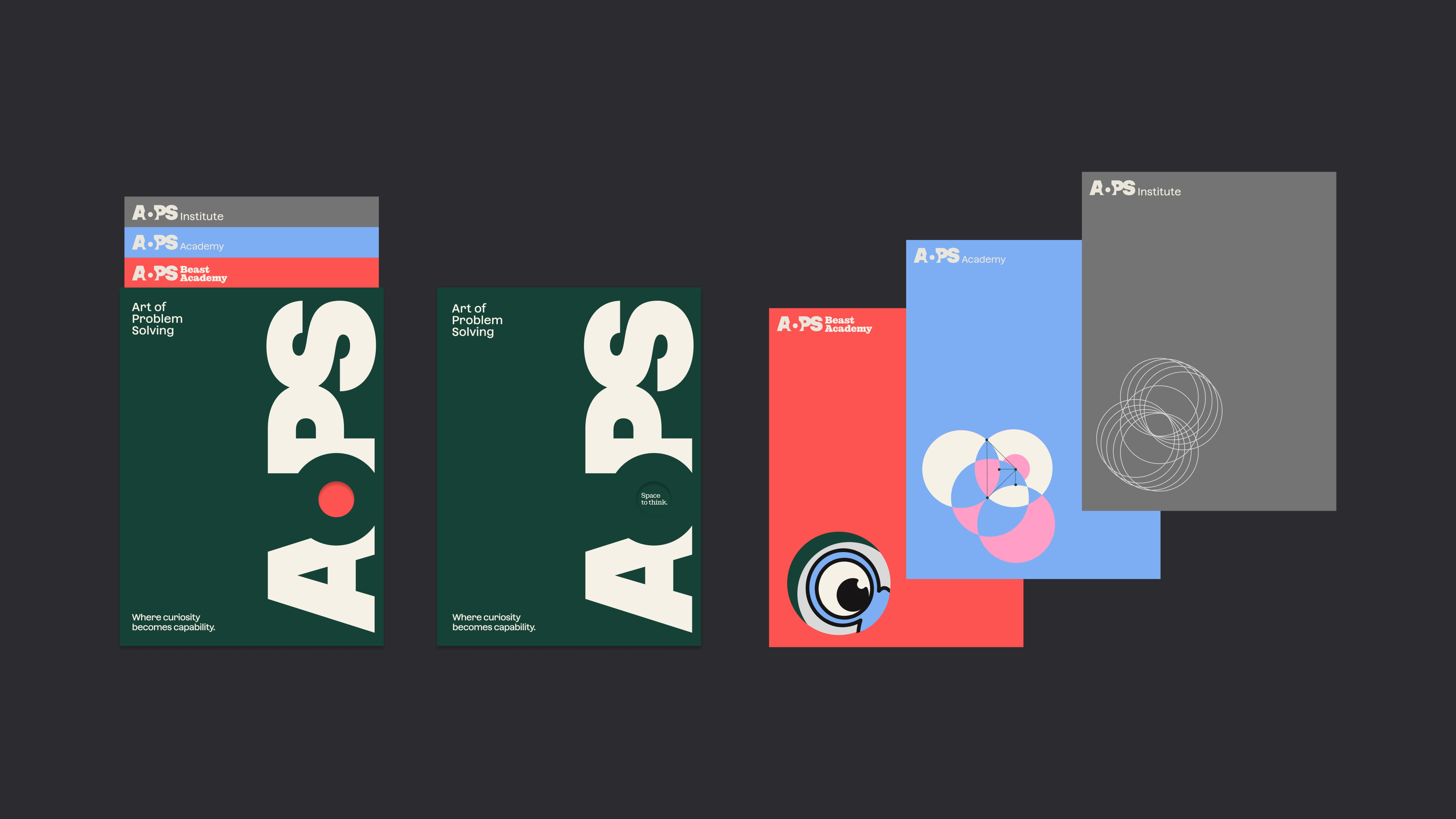
In the end, we landed on a clear brand architecture with Art of Problem Solving at the top and a structure of sub and product brands that connect visually and verbally but vary in personality, palette, and level of detail.
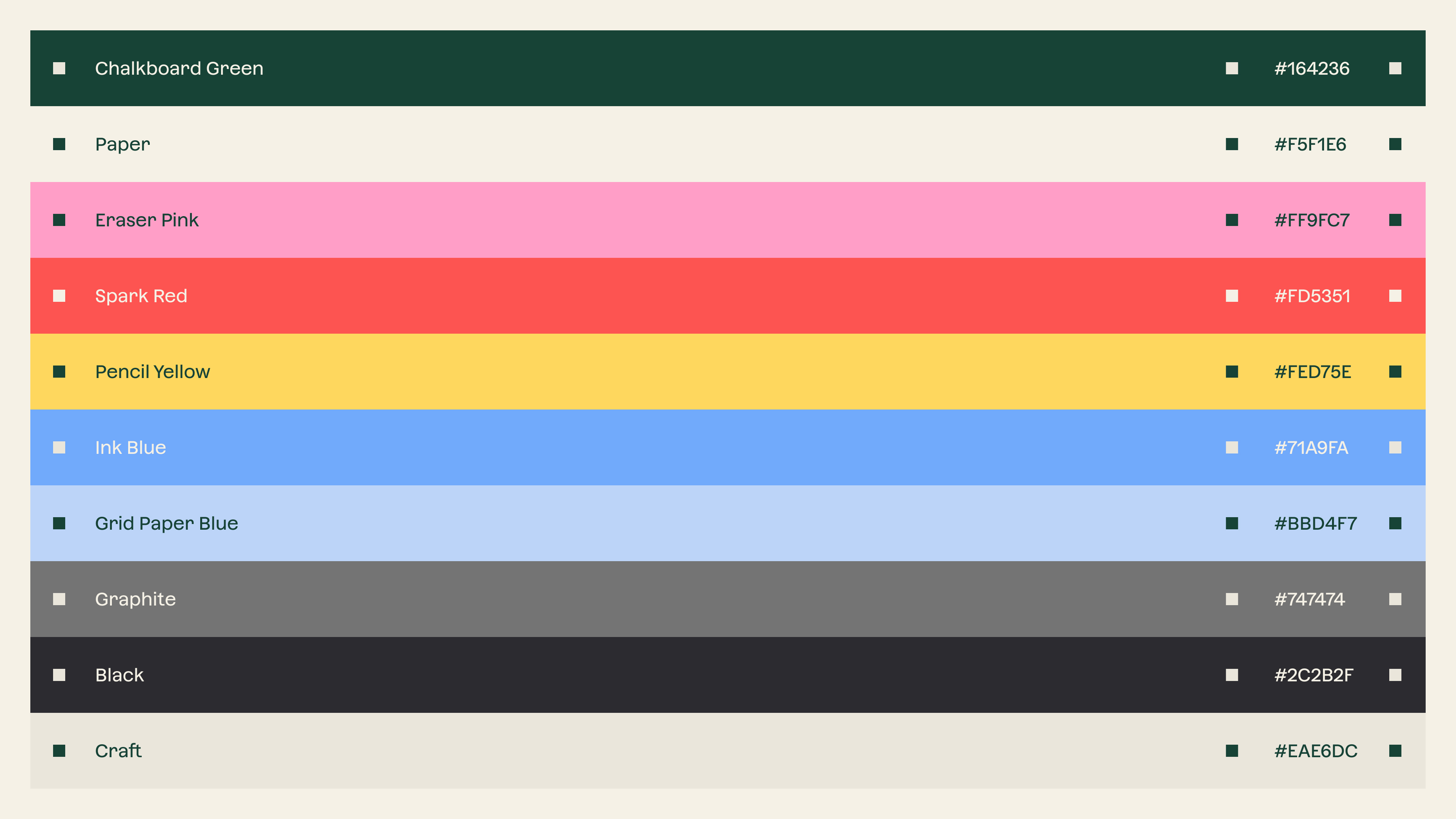
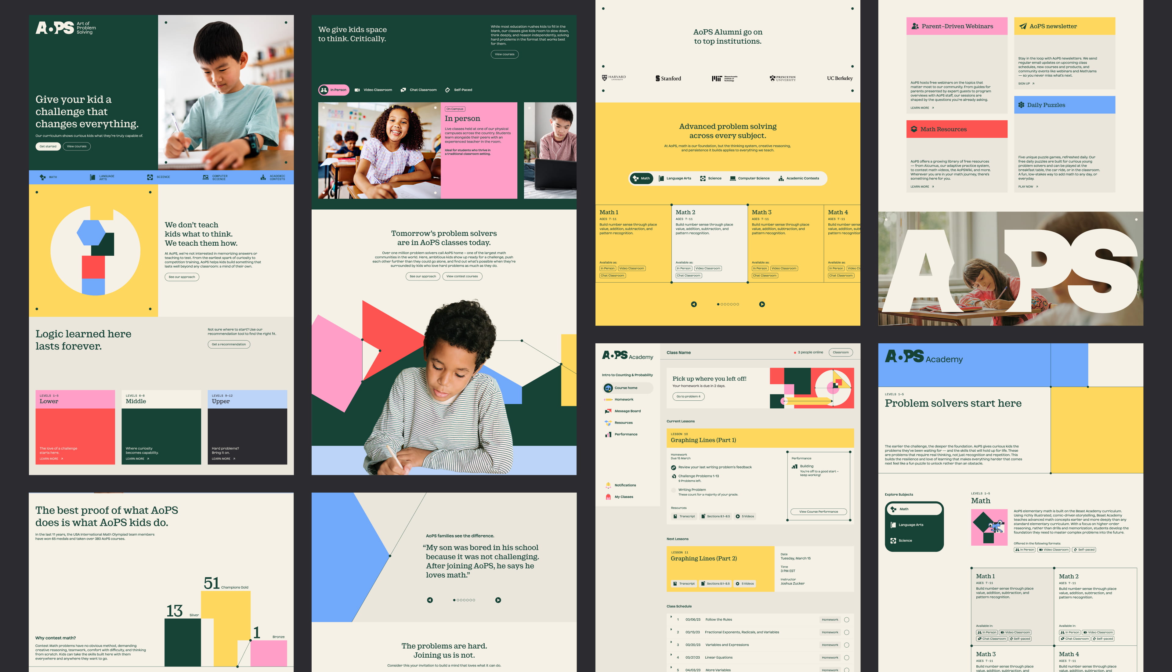
To differentiate and accomodate a range of audience and messaging needs across the brand architecture, we created a system that flexes across a spectrum but clearly holds them together as part of the same family.
Color hierarchies shift towards brighter or more neutral tones, shapes become dimensional and reveal playful characters, wireframes emerge to represent increasing complexity in challenges and ideas, and slight tonal shhifts
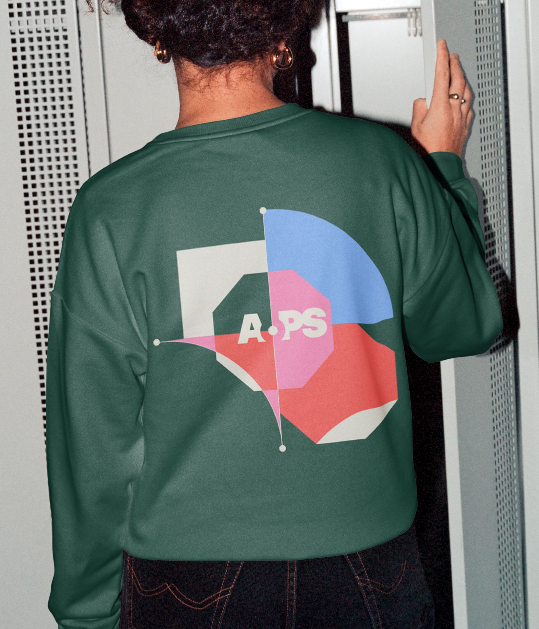
We also created a system of principles for how shapes behave and interact with each other, all inspired by the things AoPS does for its students: creating space, creating connection, building structure, and revealing insights.
Shapes can also spread, overlap, multiply, create grids, become dimensional portals, and render as technical wireframes depending on which brand, sub brand, or product brand they're associated with.
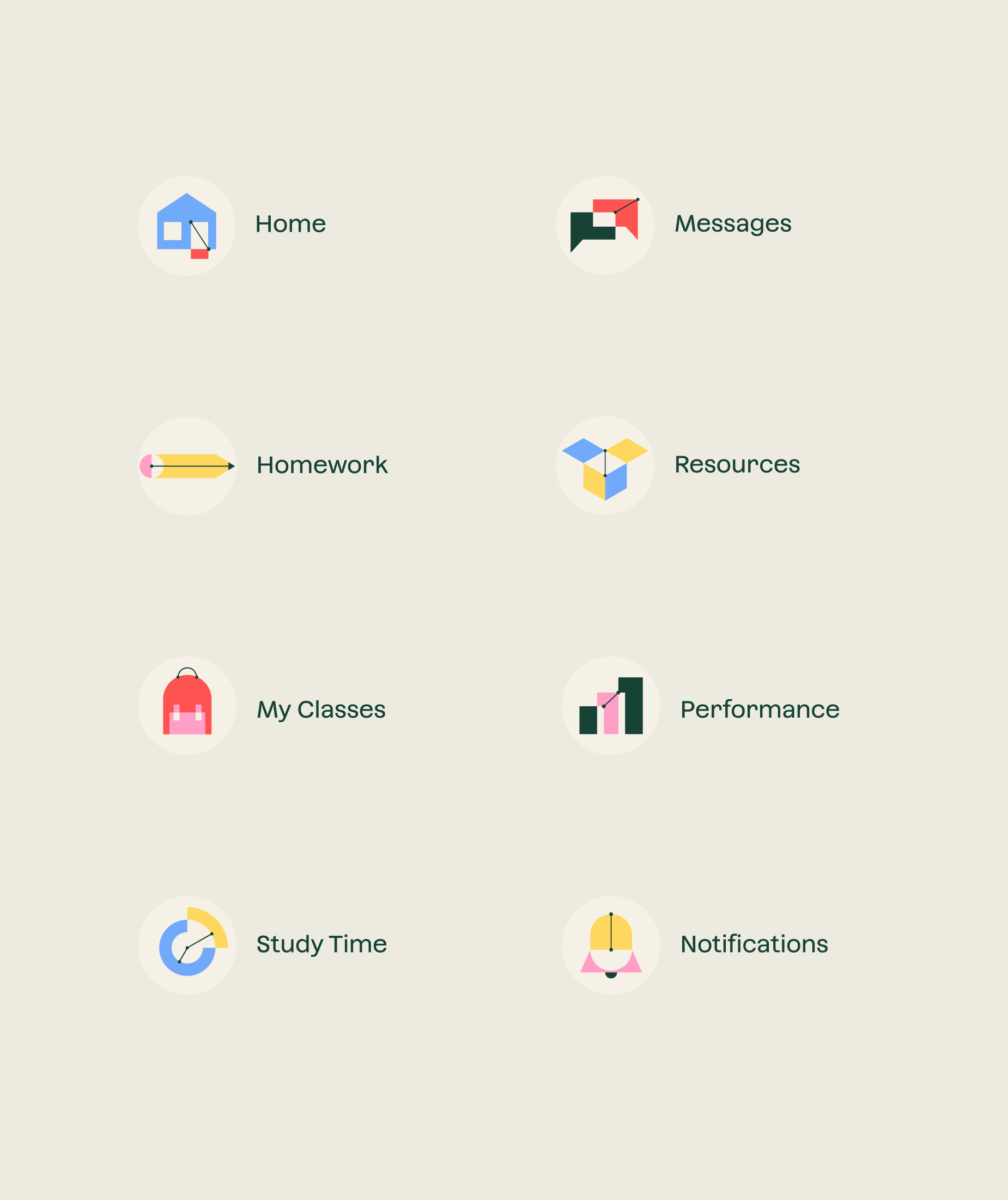
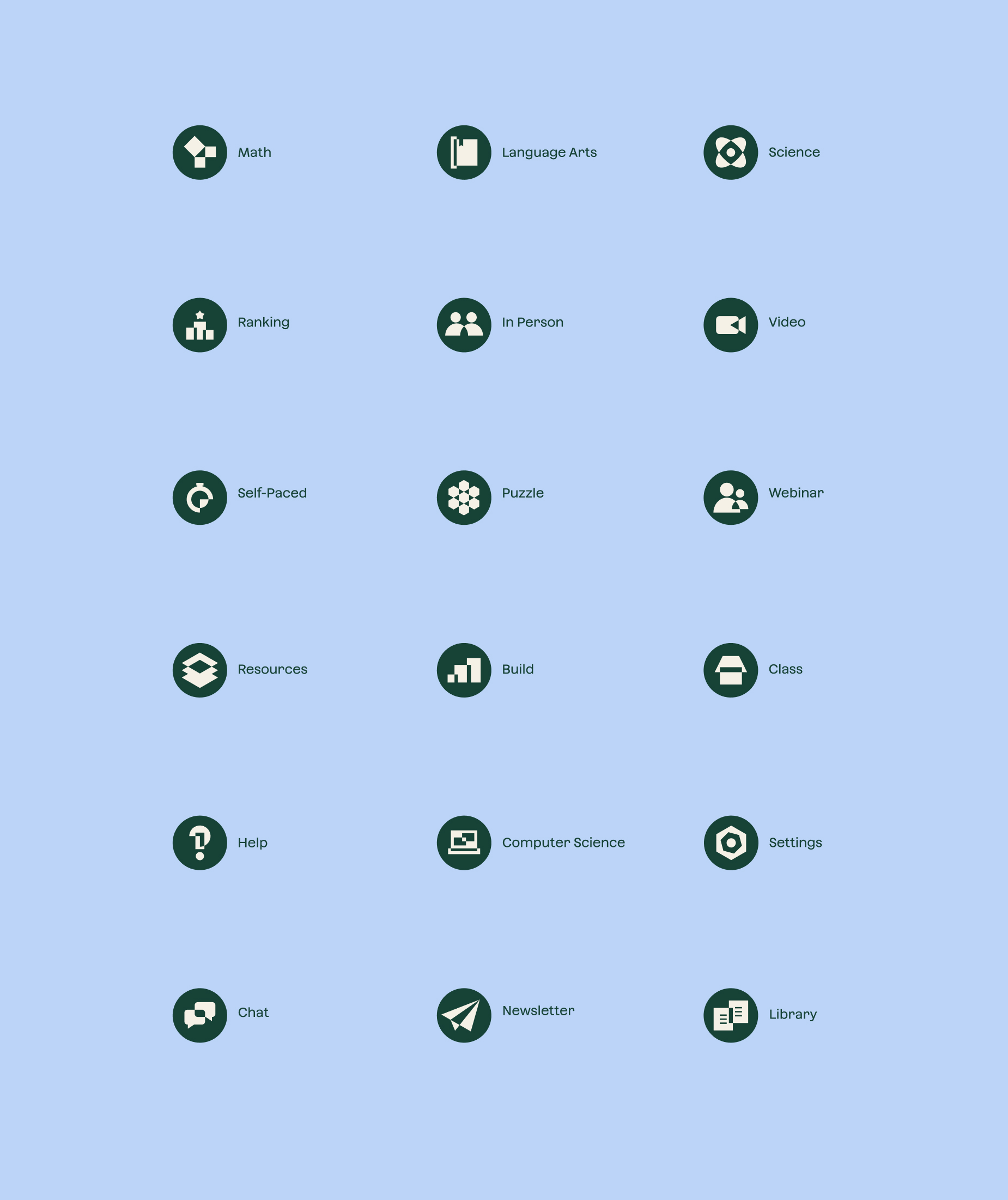
The new iconography style borrows from some of the shape principles and construction techniques to create recognizable depictions of objects and ideas. Overlapping, revealing, connecting, spreading, and multiplying methods are all used to create icons that are uniquely AoPS.
KIND WORDS
SHOUT-OUTS
Natalia Kowaleczko / Tony Mingo / Michelle Weed / Michelle Busy / Tiffany Graeff / Miriam Jacobi / Graham Bradley / Anastasia Itkina / Katherine Chui / Nick Rissmeyer / Daniel Maarleveld / Claudia Fratantonio / Sarah von Sternberg

