Anagram
Reordering the world.
Brief
Anagram puts human and financial capital behind builders of decentralized networks. With a mission to bring the ownership economy to the masses and to reorder communities toward greater freedom and empowerment while having a bit of fun. They approached Pact at their inception to create an identity that felt as unconventional as their mission. Something that could carry the weight of their ambition without losing their sense of play.
Audience
Founders, developers and early adopters who live inside the decentralized space and can spot a pose a mile away. At the same time, a wider public still standing at the edge of the ownership economy, curious but unsure how to step in. The brand had to earn credibility with the first and open a door for the second.
Opportunity
Most of the space speaks in one of two dialects: cold institutional finance or loud speculative hype. Anagram is neither of those. Their name already held the idea: take what exists and rearrange it into something new. Their personality: pioneering, based, optimistic, and fun, gave us room to build something friendlier, stranger and more open.
Concept
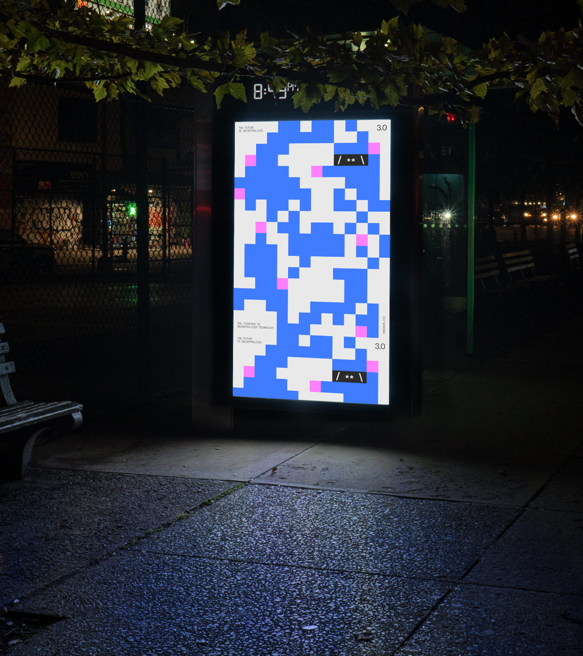
Reorder the world. The identity is a playful, ever-changing system, a kaleidoscopic composition of community, technology and capital that combines and recombines and never settles into one fixed shape. Like the name, the brand rearranges its own parts to reveal new worlds, ideas and opportunities, turning the idea of reordering systems into something you can see.
Design
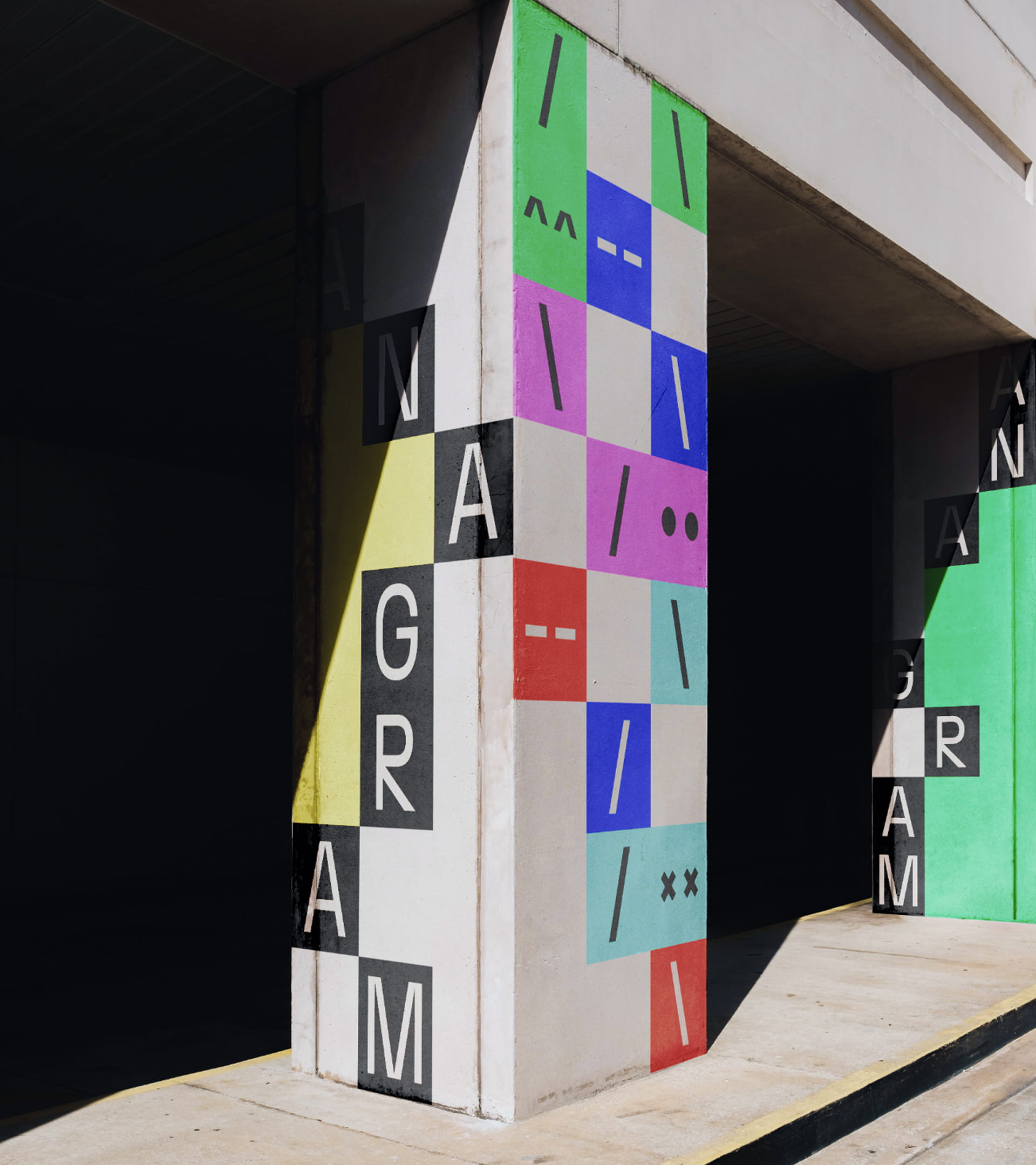
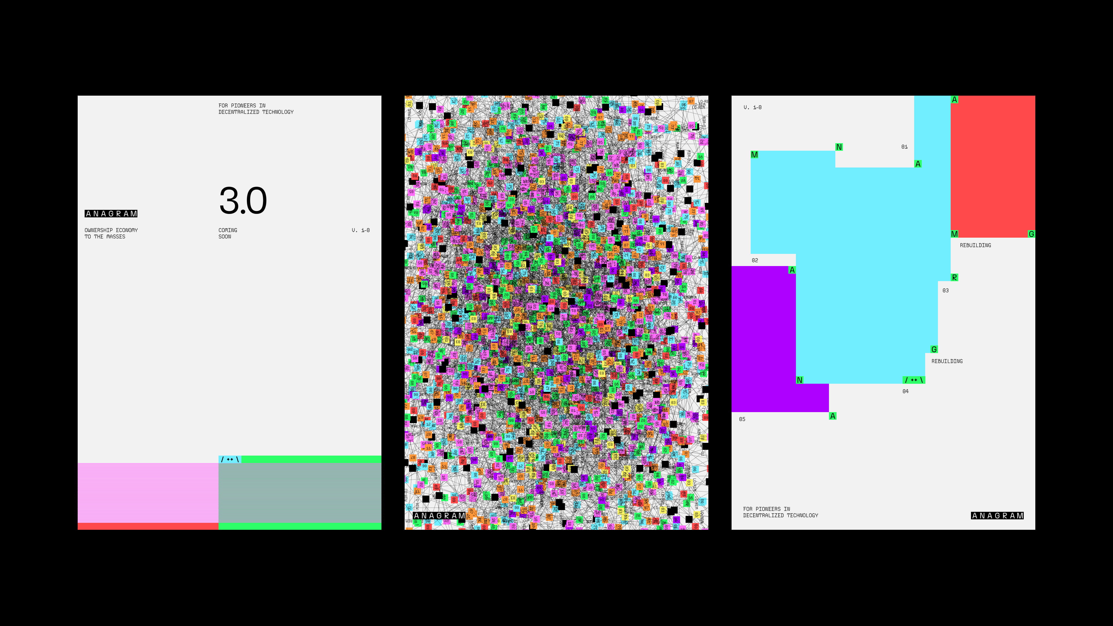
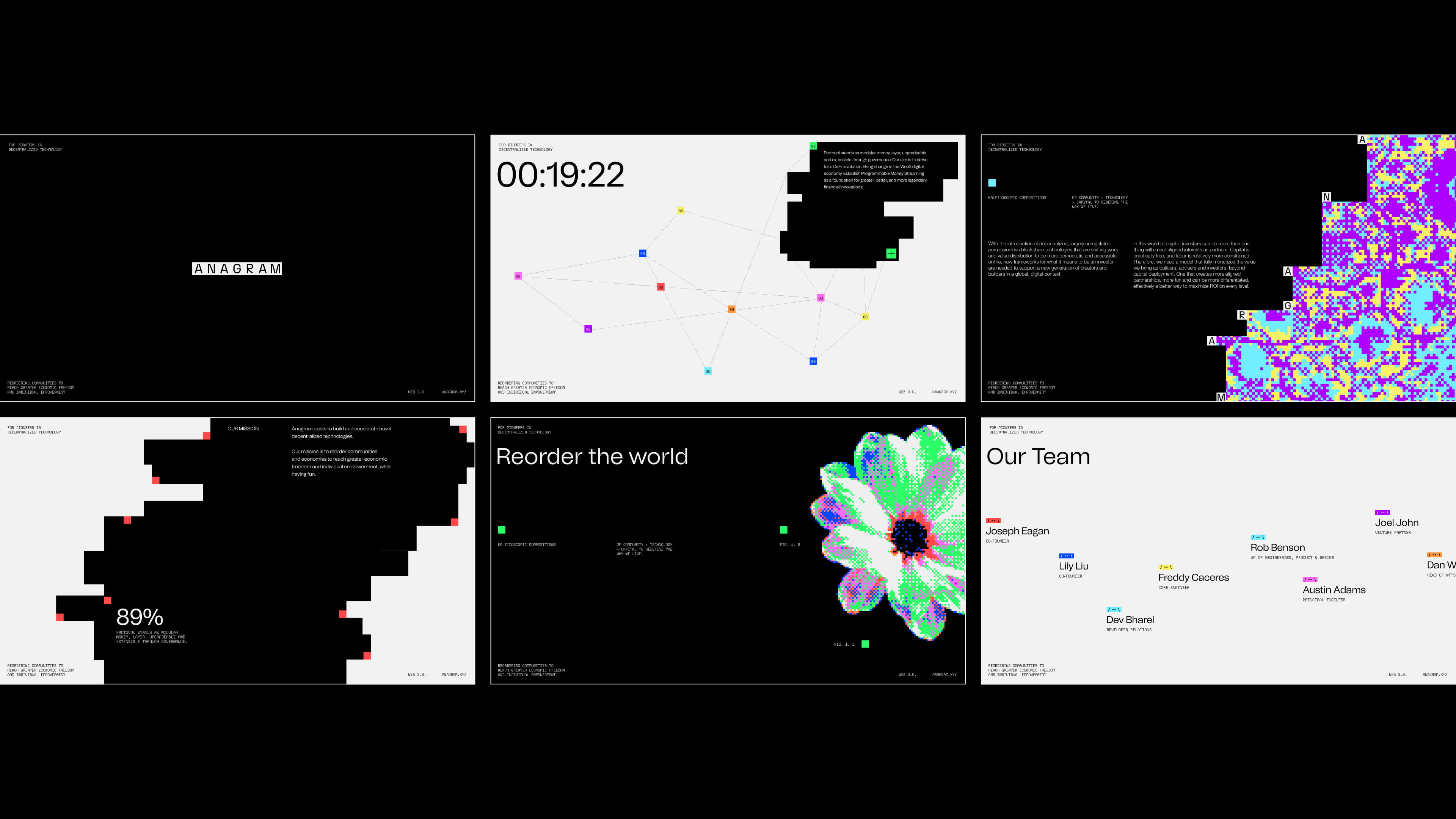
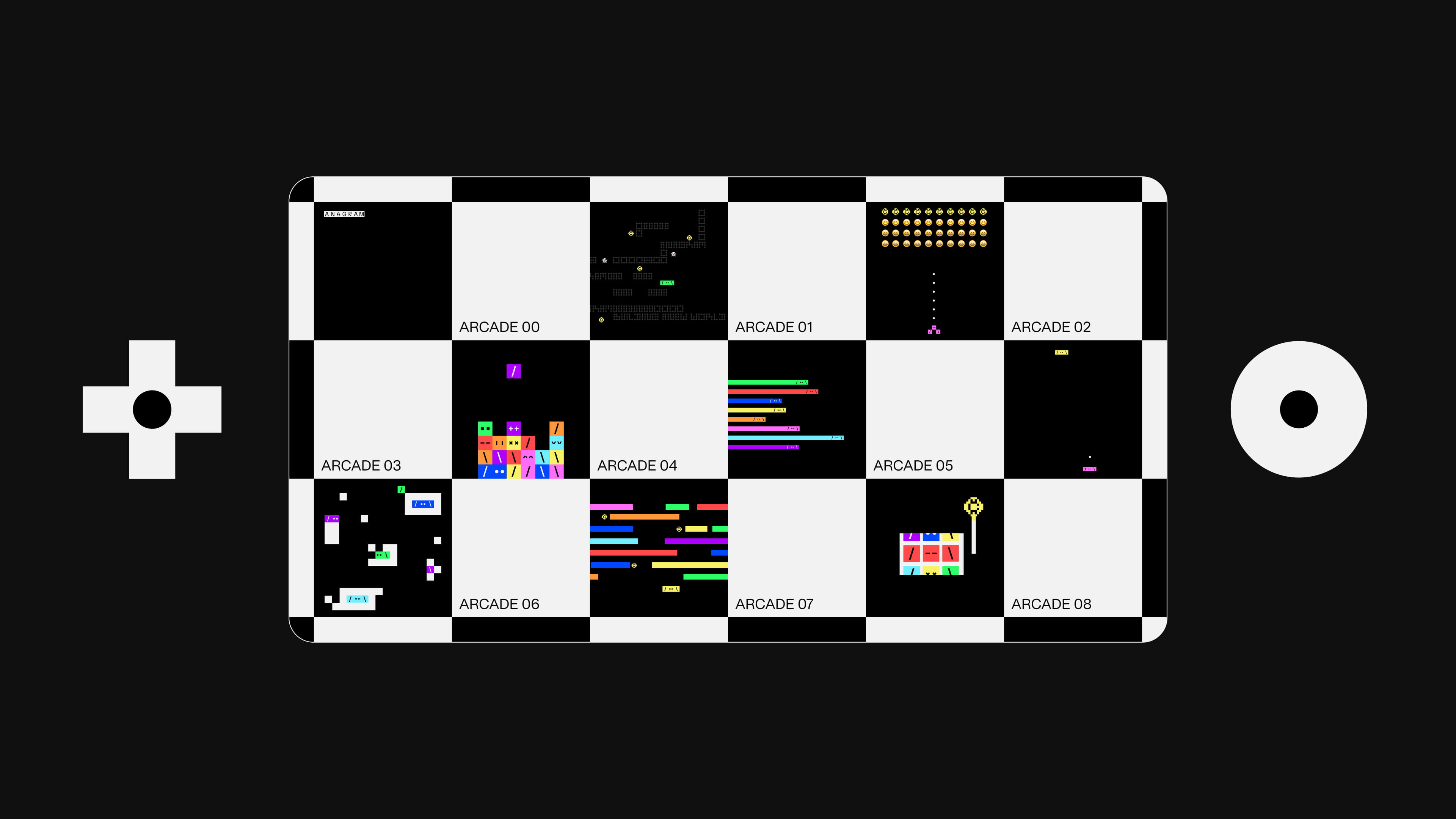
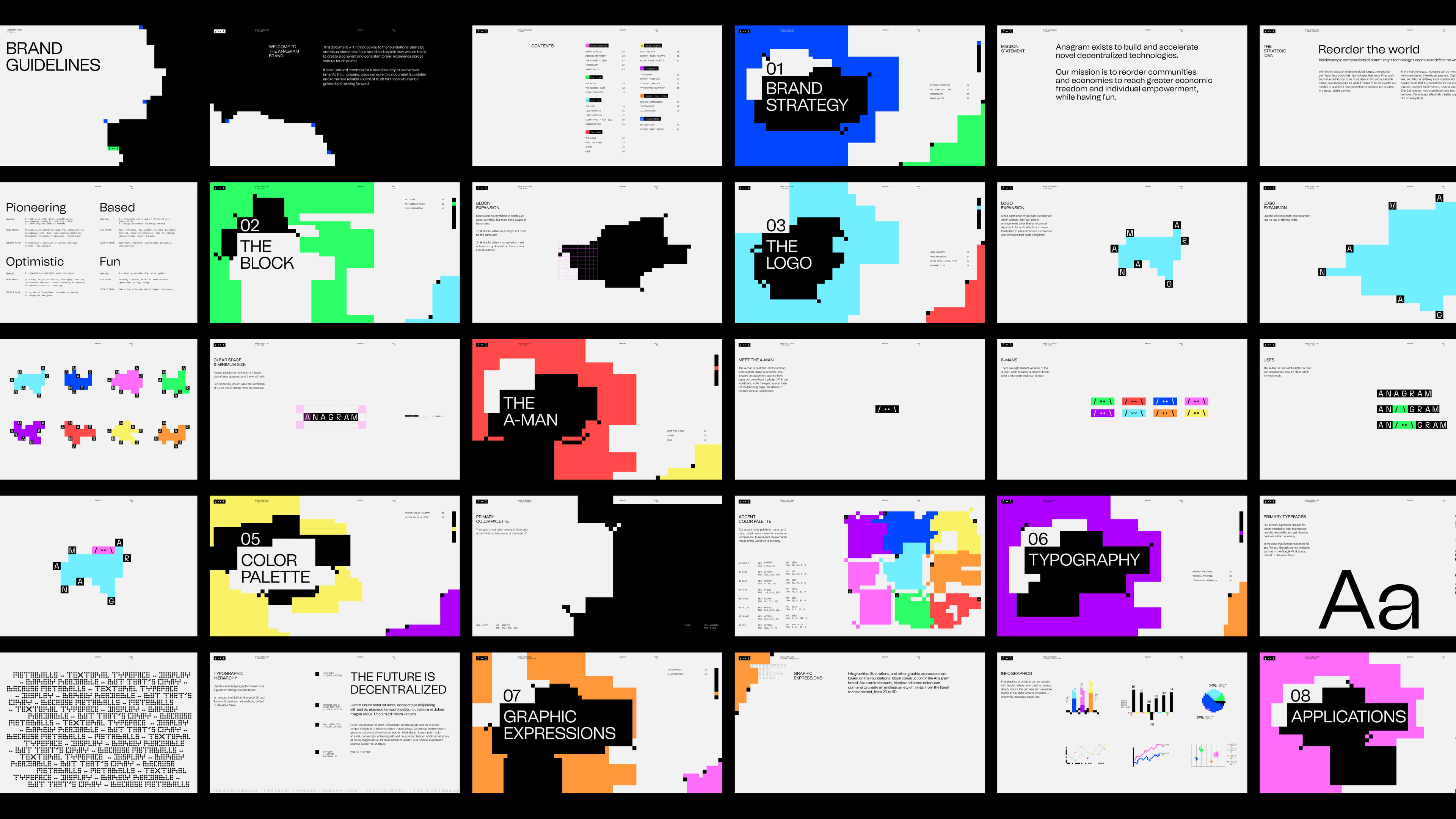
Everything starts with the genesis block. From a single square, the system grows into shapes, networks, letters and characters. Black and white form the base, a nod to the rawest days of computing, while an accent palette pulled from the vivid, early 8-bit days brings the energy. Monospaced type and rudimentary graphics make something complex feel approachable, and because every element shares the same grid, the identity can flex from poster to digital surface without losing its common language.
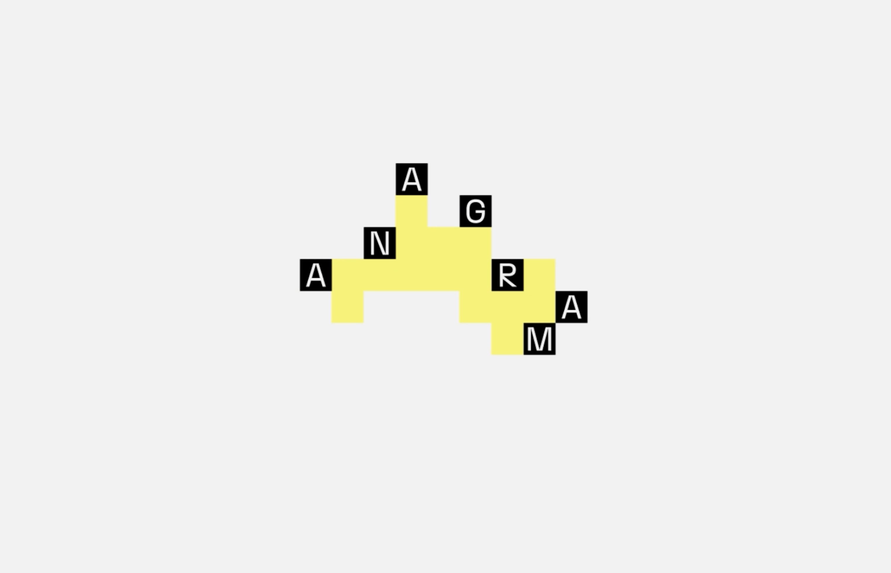
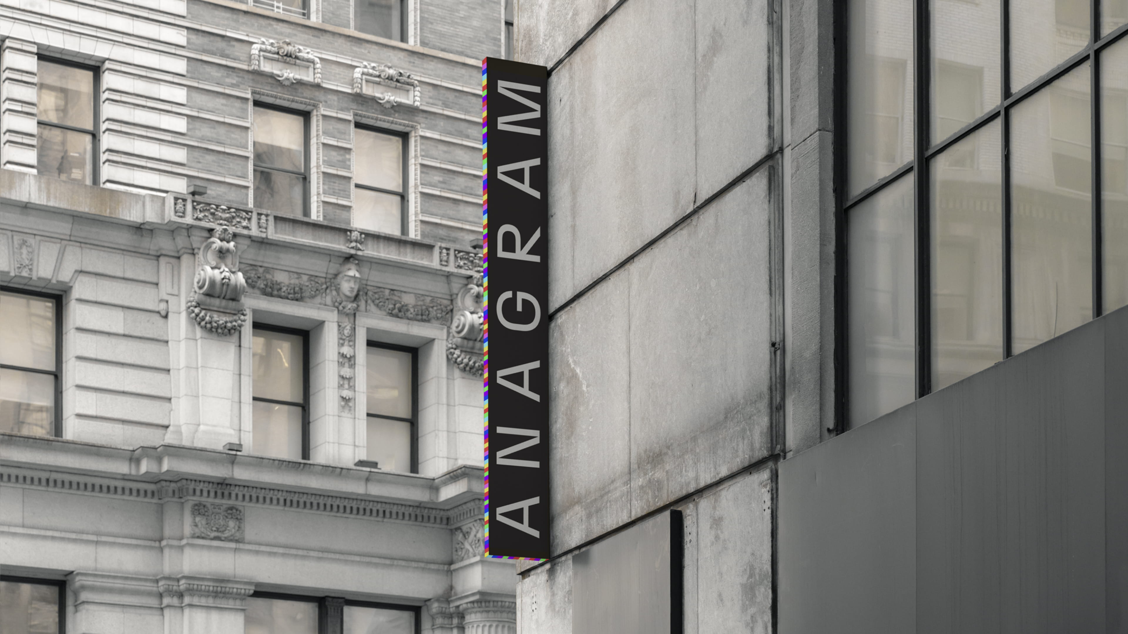
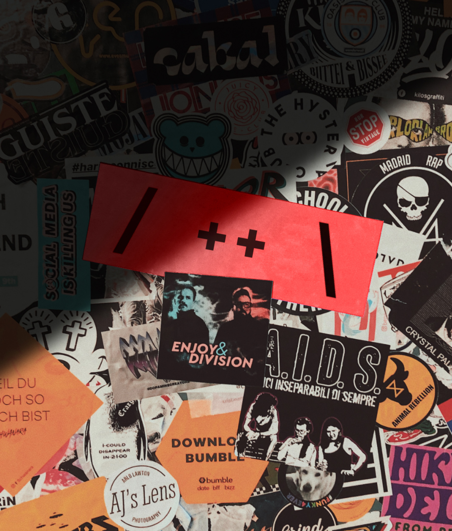
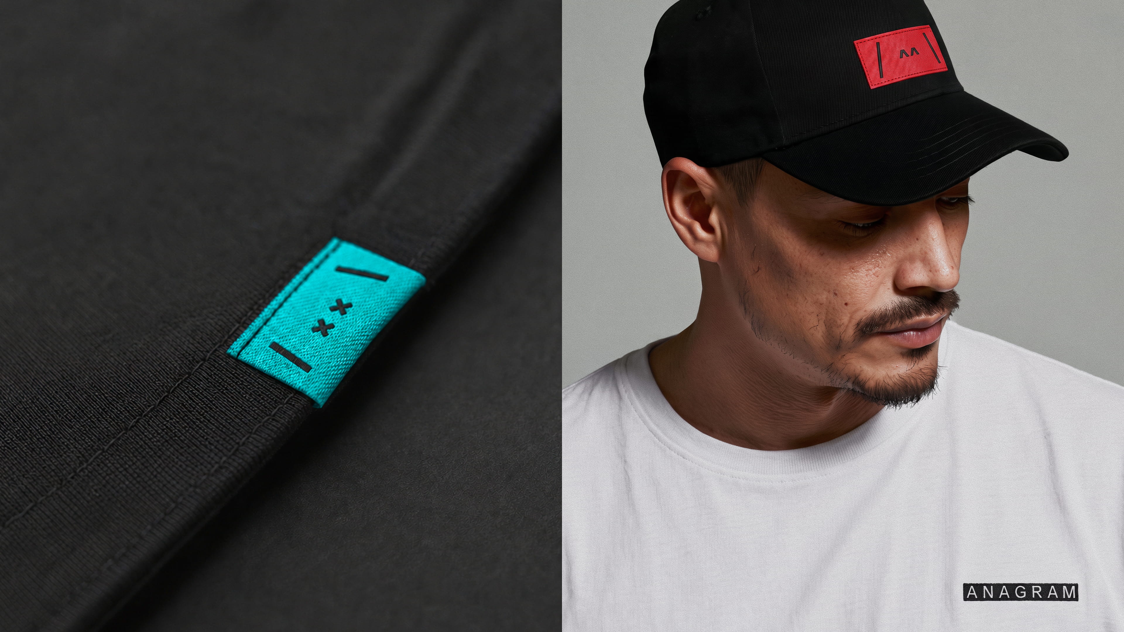
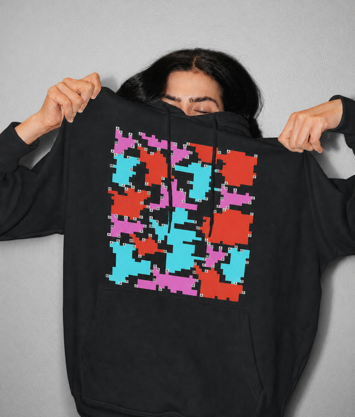
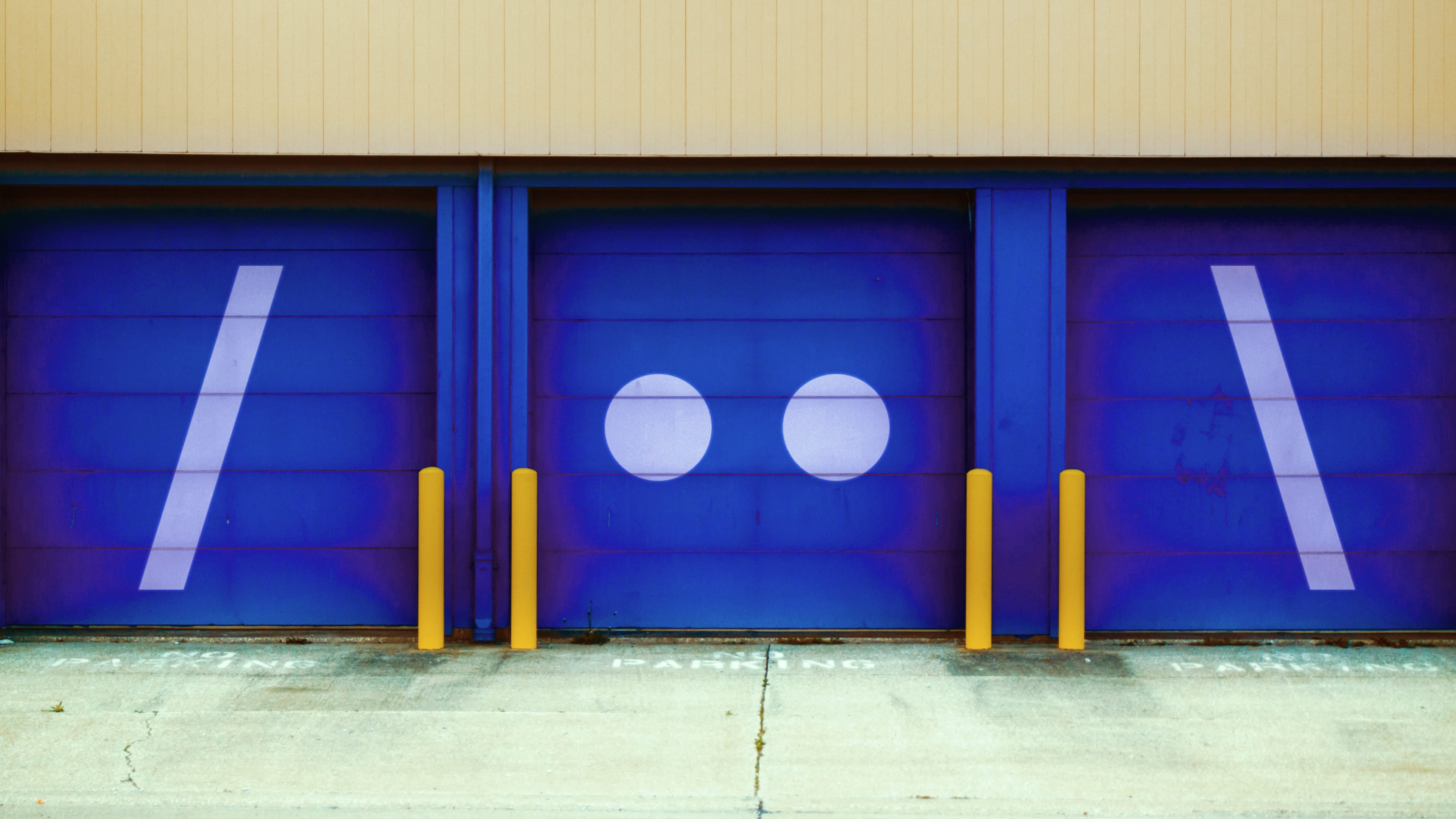
At the core of the Anagram brand is a pixel-built logo made of seven letter tiles. It can sit in a line or separate in endless ways, opening portals that reveal new worlds, ideas and opportunities, and interact with its surroundings.
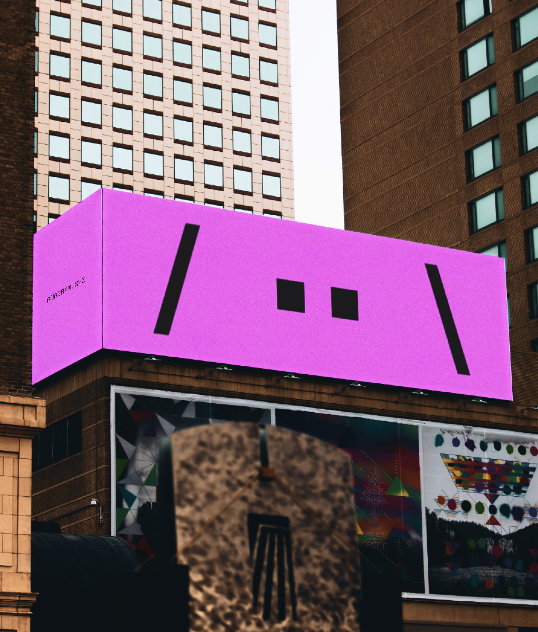
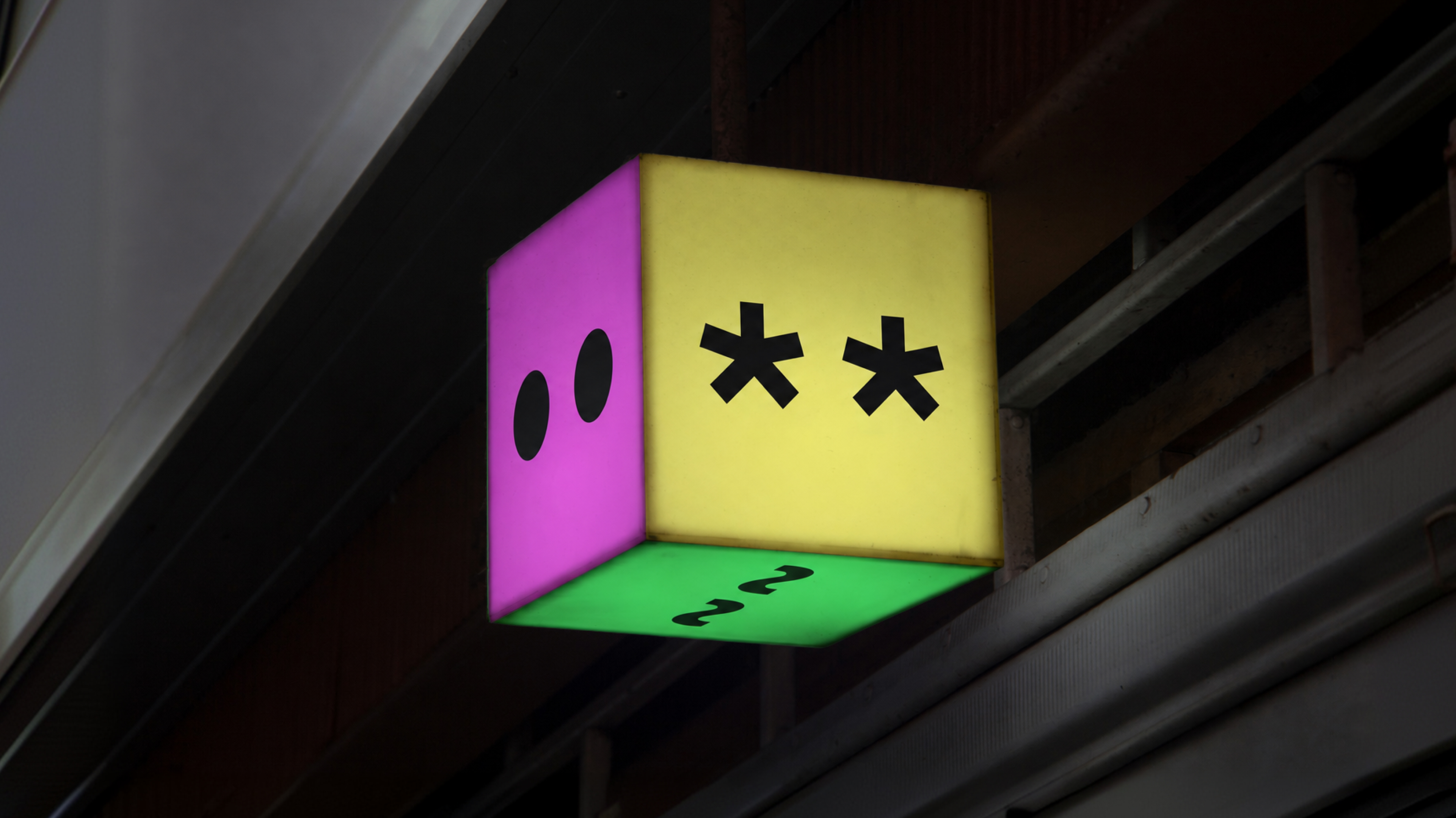
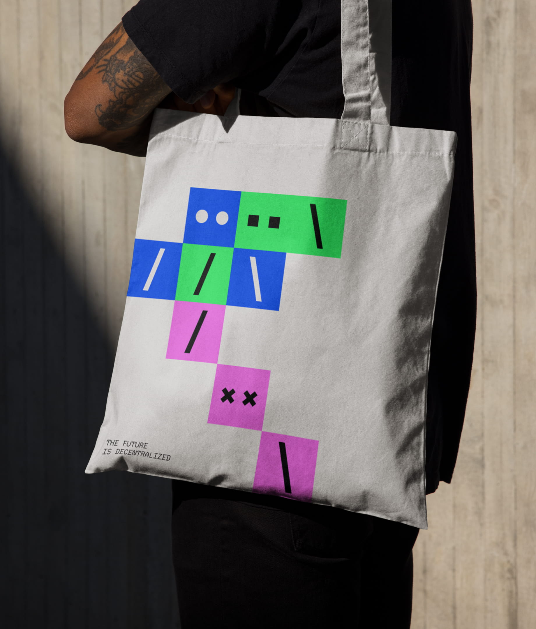
The modular logo doesn't only open up to reveal different worlds, it can also reveal the A-man sitting within its A's. He stands in for every individual building the decentralized ecosystem. Embracing the 8-bit-ness of the system, the A-man comes in 8 colors and 8 expressions, and the A-men can be combined with the logo and portals to bring more personality and character.

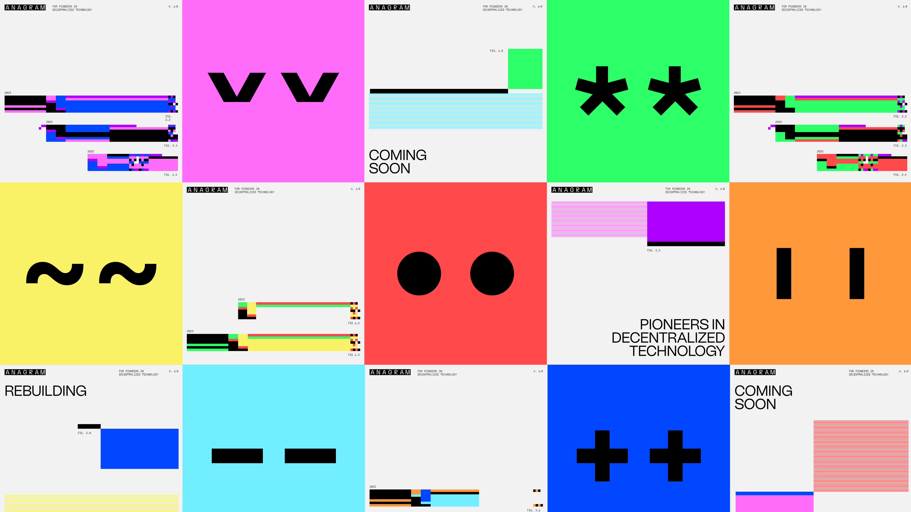
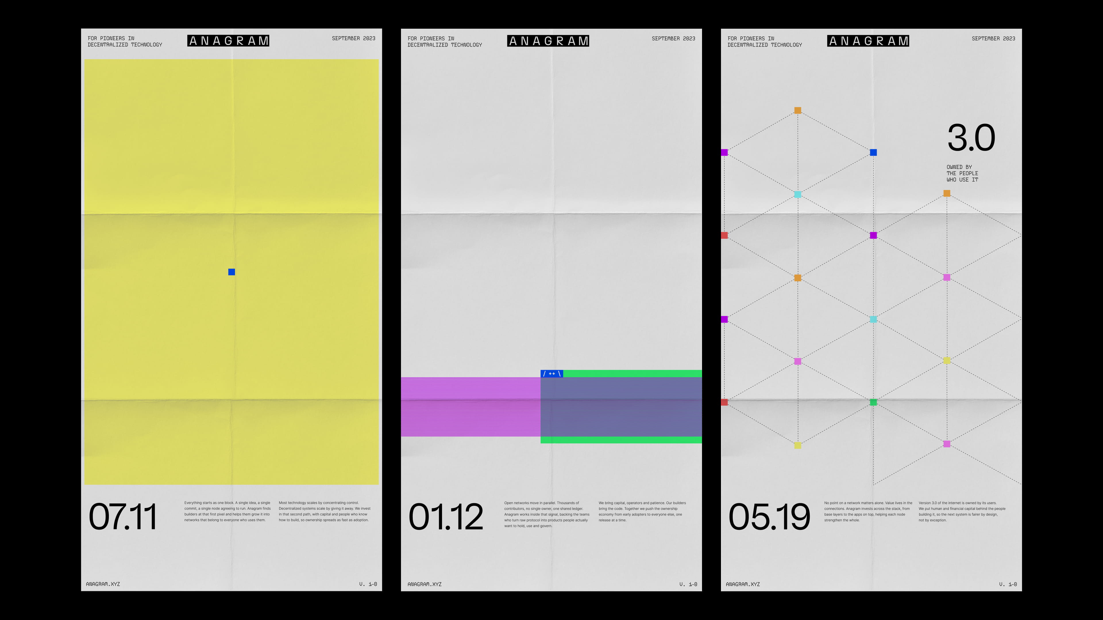
What you can't measure, you can't change. That's why we created a system of data visualizations for Anagram that turns dense financial information into something clear, lively and readable at a glance. Built from the same blocks and bright accents as the rest of the identity, every chart stays unmistakably Anagram.
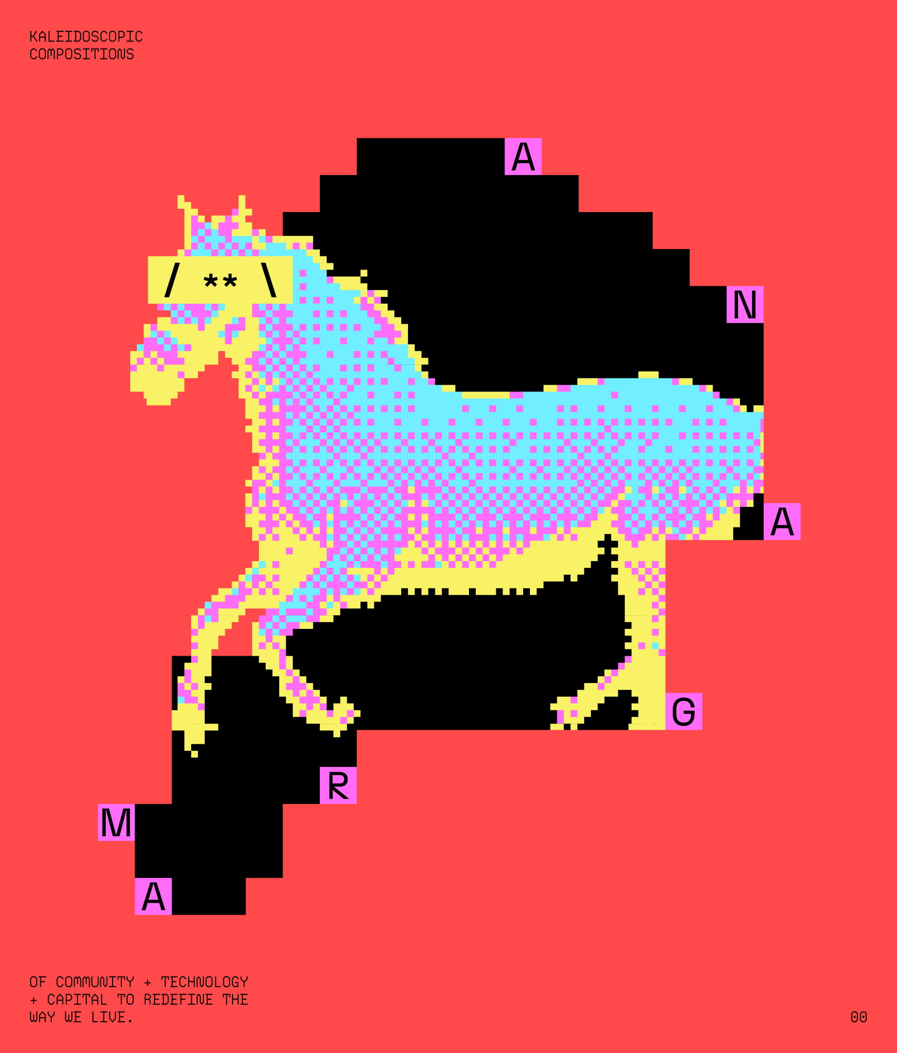
Pixel illustrations bring warmth and wit to a technical space. Built block by block and layered with the logo, portals and A-men, they become kaleidoscopic compositions of community, technology and capital. A reminder that pioneering technology can still be fun.

FROM THE CLIENT
SHOUT-OUTS
Natalia Kowaleczko / Tony Mingo / Michelle Weed / Michele Busy / Sofia Llaguno / Jamie Chiang / Guide & Anchor

